## Time Series Analysis Diagrams
### Overview
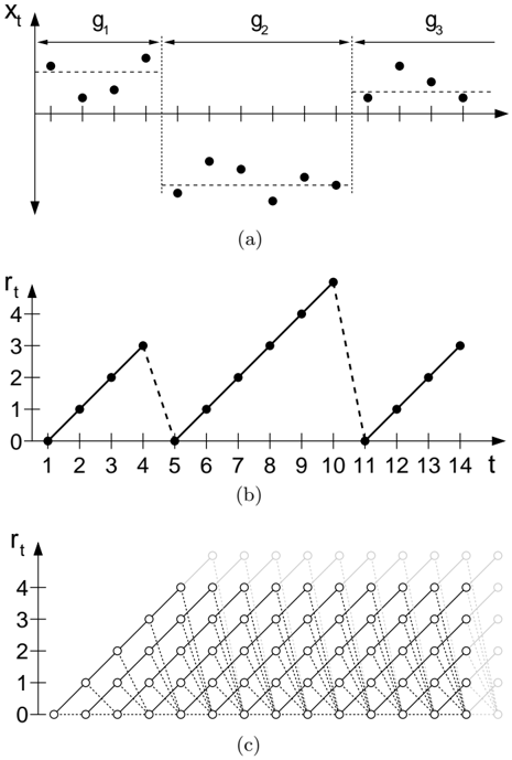
The image presents three diagrams related to time series analysis. Diagram (a) shows a discrete time series, while diagrams (b) and (c) illustrate cumulative reward functions based on the time series in (a).
### Components/Axes
**Diagram (a):**
* **X-axis:** Represents time, denoted as 't'. The axis has tick marks, but no explicit numerical labels.
* **Y-axis:** Represents the value of the time series, denoted as 'xt'.
* **Regions:** The time series is divided into three regions labeled g1, g2, and g3. These regions are visually separated by dotted vertical lines.
* **Data Points:** Discrete data points are plotted within each region. The points in g1 are generally above the x-axis, the points in g2 are generally below the x-axis, and the points in g3 are generally above the x-axis.
* **Horizontal Dotted Lines:** Horizontal dotted lines are drawn to visually represent the approximate upper and lower bounds of the data points within each region.
**Diagram (b):**
* **X-axis:** Represents time, denoted as 't'. The axis is labeled with numerical values from 1 to 14.
* **Y-axis:** Represents the cumulative reward, denoted as 'rt'. The axis is labeled with numerical values from 0 to 4.
* **Data Points:** Data points are connected by lines. The lines are solid when the cumulative reward is increasing and dashed when the cumulative reward decreases.
**Diagram (c):**
* **X-axis:** Represents time, but without explicit labels.
* **Y-axis:** Represents the cumulative reward, denoted as 'rt'. The axis is labeled with numerical values from 0 to 4.
* **Data Points:** Data points are represented by circles, connected by dotted lines. The circles and lines fade into the background as time increases.
### Detailed Analysis
**Diagram (a):**
* **Region g1:** The data points are generally positive, with values around 1.
* **Region g2:** The data points are generally negative, with values around -1.
* **Region g3:** The data points are generally positive, with values around 1.
**Diagram (b):**
* **Time 1-4:** The cumulative reward increases linearly from 0 to approximately 3.
* **Time 4-5:** The cumulative reward decreases from approximately 3 to 0.
* **Time 5-10:** The cumulative reward increases linearly from 0 to approximately 4.5.
* **Time 10-11:** The cumulative reward decreases from approximately 4.5 to 0.
* **Time 11-14:** The cumulative reward increases linearly from 0 to approximately 3.
**Diagram (c):**
* The diagram shows multiple paths of cumulative reward, starting from time 0. Each path represents a possible sequence of rewards.
* The paths are constructed by connecting data points with dotted lines. The paths that start earlier are darker and more visible, while the paths that start later are lighter and fade into the background.
### Key Observations
* Diagram (a) shows a time series with alternating positive and negative values.
* Diagram (b) shows a cumulative reward function that increases when the time series is positive and decreases when the time series is negative.
* Diagram (c) shows multiple possible paths of cumulative reward, representing different sequences of rewards.
### Interpretation
The diagrams illustrate the relationship between a discrete time series and its cumulative reward function. Diagram (a) provides the raw data, while diagrams (b) and (c) show how the cumulative reward changes over time based on the values of the time series. The alternating positive and negative values in diagram (a) lead to increases and decreases in the cumulative reward in diagram (b). Diagram (c) provides a more comprehensive view of the possible cumulative reward paths, taking into account different sequences of rewards. The diagrams are useful for understanding how a time series can be used to generate rewards and how the cumulative reward changes over time.