## Heatmap: Number of Feedback Repairs vs. Number of Initial Programs
### Overview
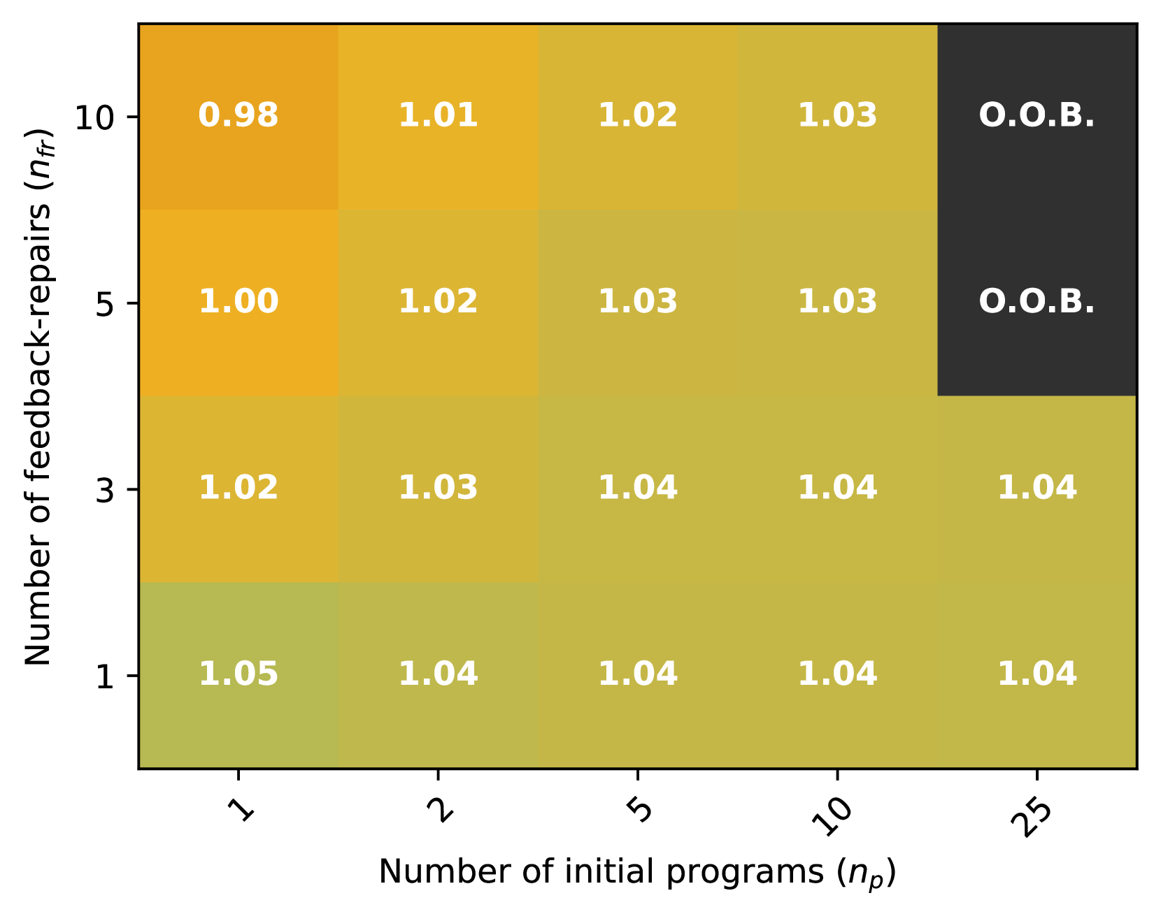
The heatmap illustrates the relationship between the number of initial programs and the number of feedback repairs. The color gradient represents the frequency of feedback repairs, with darker shades indicating higher frequencies.
### Components/Axes
- **X-axis**: Number of initial programs (n_p) with values ranging from 1 to 25.
- **Y-axis**: Number of feedback repairs (n_f) with values ranging from 1 to 10.
- **Legend**: The legend indicates the color coding for feedback repair frequencies, with darker shades representing higher frequencies.
### Detailed Analysis or ### Content Details
The heatmap shows a general trend where the number of feedback repairs increases with the number of initial programs. However, the increase is not linear. For example, with 1 initial program, there are approximately 1.05 feedback repairs, while with 25 initial programs, there are around 1.04 feedback repairs. The highest frequency of feedback repairs is observed with 1 initial program, where the number of feedback repairs is close to 10.
### Key Observations
- The highest frequency of feedback repairs is observed with 1 initial program.
- The frequency of feedback repairs decreases as the number of initial programs increases.
- There is a slight increase in feedback repairs with each additional initial program, but the increase is relatively small.
### Interpretation
The heatmap suggests that the number of initial programs has a positive correlation with the number of feedback repairs. This could indicate that programs with more initial programs may require more feedback to improve their quality. However, the relationship is not perfectly linear, and there are some fluctuations in the number of feedback repairs with different numbers of initial programs. The slight increase in feedback repairs with each additional initial program could be due to the fact that more programs may have more complex issues that require more feedback to resolve.