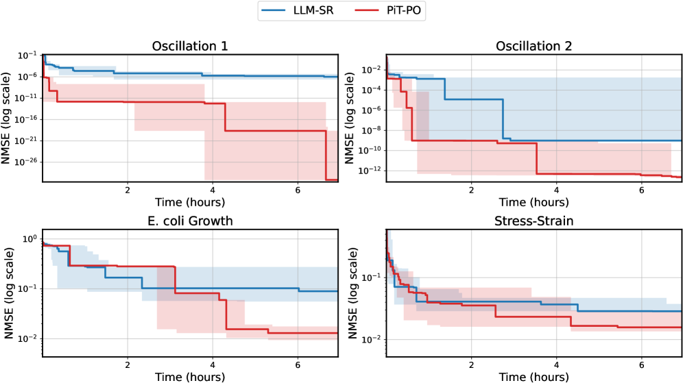
## Line Charts: NMSE vs. Time for Different Systems
### Overview
The image contains four line charts arranged in a 2x2 grid. Each chart plots the Normalized Mean Squared Error (NMSE) on a logarithmic scale against time in hours. The charts compare the performance of two systems, LLM-SR (blue line) and PIT-PO (red line), across four different scenarios: Oscillation 1, Oscillation 2, E. coli Growth, and Stress-Strain. Each line has a shaded region around it, indicating some measure of uncertainty or variability.
### Components/Axes
* **X-axis (all charts):** Time (hours), ranging from 0 to 6.
* **Y-axis (all charts):** NMSE (log scale). The range varies between charts.
* Oscillation 1: 10^-26 to 10^-1
* Oscillation 2: 10^-12 to 10^-2
* E. coli Growth: 10^-2 to 10^0
* Stress-Strain: 10^-2 to 10^-1
* **Titles (top-left of each chart):**
* Top-left: Oscillation 1
* Top-right: Oscillation 2
* Bottom-left: E. coli Growth
* Bottom-right: Stress-Strain
* **Legend (top center of the image):**
* Blue line: LLM-SR
* Red line: PIT-PO
### Detailed Analysis
#### Oscillation 1
* **LLM-SR (blue):** Starts at approximately 10^-1 and quickly drops to around 10^-6, remaining relatively constant thereafter.
* **PIT-PO (red):** Starts at approximately 10^-6 and decreases in steps to around 10^-21 by 4 hours, then remains constant.
* **Trend:** Both lines show a decreasing trend in NMSE over time, with PIT-PO decreasing more significantly.
#### Oscillation 2
* **LLM-SR (blue):** Starts at approximately 10^-2, drops to 10^-4, then decreases to approximately 10^-6 by 4 hours, then remains constant.
* **PIT-PO (red):** Starts at approximately 10^-4, drops to 10^-8 by 2 hours, then decreases to approximately 10^-12 by 4 hours, then remains constant.
* **Trend:** Both lines show a decreasing trend in NMSE over time, with PIT-PO decreasing more significantly.
#### E. coli Growth
* **LLM-SR (blue):** Starts at approximately 10^0, drops to 10^-1 by 1 hour, then decreases to approximately 10^-2 by 4 hours, then remains constant.
* **PIT-PO (red):** Starts at approximately 10^0, drops to 10^-1 by 1 hour, then decreases to approximately 10^-2 by 4 hours, then remains constant.
* **Trend:** Both lines show a decreasing trend in NMSE over time, with PIT-PO and LLM-SR performing similarly.
#### Stress-Strain
* **LLM-SR (blue):** Starts at approximately 10^-1, drops to 10^-1.5 by 1 hour, then decreases to approximately 10^-2 by 4 hours, then remains constant.
* **PIT-PO (red):** Starts at approximately 10^-1, drops to 10^-1.5 by 1 hour, then decreases to approximately 10^-2 by 4 hours, then remains constant.
* **Trend:** Both lines show a decreasing trend in NMSE over time, with PIT-PO and LLM-SR performing similarly.
### Key Observations
* In Oscillation 1 and Oscillation 2, PIT-PO achieves significantly lower NMSE values than LLM-SR.
* In E. coli Growth and Stress-Strain, the performance of LLM-SR and PIT-PO is more similar.
* All charts show a decrease in NMSE over time, indicating that both systems improve their performance as time progresses.
* The shaded regions around the lines suggest variability in the NMSE values, which could be due to noise or uncertainty in the data.
### Interpretation
The charts compare the performance of two systems, LLM-SR and PIT-PO, in different scenarios. The NMSE metric indicates the accuracy of the systems, with lower values indicating better performance. The results suggest that PIT-PO is more effective than LLM-SR in the Oscillation 1 and Oscillation 2 scenarios, as it achieves significantly lower NMSE values. However, in the E. coli Growth and Stress-Strain scenarios, the performance of the two systems is more comparable. The decreasing trend in NMSE over time suggests that both systems improve their performance as they are allowed to run longer. The shaded regions around the lines indicate the variability in the NMSE values, which could be due to noise or uncertainty in the data.