## Heatmap/Contour Plot: Spatiotemporal Distribution of a Scalar Field
### Overview
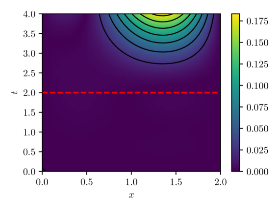
The image displays a 2D contour plot (heatmap) representing the magnitude of a scalar quantity over a spatial dimension `x` and a temporal dimension `t`. The plot uses a color gradient to indicate value intensity, with a prominent peak in the upper-central region. A horizontal red dashed line is superimposed at a specific time value.
### Components/Axes
* **X-Axis (Horizontal):**
* **Label:** `x`
* **Range:** 0.0 to 2.0
* **Major Ticks:** 0.0, 0.5, 1.0, 1.5, 2.0
* **Y-Axis (Vertical):**
* **Label:** `t`
* **Range:** 0.0 to 4.0
* **Major Ticks:** 0.0, 0.5, 1.0, 1.5, 2.0, 2.5, 3.0, 3.5, 4.0
* **Color Bar (Legend):**
* **Position:** Right side of the plot.
* **Scale:** Linear, from 0.000 (dark purple) to approximately 0.175 (bright yellow).
* **Key Value Markers:** 0.000, 0.025, 0.050, 0.075, 0.100, 0.125, 0.150, 0.175.
* **Color Gradient:** Transitions from dark purple (low) through blue, teal, and green to yellow (high).
* **Overlay Element:**
* A horizontal, red, dashed line spans the entire width of the plot at `t = 2.0`.
### Detailed Analysis
* **Data Distribution & Trends:**
* **Primary Feature (Peak):** A region of high values is centered approximately at `x ≈ 1.25` and `t ≈ 3.75`. The contours form concentric, semi-circular arcs radiating downward and outward from the top edge of the plot.
* **Value Gradient:** The value increases sharply towards the peak. The outermost visible contour line (dark blue) corresponds to a value of approximately 0.050. Moving inward, subsequent contours represent increasing values (~0.075, 0.100, 0.125, 0.150), culminating in a bright yellow core exceeding 0.175.
* **Background Field:** The vast majority of the plot area, particularly for `t < 2.5` and outside the central peak region, is a uniform dark purple, indicating values at or very near 0.000.
* **Temporal Evolution:** The scalar field appears to be zero or negligible for early times (`t < ~2.5`). The disturbance emerges and intensifies rapidly in the upper-central region after this time.
* **Spatial Distribution:** At any given time `t > 2.5`, the field is strongest near the center (`x ≈ 1.0 - 1.5`) and decays symmetrically towards the boundaries at `x=0.0` and `x=2.0`.
### Key Observations
1. **Localized Peak:** The phenomenon is highly localized in both space and time, with no significant activity outside the central upper quadrant.
2. **Symmetry:** The pattern exhibits approximate symmetry about the vertical line `x = 1.25`.
3. **Sharp Onset:** The transition from the zero-field region (dark purple) to the high-value region (contours) is relatively sharp, suggesting a front or wave-like propagation.
4. **Reference Line:** The red dashed line at `t = 2.0` serves as a clear temporal marker, possibly indicating an initial condition, a trigger time, or a boundary between different phases of the process being visualized.
### Interpretation
This plot likely visualizes the solution to a partial differential equation (PDE) modeling a diffusion, wave, or transport process. The pattern is characteristic of a **localized source or initial disturbance** that activates or becomes significant after `t ≈ 2.5`, spreading outward in space while its intensity peaks and then presumably decays (though decay is not visible within the `t=4.0` window).
* **What it Suggests:** The data demonstrates a process where a quantity is generated or concentrated at a specific location (`x≈1.25`) starting at a specific time, then diffuses or propagates spatially. The red line at `t=2.0` may mark the moment before the main event begins, highlighting the "quiet" initial state.
* **Relationships:** The `x` and `t` axes are independent variables defining the domain. The color-mapped value is the dependent variable. The contours connect points of equal value, revealing the shape and gradient of the field. The red line is an annotation for analytical reference.
* **Anomalies/Notable Points:** The most notable feature is the **absence of data** in the lower half of the plot. This is not an anomaly but a key characteristic: the system is quiescent until a later time. The perfect symmetry suggests an idealized or controlled scenario. The peak value (~0.175) is the maximum intensity achieved within the observed timeframe.