## Heatmap: Value Distribution Across x and t Axes
### Overview
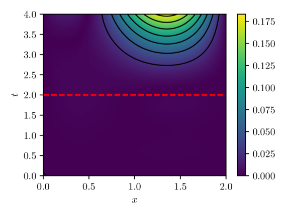
The image depicts a heatmap visualizing a scalar field across two dimensions: spatial coordinate `x` (0.0–2.0) and temporal coordinate `t` (0.0–4.0). The color gradient transitions from purple (low values) to yellow (high values), with black contour lines delineating regions of similar magnitude. A red dashed horizontal line at `t = 2.0` intersects the plot, and a color bar on the right quantifies the value range (0.000–0.175).
---
### Components/Axes
- **Axes**:
- **x-axis**: Horizontal axis labeled `x`, ranging from 0.0 to 2.0 in increments of 0.5.
- **t-axis**: Vertical axis labeled `t`, ranging from 0.0 to 4.0 in increments of 0.5.
- **Color Bar**:
- Located on the right, with a gradient from purple (0.000) to yellow (0.175).
- Discrete value markers: 0.000, 0.025, 0.050, 0.075, 0.100, 0.125, 0.150, 0.175.
- **Contour Lines**:
- Black lines tracing regions of constant value, denser in high-value areas (top-right).
- No explicit numerical labels on contour lines; values inferred from color bar.
- **Red Dashed Line**:
- Horizontal line at `t = 2.0`, spanning the full `x` range (0.0–2.0).
---
### Detailed Analysis
- **Value Distribution**:
- **High Values (Yellow)**: Concentrated in the top-right corner (`x ≈ 2.0`, `t ≈ 4.0`), decreasing radially outward.
- **Low Values (Purple)**: Dominant in the bottom-left quadrant (`x < 1.0`, `t < 2.0`).
- **Transition Zone**: Intermediate values (green/blue) occupy the central region (`1.0 < x < 2.0`, `2.0 < t < 4.0`).
- **Contour Line Behavior**:
- Lines are circular/elliptical, suggesting a radial decay from the top-right peak.
- Spacing between lines indicates gradient steepness: closer lines near `t = 4.0` imply rapid value changes.
- **Red Dashed Line**:
- Positioned at `t = 2.0`, it separates the low-value region (below) from the transition zone (above).
- No direct correlation between the line and contour values; likely a threshold or reference.
---
### Key Observations
1. **Radial Decay Pattern**: Values peak at (`x = 2.0`, `t = 4.0`) and decay outward, consistent with a wavefront or diffusion process.
2. **Threshold at `t = 2.0`**: The red line may demarcate a regime shift (e.g., critical time for a physical phenomenon).
3. **Color-Legend Consistency**: All colors align precisely with the legend (e.g., yellow at `t = 4.0`, `x = 2.0` matches 0.175).
---
### Interpretation
The heatmap likely represents a physical or mathematical system where:
- **High values** (yellow) correspond to a localized source or boundary condition at (`x = 2.0`, `t = 4.0`).
- **Low values** (purple) indicate an initial or equilibrium state in the bottom-left.
- The **red line at `t = 2.0`** could represent a critical time step where the system transitions from a stable to an active phase (e.g., phase change, activation threshold).
- The **contour lines** suggest the phenomenon propagates outward from the top-right, with diminishing intensity over time and space.
Uncertainties:
- Exact contour values are approximate due to unlabeled lines.
- The red line’s significance (e.g., physical threshold vs. arbitrary marker) is not explicitly stated in the image.