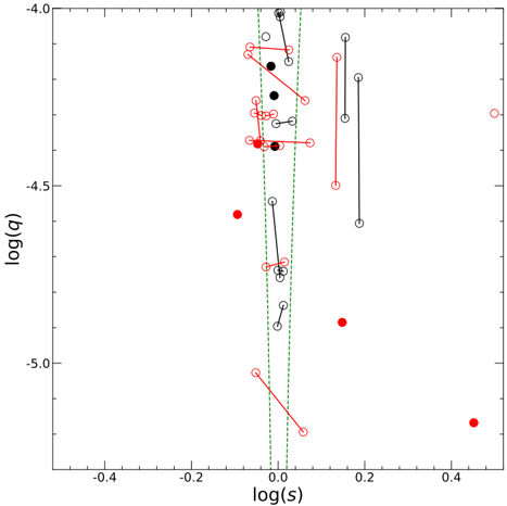
## Scatter Plot: Logarithmic Relationships between q and s
### Overview
The image is a scatter plot displaying the relationship between log(q) on the y-axis and log(s) on the x-axis. The plot includes data points represented by red filled circles, black filled circles, and open circles (both red and black). Some data points are connected by lines, either red or black, indicating a relationship or transition between those points. Two vertical dashed green lines are present, possibly indicating a region of interest or a threshold.
### Components/Axes
* **X-axis:** log(s), with scale markers at -0.4, -0.2, 0.0, 0.2, and 0.4.
* **Y-axis:** log(q), with scale markers at -4.0, -4.5, and -5.0.
* **Data Points:**
* Red filled circles: Represent one set of data points.
* Black filled circles: Represent another set of data points.
* Open circles (red and black): Represent additional data points, some connected by lines.
* **Lines:** Red and black lines connect pairs of data points.
* **Vertical Dashed Lines:** Two parallel vertical dashed green lines are positioned near log(s) = 0.0.
### Detailed Analysis
* **Data Point Distribution:**
* Most data points are clustered between log(s) values of -0.2 and 0.2.
* A few red filled circles are located at log(s) values of approximately 0.2 and 0.4.
* The log(q) values range from approximately -4.0 to -5.2.
* **Connected Data Points:**
* Several pairs of data points are connected by black lines, primarily within the log(s) range of -0.1 to 0.1.
* Several pairs of data points are connected by red lines, also primarily within the log(s) range of -0.1 to 0.1, but some extend to higher log(s) values.
* **Vertical Dashed Lines:**
* The dashed green lines are located at approximately log(s) = -0.03 and log(s) = 0.03.
### Key Observations
* There is a concentration of data points and connecting lines near log(s) = 0.
* The red filled circles appear to be more scattered compared to the other data points.
* The connecting lines suggest a relationship or transition between specific data points.
### Interpretation
The scatter plot visualizes the relationship between log(q) and log(s). The clustering of data points near log(s) = 0 suggests a significant interaction or phenomenon occurring in that region. The red filled circles, being more scattered, might represent outliers or a different type of behavior compared to the other data points. The connecting lines likely indicate a change or transition in the system being studied, with the color of the line possibly indicating the type or direction of the change. The vertical dashed lines could represent a critical region or threshold for the log(s) value. Without further context, it's difficult to determine the exact meaning of q and s, but the plot suggests a complex relationship with notable behavior around log(s) = 0.