\n
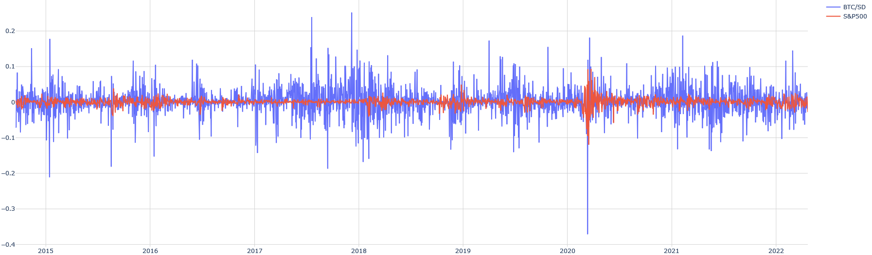
## Time Series Line Chart: Daily Returns/Volatility Comparison (BTC/SD vs. S&P500)
### Overview
The image displays a time series line chart comparing the daily returns or volatility (likely log returns or percentage changes) of two financial instruments: "BTC/SD" (Bitcoin to some currency, likely USD) and the "S&P500" stock market index. The chart spans from approximately the start of 2015 to the end of 2022. The primary visual takeaway is the stark contrast in volatility between the two assets.
### Components/Axes
* **Chart Type:** Dual-line time series chart.
* **X-Axis (Horizontal):** Represents time. Major tick marks and labels denote the start of each year: `2015`, `2016`, `2017`, `2018`, `2019`, `2020`, `2021`, `2022`. The axis spans roughly 8 years.
* **Y-Axis (Vertical):** Represents a numerical value, likely daily return or volatility. The scale is linear. Major tick marks and labels are present at: `-0.4`, `-0.3`, `-0.2`, `-0.1`, `0`, `0.1`, `0.2`.
* **Legend:** Positioned in the **top-right corner** of the chart area.
* A blue line segment is labeled `BTC/SD`.
* A red line segment is labeled `S&P500`.
* **Data Series:**
1. **BTC/SD (Blue Line):** This series exhibits extremely high volatility throughout the entire period. It is characterized by frequent, large-magnitude spikes both above and below the zero line.
2. **S&P500 (Red Line):** This series shows significantly lower volatility. It fluctuates much closer to the zero line, with smaller and less frequent deviations compared to the blue line.
### Detailed Analysis
**Trend Verification & Data Point Extraction:**
* **BTC/SD (Blue Line) Trend:** The line is highly erratic with no sustained directional trend over the long term. It oscillates violently around zero.
* **Notable Highs:** Multiple spikes exceed the `0.1` level. The highest visible peaks approach or slightly exceed `0.2`, occurring notably around late 2017/early 2018 and again in 2021.
* **Notable Lows:** Numerous dips go below `-0.1`. The most extreme negative spike is a sharp, deep trough occurring in **early 2020**, plunging to approximately `-0.38` (just above the `-0.4` label). Other significant drops below `-0.2` are visible in 2015, 2017, and 2018.
* **General Behavior:** The amplitude of the swings appears somewhat higher in the 2017-2018 period and again in 2020-2021 compared to the earlier (2015-2016) and later (2022) parts of the chart.
* **S&P500 (Red Line) Trend:** This line is much smoother and contained.
* **General Range:** For most of the chart, the red line fluctuates within a narrow band, roughly between `-0.05` and `+0.05`.
* **Notable Event:** There is a single, pronounced period of high volatility for the S&P500. In **early 2020**, coinciding with the major dip in BTC/SD, the red line shows its largest swings, with a sharp drop to approximately `-0.12` followed by a quick recovery and elevated volatility for a short period. This aligns with the COVID-19 market crash.
* **Comparison:** Outside of the early 2020 event, the S&P500's movements are dwarfed by the constant large swings of the BTC/SD series.
### Key Observations
1. **Volatility Disparity:** The most striking feature is the order-of-magnitude difference in volatility between Bitcoin (BTC/SD) and the traditional equity index (S&P500). The blue line's "noise" is consistently larger than the red line's largest moves.
2. **Synchronized Crisis (Early 2020):** Both assets experienced their most significant negative shock of the displayed period at the same time (early 2020). The BTC/SD drop was far more severe in magnitude (~ -0.38 vs. ~ -0.12).
3. **Clustering of Volatility:** For BTC/SD, periods of extreme volatility (large spikes) appear to cluster, notably around 2017-2018 and 2020-2021.
4. **Asymmetry in BTC/SD:** The largest downward spikes for BTC/SD (e.g., early 2020) appear more extreme in magnitude than the largest upward spikes.
### Interpretation
This chart visually demonstrates the **extreme risk and volatility profile of Bitcoin compared to a broad market index like the S&P500** over an 8-year period.
* **What the data suggests:** An investor in BTC/SD would have experienced daily price swings that are routinely 5 to 10 times larger than those in the S&P500. The asset class is characterized by "fat tails" – extreme positive and negative events occur with much higher frequency than in traditional markets.
* **Relationship between elements:** The chart shows that while both assets are subject to systemic market shocks (as seen in early 2020), their baseline behavior is fundamentally different. The S&P500 represents a relatively stable, mean-reverting series of returns, while BTC/SD represents a high-variance, speculative series. The correlation between the two appears low most of the time, except during the major crisis event where they moved in the same direction (down).
* **Notable Anomalies:** The early 2020 crash is the key anomaly where the typically low-volatility S&P500 exhibited behavior more reminiscent of a high-risk asset, though still less extreme than Bitcoin. The chart also suggests that Bitcoin's volatility may have slightly decreased in the most recent period (2022) compared to its 2021 peaks, though it remains vastly higher than the S&P500.
* **Peircean Insight:** The chart is an index of market sentiment and risk perception. The blue spikes are a direct visual representation of periods of greed (large positive spikes) and fear (large negative spikes) in the cryptocurrency market, which operate at a scale and frequency unseen in the established equity market represented by the red line.