## Bar Chart: Mean Values (%) vs. Layer
### Overview
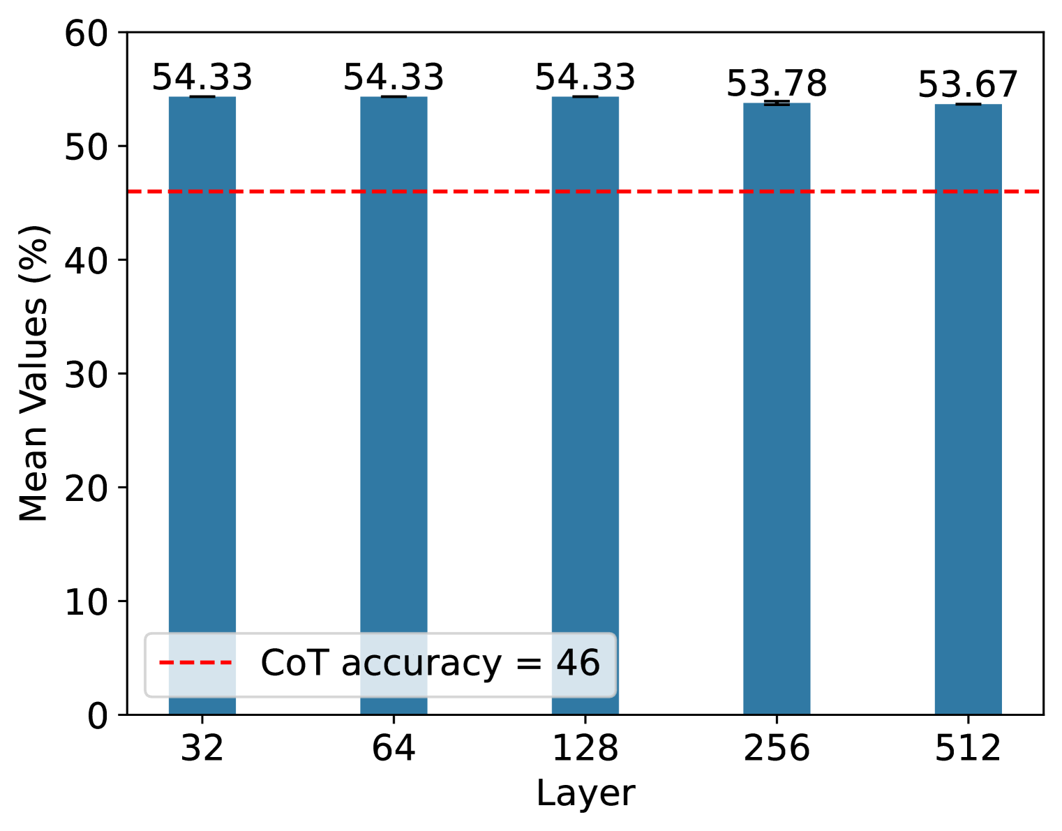
The image is a bar chart comparing the mean values (in percentage) across different layers. The chart also includes a horizontal dashed line representing the "CoT accuracy" at 46%. The x-axis represents the layer, with values 32, 64, 128, 256, and 512. The y-axis represents the mean values in percentage, ranging from 0 to 60.
### Components/Axes
* **X-axis:** "Layer" with values 32, 64, 128, 256, and 512.
* **Y-axis:** "Mean Values (%)" ranging from 0 to 60, with increments of 10.
* **Bars:** Blue bars representing the mean values for each layer.
* **Horizontal Line:** A dashed red line representing "CoT accuracy = 46".
* **Legend:** Located at the bottom-left, indicating the red dashed line represents "CoT accuracy = 46".
### Detailed Analysis
The chart displays the following data points:
* **Layer 32:** Mean Value = 54.33%
* **Layer 64:** Mean Value = 54.33%
* **Layer 128:** Mean Value = 54.33%
* **Layer 256:** Mean Value = 53.78% (with a small error bar)
* **Layer 512:** Mean Value = 53.67% (with a small error bar)
The CoT accuracy is represented by a horizontal dashed red line at 46%.
### Key Observations
* The mean values are relatively consistent across all layers, hovering around 54%.
* The mean values for layers 256 and 512 are slightly lower than layers 32, 64, and 128.
* All mean values are significantly higher than the CoT accuracy of 46%.
### Interpretation
The chart suggests that the mean values (%) are relatively stable across different layers (32 to 512). The fact that all mean values are above the CoT accuracy indicates that the model performs better than the CoT accuracy across all tested layers. The slight decrease in mean values for layers 256 and 512 might indicate a slight performance degradation at higher layers, but the difference is minimal. The error bars on layers 256 and 512 suggest a small variance in the measurements for those layers.