\n
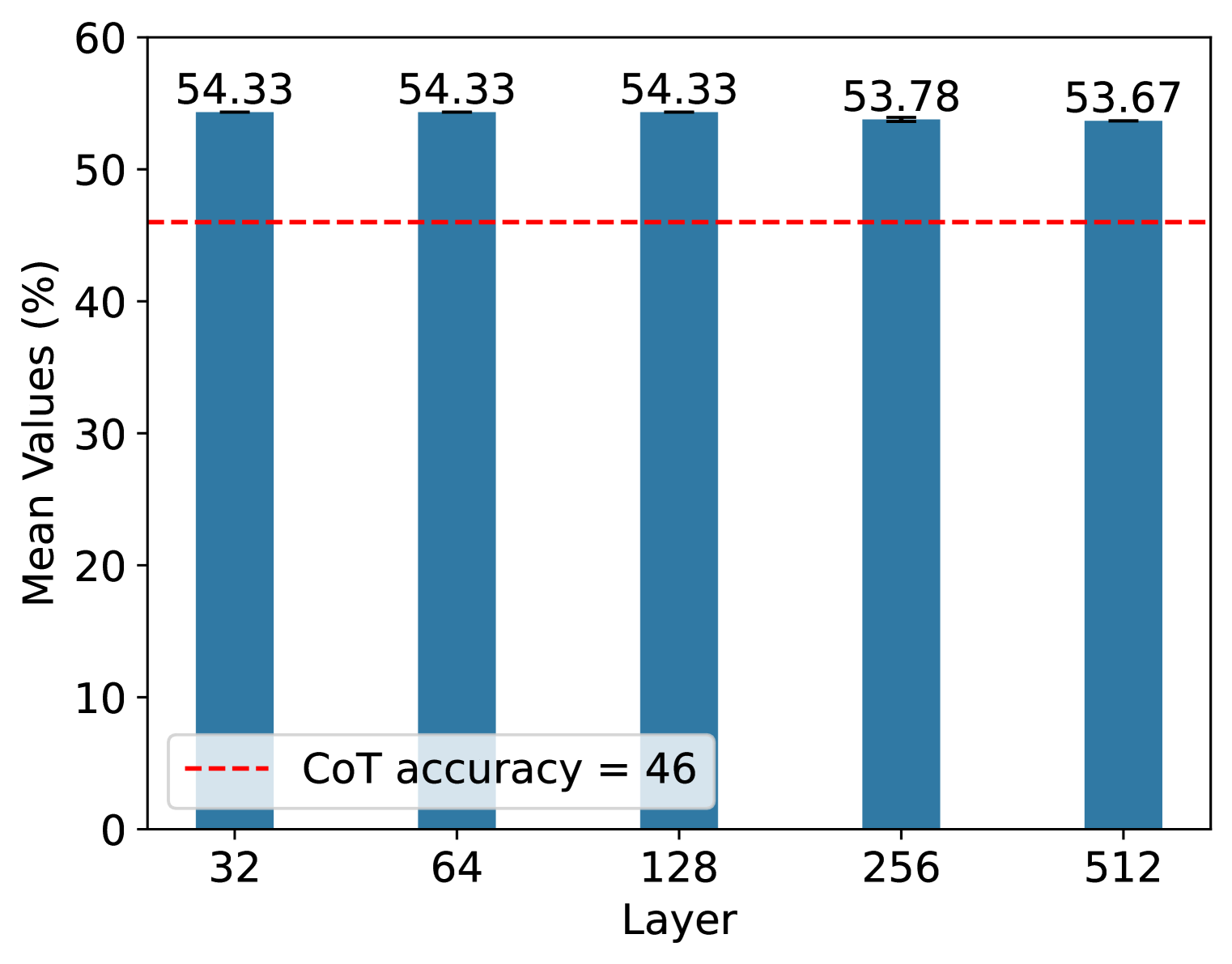
## Bar Chart: Mean Values vs. Layer
### Overview
This image presents a bar chart comparing the mean values (expressed as percentages) across different layers (32, 64, 128, 256, and 512). A horizontal dashed red line indicates a CoT accuracy threshold of 46. The chart visually represents the performance of something across varying layer configurations.
### Components/Axes
* **X-axis:** "Layer" with markers at 32, 64, 128, 256, and 512.
* **Y-axis:** "Mean Values (%)" ranging from 0 to 60, with increments of 10.
* **Bars:** Five blue bars, each representing a different layer.
* **Horizontal Line:** A dashed red line labeled "CoT accuracy = 46".
* **Data Labels:** Each bar is labeled with its corresponding mean value.
### Detailed Analysis
The chart displays the following data points:
* **Layer 32:** Mean Value = 54.33%
* **Layer 64:** Mean Value = 54.33%
* **Layer 128:** Mean Value = 54.33%
* **Layer 256:** Mean Value = 53.78%
* **Layer 512:** Mean Value = 53.67%
The bars are of roughly equal height, indicating relatively consistent mean values across the different layers. The values are all above the CoT accuracy threshold line.
### Key Observations
* The mean values are clustered around the 54% mark, with a slight decrease observed for layers 256 and 512.
* All layers exhibit mean values significantly higher than the CoT accuracy threshold of 46%.
* There is minimal variation in performance across the different layer sizes.
### Interpretation
The data suggests that the performance metric being measured (represented by "Mean Values (%)") remains relatively stable as the layer size increases from 32 to 512. The consistent values above the CoT accuracy threshold indicate that all layer configurations perform well according to this metric. The slight dip in performance for layers 256 and 512 might warrant further investigation, but the difference is small.
The "CoT accuracy" line serves as a baseline for comparison. The fact that all layers exceed this baseline suggests that the system or model being evaluated is consistently performing above a certain level of acceptable accuracy. The chart doesn't reveal *why* the values are stable, or what the underlying mechanism is, but it clearly demonstrates that increasing the layer size within the tested range does not lead to a significant improvement or degradation in performance. It's possible that other factors are more influential in determining performance than layer size alone.