\n
## Diagram: Causal Diagrams
### Overview
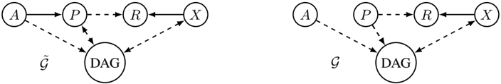
The image presents two causal diagrams, likely illustrating relationships between variables in a statistical or probabilistic model. Both diagrams share the same structure but differ in the direction of one edge. The diagrams use nodes representing variables and directed edges representing causal relationships.
### Components/Axes
The diagrams consist of the following nodes:
* **A**: Represented by a circle containing the letter "A".
* **P**: Represented by a circle containing the letter "P".
* **R**: Represented by a circle containing the letter "R".
* **X**: Represented by a circle containing the letter "X".
* **DAG**: Represented by an oval containing the letters "DAG".
The diagrams also include directed edges (arrows) indicating causal relationships. The label "G" is present below the DAG node in both diagrams.
### Detailed Analysis or Content Details
**Diagram 1 (Left):**
* A solid arrow points from A to P.
* A dashed arrow points from P to R.
* A solid arrow points from R to X.
* A dashed arrow points from A to DAG.
* A dashed arrow points from P to DAG.
* A dashed arrow points from R to DAG.
**Diagram 2 (Right):**
* A solid arrow points from A to P.
* A dashed arrow points from P to R.
* A solid arrow points from R to X.
* A dashed arrow points from A to DAG.
* A dashed arrow points from P to DAG.
* A dashed arrow points from R to DAG.
The only difference between the two diagrams is the direction of the dashed arrow between A and DAG. In the first diagram, the arrow points *to* DAG, while in the second diagram, the arrow points *from* DAG.
### Key Observations
Both diagrams depict a similar causal structure. The key difference lies in the relationship between A and DAG. The first diagram suggests that A influences DAG, while the second diagram suggests that DAG influences A. The use of dashed lines for some edges suggests a weaker or less direct causal relationship compared to the solid lines.
### Interpretation
These diagrams likely represent two different models of a causal system. The "DAG" node likely represents a Directed Acyclic Graph, which is a common tool for representing causal relationships in statistical modeling. The diagrams illustrate how changing the direction of a single edge can alter the causal interpretation of the model. The difference in the direction of the edge between A and DAG could represent different assumptions about the underlying causal mechanisms. For example, the first diagram might represent a scenario where A is a predictor of DAG, while the second diagram might represent a scenario where DAG influences A. The use of dashed lines suggests that the relationships between P, R, and DAG are less certain or more indirect than the relationship between A and P or R and X. The diagrams are useful for visualizing and comparing different causal hypotheses.