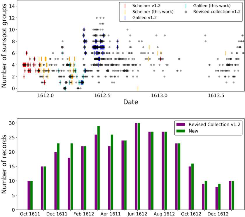
## Scatter Plot and Bar Chart: Sunspot Group Records (1611-1612)
### Overview
The image contains two visualizations:
1. **Top**: A scatter plot showing sunspot group counts over time (1612.0–1613.5) with multiple data series.
2. **Bottom**: A bar chart comparing monthly records of "Revised Collection v1.2" and "New" data (October 1611–December 1612).
---
### Components/Axes
#### Scatter Plot (Top)
- **X-axis**: Date (1612.0 to 1613.5, increments of 0.1).
- **Y-axis**: Number of sunspot groups (0 to 14, increments of 2).
- **Legend**:
- Red: Scheiner v1.2
- Yellow: Scheiner (this work)
- Cyan: Galileo (this work)
- Blue: Galileo v1.2
- Gray: Revised collection v1.2
- Black: Unlabeled data points (possibly background or aggregated data).
#### Bar Chart (Bottom)
- **X-axis**: Months (October 1611 to December 1612, monthly intervals).
- **Y-axis**: Number of records (0 to 30, increments of 5).
- **Legend**:
- Purple: Revised Collection v1.2
- Green: New
---
### Detailed Analysis
#### Scatter Plot
- **Data Series Distribution**:
- **Revised collection v1.2 (gray)**: Dominates the plot with dense clusters, especially between 1612.3–1612.7.
- **Scheiner v1.2 (red)**: Sparse points, mostly below 6 sunspot groups.
- **Scheiner (this work) (yellow)**: Fewer points than gray, concentrated around 1612.1–1612.3.
- **Galileo (this work) (cyan)**: Scattered points, with a peak near 1612.5.
- **Galileo v1.2 (blue)**: Sparse, with a cluster near 1612.4.
- **Trends**:
- Sunspot counts peak around 1612.5 (up to ~12 groups).
- Lower counts (<4) are frequent in early 1612.0–1612.2.
#### Bar Chart
- **Monthly Records**:
- **Revised Collection v1.2 (purple)**:
- Peaks in June 1612 (~30 records).
- Declines steadily after August 1612.
- **New (green)**:
- Matches purple closely in most months (e.g., June 1612: ~30 vs. ~28).
- Slightly higher in December 1612 (~10 vs. ~8).
- **Trends**:
- Both datasets show similar seasonal patterns, with peaks in mid-1612.
---
### Key Observations
1. **Scatter Plot**:
- The Revised Collection v1.2 (gray) contains the most data points, suggesting it is the most comprehensive dataset.
- Discrepancies between Scheiner and Galileo datasets (e.g., sparse vs. clustered points) may reflect differing observational methods or revisions.
2. **Bar Chart**:
- The "New" dataset closely aligns with the Revised Collection, indicating consistency in updated records.
- Minor deviations (e.g., December 1612) could signal unresolved discrepancies or new observations.
---
### Interpretation
- **Data Reliability**: The Revised Collection v1.2 and "New" dataset (bar chart) likely represent validated or cross-verified records, given their alignment.
- **Historical Context**: The scatter plot’s variability in sunspot counts aligns with known solar activity cycles in the early 17th century, though the Revised Collection’s density suggests improved calibration.
- **Anomalies**:
- The sparse Scheiner v1.2 data (red) may indicate outdated or incomplete observations.
- The Galileo (this work) cluster near 1612.5 could represent a newly discovered or corrected dataset.
- **Implications**: The consistency between Revised Collection and New data supports their use for historical solar activity analysis, while discrepancies in older datasets (e.g., Scheiner v1.2) highlight the need for ongoing revisions.