## Kernel Density Estimation
### Overview
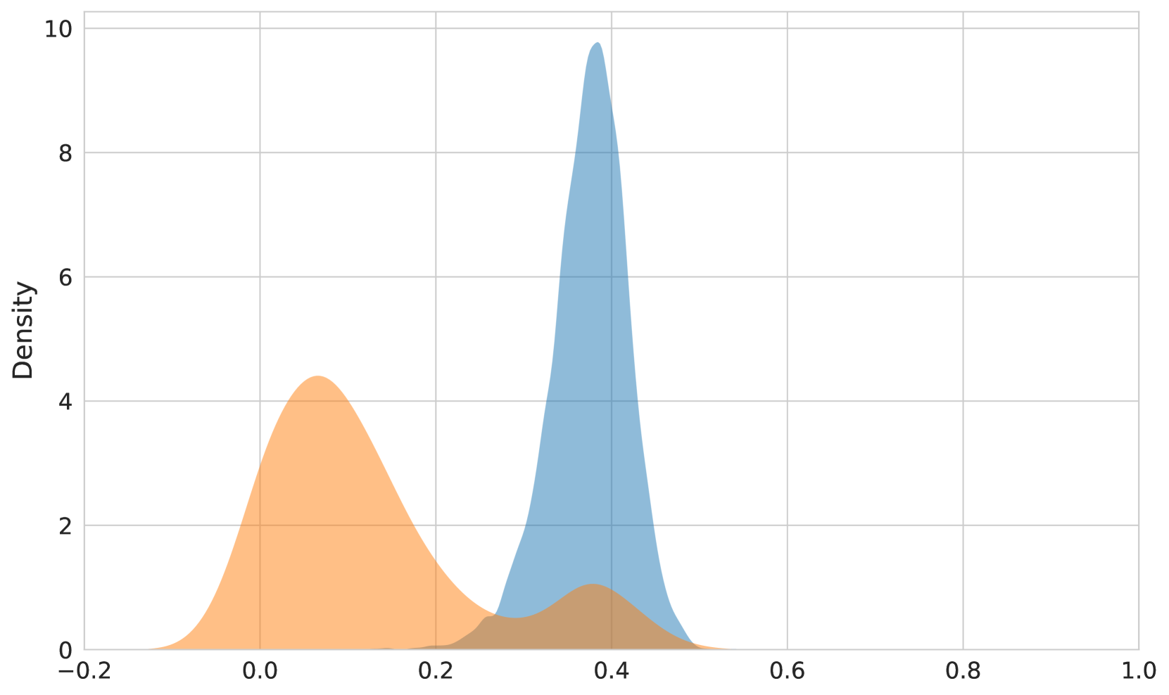
The image displays a kernel density estimation (KDE) plot, which is a non-parametric way to estimate the probability density function of a random variable. The KDE plot shows two overlapping distributions, one in orange and one in blue, with the blue distribution being more concentrated around the center.
### Components/Axes
- **X-axis**: Represents the variable being measured, ranging from -0.2 to 1.0.
- **Y-axis**: Represents the density of the variable, ranging from 0 to 10.
- **Legend**: There is no legend visible in the image, but the color of the distributions (orange and blue) corresponds to the data points they represent.
- **Grid**: The background of the plot is white with a grid overlay to help in reading the values on the axes.
### Detailed Analysis or ### Content Details
- The orange distribution is more spread out, with a higher density at the edges and a lower density in the center.
- The blue distribution is more concentrated, with a sharp peak around the center and a gradual decrease towards the edges.
- The blue distribution has a higher peak density compared to the orange distribution, indicating that the variable is more likely to take on values around the center in the blue distribution.
### Key Observations
- The blue distribution has a higher peak density, suggesting that the variable is more likely to take on values around the center.
- The orange distribution is more spread out, indicating that the variable has a wider range of values.
- There is a noticeable overlap between the two distributions, suggesting that the variable may have multiple modes or that the distributions are not mutually exclusive.
### Interpretation
The KDE plot suggests that the variable being measured has two distinct distributions. The blue distribution, which is more concentrated, may represent a central tendency or a mode of the variable, while the orange distribution, which is more spread out, may represent a broader range of values. The overlap between the two distributions suggests that the variable may have multiple modes or that the distributions are not mutually exclusive. The higher peak density in the blue distribution indicates that the variable is more likely to take on values around the center.