## Line Chart: Time Series Data
### Overview
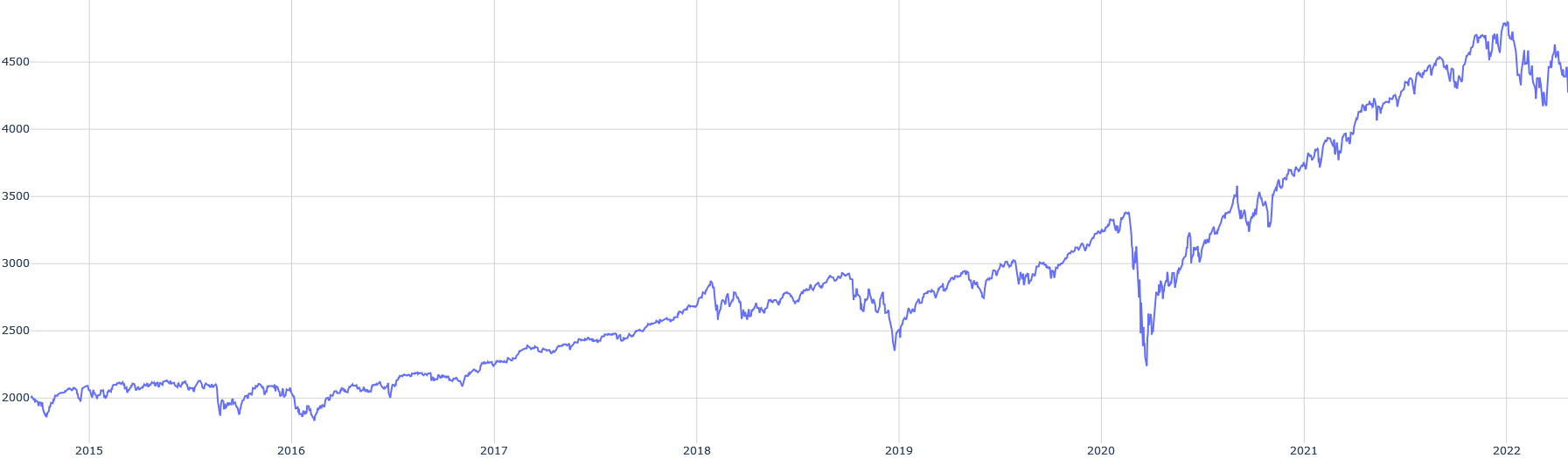
The image is a line chart displaying a time series of data from 2015 to 2022. The y-axis represents a numerical value ranging from approximately 2000 to 4500, while the x-axis represents time in years. The single blue line shows the trend of the data over time.
### Components/Axes
* **X-axis:** Years from 2015 to 2022.
* **Y-axis:** Numerical values ranging from 2000 to 4500, with increments of 500.
* **Data Series:** A single blue line representing the data.
### Detailed Analysis
* **2015:** The blue line starts at approximately 2000.
* **2016:** The line fluctuates around 2000, with a slight dip below 2000.
* **2017:** The line shows an upward trend, reaching approximately 2500.
* **2018:** The upward trend continues, reaching approximately 2800.
* **2019:** The line fluctuates around 3000, with a dip towards the end of the year.
* **2020:** A significant drop occurs in early 2020, reaching a low of approximately 2250, followed by a sharp recovery.
* **2021:** The line shows a strong upward trend, reaching approximately 4250.
* **2022:** The line fluctuates around 4500, with a slight downward trend towards the end of the year.
### Key Observations
* The data shows a general upward trend from 2015 to 2022, with a significant drop in early 2020.
* The most substantial growth occurs between 2020 and 2021.
* The data fluctuates significantly in 2022.
### Interpretation
The line chart likely represents a stock market index or similar financial data. The upward trend suggests growth over the period, while the drop in 2020 likely corresponds to a significant economic event, such as the COVID-19 pandemic. The fluctuations in 2022 could indicate market volatility or uncertainty.