\n
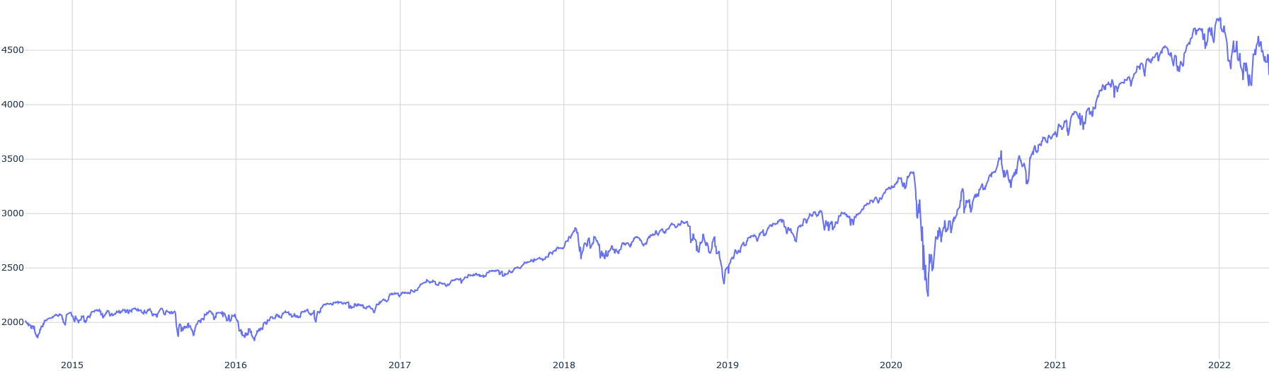
## Line Chart: Time Series Data
### Overview
The image presents a line chart depicting a time series. The chart shows a single data series fluctuating over time, with a clear upward trend overall. The x-axis represents time, spanning from 2015 to 2022, and the y-axis represents a numerical value, ranging from approximately 1800 to 4700.
### Components/Axes
* **X-axis:** Time, labeled with years from 2015 to 2022. The axis is evenly spaced.
* **Y-axis:** Numerical value, ranging from approximately 1800 to 4700. The axis is linearly scaled with gridlines.
* **Data Series:** A single blue line representing the time series data.
* **No Legend:** There is no explicit legend provided.
### Detailed Analysis
The data series begins around 2015 at approximately 2000. From 2015 to 2018, the line exhibits relatively stable fluctuations, generally trending upwards but with several dips and peaks.
* **2015:** Starts around 2000, fluctuates between approximately 1900 and 2200.
* **2016:** Fluctuates between approximately 1900 and 2300.
* **2017:** Shows a more consistent upward trend, reaching approximately 2500 by the end of the year.
* **2018:** Continues the upward trend, reaching approximately 2800.
* **2019:** Exhibits more volatility, fluctuating between approximately 2700 and 3100.
* **2020:** A significant drop occurs around the beginning of 2020, reaching a low of approximately 2400. The line then recovers sharply, reaching approximately 3500 by the end of the year.
* **2021:** A strong upward trend is observed, with the line increasing from approximately 3500 to 4000.
* **2022:** Continues the upward trend, reaching a peak of approximately 4700, followed by some fluctuations towards the end of the year. The line ends around 4500.
### Key Observations
* **Overall Trend:** The dominant trend is upward, indicating a general increase in the value represented by the y-axis over time.
* **Volatility:** The data exhibits volatility, particularly in 2019 and 2022.
* **Significant Drop in 2020:** The sharp drop in early 2020 is a notable anomaly, potentially indicating a significant event or disruption.
* **Rapid Recovery in 2020:** The subsequent rapid recovery in 2020 suggests resilience or a strong rebound effect.
### Interpretation
The chart likely represents the value of an asset, an index, or a key performance indicator (KPI) over time. The upward trend suggests growth or positive performance. The drop in 2020 could be attributed to a global event, such as the COVID-19 pandemic, which caused market disruptions. The rapid recovery indicates a strong response to the event. The volatility in 2019 and 2022 could be due to various factors, such as economic uncertainty, geopolitical events, or market speculation. Without further context, it is difficult to determine the exact nature of the data, but the chart clearly demonstrates a positive long-term trend with periods of volatility and a significant disruption in 2020.