## Line Chart: Time Series Data (2015–2022)
### Overview
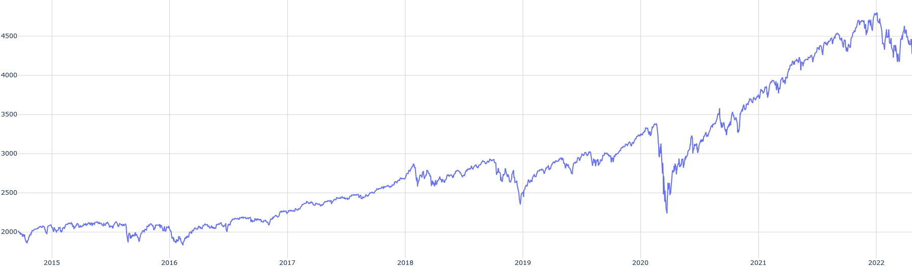
The image displays a single-series line chart plotting a numerical value over an eight-year period, from the beginning of 2015 to the beginning of 2022. The chart shows a general upward trend with significant volatility, including a major dip in early 2020 followed by a strong recovery and new highs.
### Components/Axes
* **Chart Type:** Single-line time series chart.
* **X-Axis (Horizontal):** Represents time in years. Major tick marks and labels are present for the start of each year: `2015`, `2016`, `2017`, `2018`, `2019`, `2020`, `2021`, `2022`. The axis spans from just before 2015 to just after the start of 2022.
* **Y-Axis (Vertical):** Represents a numerical value. Major tick marks and labels are present at intervals of 500: `2000`, `2500`, `3000`, `3500`, `4000`, `4500`. The axis scale appears linear.
* **Data Series:** A single, continuous blue line. There is no legend, title, or axis titles present in the image.
* **Grid:** A light gray grid is present, with vertical lines aligning with the year markers and horizontal lines aligning with the 500-unit value markers.
### Detailed Analysis
**Trend Verification & Data Point Extraction (Approximate):**
The blue line exhibits the following general trajectory:
1. **2015 - Early 2016:** The line starts near the 2000 level. It fluctuates in a relatively narrow range between approximately 1900 and 2100, showing no strong directional trend.
2. **Mid-2016 - Late 2019:** A sustained upward trend begins. The line climbs from ~2000 to a peak of approximately 3300-3400 in late 2019. This ascent is not smooth; it includes several notable pullbacks (e.g., dips to ~2500 in mid-2018 and ~2400 in late 2018/early 2019).
3. **Early 2020:** A sharp, severe decline occurs. The line plummets from its late-2019 high of ~3300 to a trough of approximately 2200-2300. This is the most dramatic single movement on the chart.
4. **Mid-2020 - Early 2022:** A strong and persistent recovery and uptrend follow the 2020 low. The line surpasses its previous 2019 high by mid-2020 and continues climbing, reaching new all-time highs. By the start of 2022, the value is near the 4500 level, with the peak appearing to be slightly above 4500.
5. **2022 Onward:** After the peak near 4500, the line shows increased volatility and a slight pullback, ending the visible data in early 2022 at a level between 4300 and 4500.
**Spatial Grounding:**
* The **lowest point** on the chart (the 2020 trough) is located in the lower-left quadrant, horizontally aligned with the "2020" label.
* The **highest point** (the early 2022 peak) is located in the upper-right quadrant, just to the right of the "2022" label.
* The most significant period of volatility (large swings up and down) is concentrated in the right half of the chart, from 2020 onward.
### Key Observations
1. **Secular Uptrend:** Despite major corrections, the primary trend over the entire period is upward, with the ending value (~4400) being more than double the starting value (~2000).
2. **The 2020 Anomaly:** The sharp V-shaped drop and recovery in 2020 is the most prominent feature. The speed of both the decline and the subsequent rebound is notable compared to the more gradual trends before and after.
3. **Increased Volatility Post-2020:** The magnitude of the price swings (both up and down) appears larger in the 2020-2022 period compared to the 2015-2019 period.
4. **Lack of Context:** The chart lacks a title, axis labels, or a legend. Therefore, it is impossible to know what specific metric (e.g., stock price, index value, sales figure) is being plotted or the units of measurement.
### Interpretation
This chart visually narrates a story of growth punctuated by a crisis. The data suggests an asset or metric that experienced steady, if volatile, growth for several years, was hit by a severe shock in early 2020 (the timing strongly correlates with the global COVID-19 market crash), and then entered a powerful new bull phase that took it to unprecedented levels.
The **Peircean investigative reading** would focus on the indexical sign of the 2020 dip pointing to a specific external event, and the symbolic sign of the overall uptrend representing underlying growth or inflation. The chart's meaning is entirely dependent on the missing context. If this were a stock index, it would depict a classic crash and recovery. If it were a commodity price, it might indicate supply chain disruptions and subsequent demand surge. The increased volatility post-2020 could indicate a regime change in the market or environment governing this data.
**Conclusion:** The image provides clear visual data on the *behavior* of an unknown variable over time, highlighting a major inflection point in 2020. To extract factual meaning, the chart must be labeled with its subject matter.