## Line Graph: Value Over Time (2015–2022)
### Overview
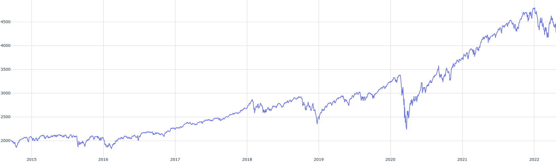
The image depicts a line graph illustrating a time series trend of a metric labeled "Value" from 2015 to 2022. The graph shows fluctuations with notable increases, decreases, and volatility over the period.
### Components/Axes
- **X-Axis (Horizontal)**: Labeled "Year," with markers at 2015, 2016, 2017, 2018, 2019, 2020, 2021, and 2022.
- **Y-Axis (Vertical)**: Labeled "Value," with increments of 500, ranging from 2000 to 4500.
- **Legend**: Located in the top-right corner, indicating the blue line represents "Value Over Time."
- **Gridlines**: Subtle gridlines divide the chart into 500-unit intervals for reference.
### Detailed Analysis
- **2015–2016**: The line begins at approximately **2000** in 2015, fluctuates slightly, and dips to ~1900 in 2016.
- **2017–2018**: A steady upward trend occurs, reaching ~2800 by 2018.
- **2019**: A sharp decline to ~2400 in mid-2019, followed by recovery to ~2800 by year-end.
- **2020**: A significant drop to ~2300 in early 2020, followed by a rebound to ~3200 by late 2020.
- **2021**: Consistent growth, peaking at ~4700 in 2022.
- **2022**: The line stabilizes around ~4500–4700, with minor fluctuations.
### Key Observations
1. **Initial Stability (2015–2016)**: Minimal change, hovering near 2000.
2. **Gradual Growth (2017–2018)**: Steady increase to ~2800.
3. **Volatility (2019–2020)**: Sharp dips and recoveries, suggesting external shocks (e.g., economic/pandemic impacts).
4. **Exponential Rise (2021–2022)**: Rapid growth from ~3200 to ~4700, indicating a potential structural shift.
### Interpretation
The data suggests a metric that remained stable until 2017, then grew gradually until disrupted by external factors in 2019–2020. The post-2020 surge implies a recovery or acceleration driven by policy changes, technological adoption, or market dynamics. The 2020 dip aligns with global events like the COVID-19 pandemic, while the 2021–2022 rebound may reflect stimulus measures or sector-specific growth.
**Uncertainties**:
- Exact values are approximate due to lack of gridline precision.
- The 2020 dip could represent a temporary anomaly or a systemic shift.
- The 2022 plateau may indicate saturation or ongoing growth depending on external factors.