\n
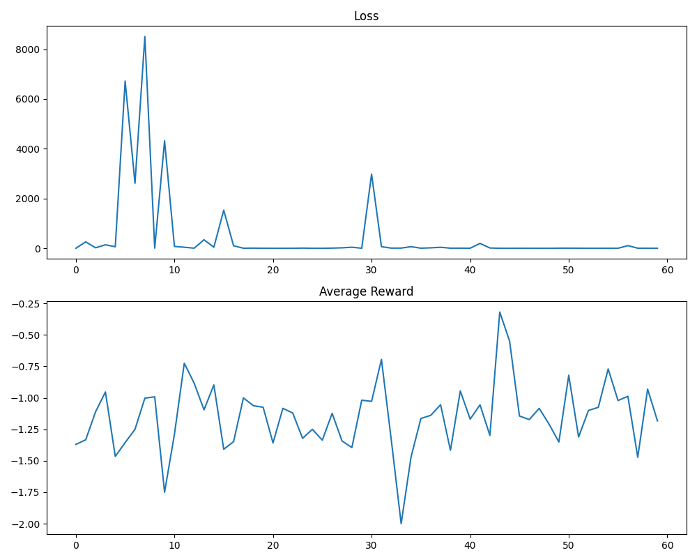
## Line Chart: Training Metrics - Loss and Average Reward
### Overview
The image presents two line charts stacked vertically. The top chart displays the 'Loss' metric over a range of approximately 0 to 60 units on the x-axis. The bottom chart shows the 'Average Reward' metric, also over a range of approximately 0 to 60 units on the x-axis. Both charts share the same x-axis scale.
### Components/Axes
* **Top Chart:**
* Title: "Loss" (centered at the top)
* X-axis: Unlabeled, representing training steps or iterations (range: 0 to 60)
* Y-axis: Unlabeled, representing Loss values (range: 0 to 8000)
* Data Series: A single blue line representing the Loss.
* **Bottom Chart:**
* Title: "Average Reward" (centered at the top)
* X-axis: Unlabeled, representing training steps or iterations (range: 0 to 60)
* Y-axis: Unlabeled, representing Average Reward values (range: -2.0 to -0.25)
* Data Series: A single blue line representing the Average Reward.
### Detailed Analysis or Content Details
* **Loss Chart:**
* The Loss line starts at approximately 8000 at x=0.
* It rapidly decreases to approximately 500 at x=5.
* There's a significant spike to approximately 8000 at x=8.
* The Loss then decreases again, reaching a minimum of approximately 0 at x=15.
* The Loss fluctuates between approximately 0 and 500 from x=15 to x=30.
* There's another spike to approximately 2000 at x=30.
* From x=30 to x=60, the Loss remains relatively stable, fluctuating around 100-300, and trending slightly downwards.
* **Average Reward Chart:**
* The Average Reward line starts at approximately -1.0 at x=0.
* It fluctuates between approximately -1.0 and -1.5 from x=0 to x=10.
* There's a dip to approximately -1.75 at x=12.
* The Average Reward increases to approximately -0.75 at x=30.
* There's a spike to approximately -0.25 at x=40.
* From x=40 to x=60, the Average Reward fluctuates between approximately -0.75 and -1.25, with a generally downward trend.
### Key Observations
* The Loss and Average Reward appear to be inversely correlated. When the Loss is high, the Average Reward is low, and vice versa.
* The Loss exhibits several large spikes, indicating potential instability or significant updates during training.
* The Average Reward shows a general trend of improvement, but with considerable fluctuations.
* Both metrics appear to stabilize after approximately x=40.
### Interpretation
The charts likely represent the training progress of a reinforcement learning agent or a similar machine learning model. The Loss chart indicates how well the model is learning to predict or approximate the desired output. The Average Reward chart shows the performance of the agent in its environment.
The initial high Loss and low Average Reward suggest the agent is initially performing poorly. As training progresses, the Loss decreases and the Average Reward increases, indicating learning. The spikes in Loss could be caused by significant changes in the model's parameters or by encountering challenging scenarios in the environment. The stabilization of both metrics after x=40 suggests that the training process is converging, and the agent is reaching a stable level of performance.
The inverse correlation between Loss and Average Reward is expected, as a lower Loss generally corresponds to a higher reward. The fluctuations in both metrics indicate that the training process is not perfectly smooth and that the agent is still exploring and adapting to its environment. The overall trend suggests that the agent is learning and improving over time.