## Chart Type: Line Graphs of Rates in Spain by Age Group
### Overview
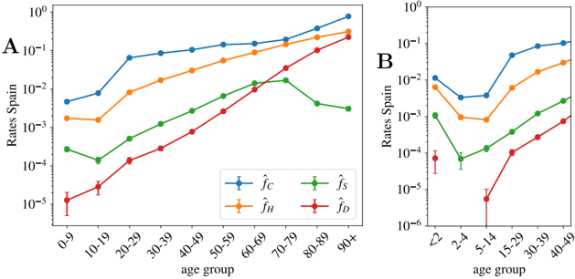
The image contains two line graphs, labeled A and B, displaying rates in Spain across different age groups. Both graphs share a logarithmic y-axis representing "Rates Spain" and an x-axis representing "age group." The graphs show four different rates, distinguished by color and labeled in a shared legend: blue (f_C), orange (f_H), green (f_S), and red (f_D). Graph A covers a broader age range, while Graph B focuses on younger age groups.
### Components/Axes
**Graph A:**
* **Title:** Implicit, but represents rates across a broader age range.
* **X-axis:** "age group" with categories: 0-9, 10-19, 20-29, 30-39, 40-49, 50-59, 60-69, 70-79, 80-89, 90+
* **Y-axis:** "Rates Spain" on a logarithmic scale from 10^-5 to 10^0.
* **Legend:** Located at the bottom-center of the combined image.
* Blue: f_C
* Orange: f_H
* Green: f_S
* Red: f_D
**Graph B:**
* **Title:** Implicit, but represents rates for younger age groups.
* **X-axis:** "age group" with categories: <2, 2-4, 5-14, 15-29, 30-39, 40-49
* **Y-axis:** "Rates Spain" on a logarithmic scale from 10^-6 to 10^0.
* **Legend:** Shared with Graph A, located at the bottom-center of the combined image.
### Detailed Analysis
**Graph A:**
* **Blue (f_C):** Starts at approximately 2e-2 for the 0-9 age group, increases to approximately 8e-2 for the 20-29 age group, and then plateaus around 1e-1 for older age groups.
* **Orange (f_H):** Starts at approximately 2e-3 for the 0-9 age group, increases to approximately 3e-2 for the 30-39 age group, and then plateaus around 5e-2 for older age groups.
* **Green (f_S):** Starts at approximately 3e-4 for the 0-9 age group, increases steadily to approximately 8e-3 for the 60-69 age group, and then decreases slightly to approximately 5e-3 for the 90+ age group.
* **Red (f_D):** Starts at approximately 1e-5 for the 0-9 age group, increases steadily to approximately 5e-2 for the 90+ age group.
**Graph B:**
* **Blue (f_C):** Starts at approximately 1.5e-2 for the <2 age group, decreases to approximately 5e-3 for the 2-4 age group, and then increases to approximately 8e-2 for the 40-49 age group.
* **Orange (f_H):** Starts at approximately 5e-3 for the <2 age group, decreases to approximately 8e-4 for the 2-4 age group, and then increases to approximately 2e-2 for the 40-49 age group.
* **Green (f_S):** Starts at approximately 1e-3 for the <2 age group, decreases to approximately 1e-4 for the 2-4 age group, and then increases to approximately 3e-3 for the 40-49 age group.
* **Red (f_D):** Starts at approximately 8e-5 for the <2 age group, decreases significantly for the 2-4 age group, and then increases to approximately 1e-3 for the 40-49 age group.
### Key Observations
* **Graph A:** The rates f_C and f_H are generally higher than f_S and f_D across all age groups. f_D shows the most significant increase with age.
* **Graph B:** All rates show a decrease from the <2 age group to the 2-4 age group, followed by an increase for older age groups. The rate f_D shows the most dramatic increase from the 5-14 age group onwards.
* The y-axis is logarithmic, meaning equal distances represent multiplicative changes, not additive.
### Interpretation
The graphs illustrate how different rates (f_C, f_H, f_S, f_D) vary across age groups in Spain. The logarithmic scale highlights the relative changes in rates. The data suggests that f_C and f_H are more prevalent across all age groups compared to f_S and f_D. The increasing trend of f_D with age in both graphs suggests a strong age-related factor influencing this rate. The initial decrease in rates for the youngest age groups (Graph B) could indicate a different dynamic or protective factor in early childhood. The specific meaning of f_C, f_H, f_S, and f_D is not provided, but the data suggests they represent distinct phenomena with different age-related patterns.