\n
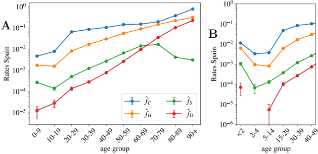
## Line Chart: Age-Specific Rates in Spain
### Overview
The image presents two line charts (labeled A and B) displaying age-specific rates in Spain. Both charts share a logarithmic y-axis ("Rates Spain") and an x-axis representing age groups. The charts depict four different rate types, distinguished by color and legend labels. Chart A covers age groups 0-90+, while Chart B focuses on younger age groups 2-49. Error bars are present in Chart B.
### Components/Axes
* **Chart A:**
* **X-axis:** Age Group (0-9, 10-19, 20-29, 30-39, 40-49, 50-59, 60-69, 70-79, 80-89, 90+)
* **Y-axis:** Rates Spain (logarithmic scale, ranging approximately from 10^-5 to 10^-1)
* **Legend:**
* `f_c` (Blue line with cross markers)
* `f_s` (Green line with cross markers)
* `f_h` (Orange line with cross markers)
* `f_D` (Red line with cross markers)
* **Chart B:**
* **X-axis:** Age Group (2-4, 5-14, 15-29, 30-39, 40-49)
* **Y-axis:** Rates Spain (logarithmic scale, ranging approximately from 10^-6 to 10^-1)
* **Legend:** (Same as Chart A)
* `f_c` (Blue line with cross markers)
* `f_s` (Green line with cross markers)
* `f_h` (Orange line with cross markers)
* `f_D` (Red line with cross markers)
### Detailed Analysis or Content Details
**Chart A:**
* **`f_c` (Blue):** Starts at approximately 1.5 x 10^-2, increases to a peak of approximately 3.5 x 10^-2 around age 80-89, and then slightly decreases to approximately 3.0 x 10^-2 at 90+. The line generally slopes upward.
* **`f_s` (Green):** Starts at approximately 1.0 x 10^-3, increases to a peak of approximately 2.5 x 10^-3 around age 20-29, then decreases to approximately 1.5 x 10^-3 at 90+. The line shows an initial increase followed by a decline.
* **`f_h` (Orange):** Starts at approximately 2.0 x 10^-3, increases steadily to approximately 2.0 x 10^-2 around age 70-79, and then plateaus. The line slopes upward.
* **`f_D` (Red):** Starts at approximately 1.0 x 10^-5, increases steadily and significantly to approximately 1.0 x 10^-2 at 90+. The line shows a strong upward trend.
**Chart B:**
* **`f_c` (Blue):** Starts at approximately 2.0 x 10^-2, decreases to approximately 5.0 x 10^-3 at age 2-4, increases to approximately 1.0 x 10^-1 at age 15-29, and then plateaus. The line shows a decrease followed by a strong increase.
* **`f_s` (Green):** Starts at approximately 1.0 x 10^-4, increases to approximately 2.0 x 10^-3 at age 40-49. The line slopes upward.
* **`f_h` (Orange):** Starts at approximately 5.0 x 10^-4, increases to approximately 2.0 x 10^-2 at age 40-49. The line slopes upward.
* **`f_D` (Red):** Starts at approximately 1.0 x 10^-5, increases to approximately 1.0 x 10^-4 at age 2-4, then increases significantly to approximately 1.0 x 10^-2 at age 40-49. The line shows a strong upward trend. Error bars are visible for each data point, indicating variability.
### Key Observations
* In both charts, `f_D` (red line) consistently shows the lowest rates at younger ages but exhibits the most substantial increase with age.
* `f_c` (blue line) generally has the highest rates, particularly in Chart A for older age groups.
* Chart B shows more variability in the rates for younger age groups, as indicated by the error bars.
* The logarithmic scale compresses the differences in rates, making it easier to visualize trends across a wide range of values.
### Interpretation
The charts likely represent age-specific incidence or prevalence rates of a disease or condition in Spain. The different rate types (`f_c`, `f_s`, `f_h`, `f_D`) could represent different subtypes, risk factors, or diagnostic criteria.
The increasing rates with age observed for all rate types suggest that the condition becomes more common as individuals get older. The particularly steep increase in `f_D` with age suggests that this subtype or risk factor is strongly associated with aging.
The differences between the rate types indicate that certain factors or subtypes are more prevalent than others. The error bars in Chart B suggest that the rates for younger age groups are more variable, potentially due to smaller sample sizes or greater individual variability.
The two charts together provide a comprehensive view of the age-specific rates, allowing for a detailed analysis of the condition's epidemiology in Spain. The use of a logarithmic scale is crucial for visualizing the data effectively, as it allows for the display of both low and high rates on the same scale.