\n
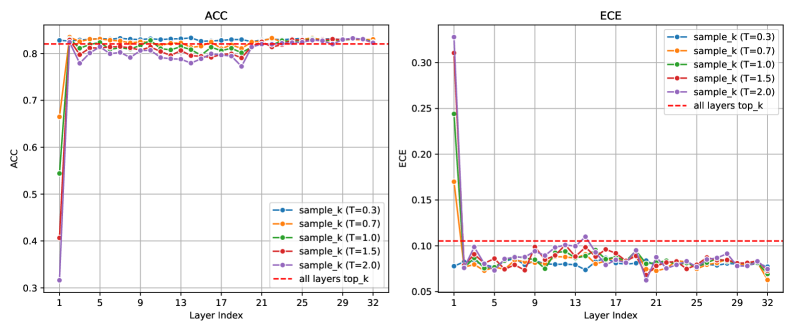
## Line Charts: Layer-wise Accuracy (ACC) and Expected Calibration Error (ECE)
### Overview
The image contains two side-by-side line charts comparing the performance of a model across its layers using different sampling strategies. The left chart plots Accuracy (ACC) against Layer Index, and the right chart plots Expected Calibration Error (ECE) against the same Layer Index. Both charts evaluate five variants of a `sample_k` method with different temperature parameters (`T`) and compare them to a baseline `all layers top_k` method.
### Components/Axes
**Common Elements:**
* **X-Axis (Both Charts):** Labeled "Layer Index". The scale runs from 1 to 32, with major tick marks at intervals of 4 (1, 5, 9, 13, 17, 21, 25, 29, 32).
* **Legend (Both Charts):** Located in the top-right corner of each plot area. It contains six entries:
1. `sample_k (T=0.3)`: Blue line with circle markers.
2. `sample_k (T=0.7)`: Orange line with circle markers.
3. `sample_k (T=1.0)`: Green line with circle markers.
4. `sample_k (T=1.5)`: Red line with circle markers.
5. `sample_k (T=2.0)`: Purple line with circle markers.
6. `all layers top_k`: Red dashed line without markers.
**Left Chart - ACC:**
* **Title:** "ACC"
* **Y-Axis:** Labeled "ACC". The scale runs from 0.3 to 0.8, with major tick marks at 0.1 intervals (0.3, 0.4, 0.5, 0.6, 0.7, 0.8).
**Right Chart - ECE:**
* **Title:** "ECE"
* **Y-Axis:** Labeled "ECE". The scale runs from 0.05 to 0.30, with major tick marks at 0.05 intervals (0.05, 0.10, 0.15, 0.20, 0.25, 0.30).
### Detailed Analysis
**ACC Chart (Left):**
* **Trend Verification:** All five `sample_k` lines show a similar, sharp upward trend from Layer 1 to Layer 2, followed by a plateau with minor fluctuations for the remaining layers (3-32). The lines are tightly clustered in the plateau region.
* **Data Points (Approximate):**
* **Layer 1:** Values are low and spread out. From lowest to highest: Purple (`T=2.0`) ~0.32, Red (`T=1.5`) ~0.40, Green (`T=1.0`) ~0.55, Orange (`T=0.7`) ~0.67, Blue (`T=0.3`) ~0.82.
* **Layer 2:** All lines jump significantly. They converge into a narrow band between approximately 0.78 and 0.83.
* **Layers 3-32:** All `sample_k` lines fluctuate within a tight range, roughly between 0.78 and 0.84. No single temperature variant consistently outperforms the others across all layers.
* **Baseline (`all layers top_k`):** The red dashed line is horizontal at approximately ACC = 0.82. Most `sample_k` variants hover around or slightly below this baseline after Layer 2.
**ECE Chart (Right):**
* **Trend Verification:** All five `sample_k` lines show a sharp downward trend from Layer 1 to Layer 2, followed by a relatively stable, low-value plateau with minor fluctuations for layers 3-32.
* **Data Points (Approximate):**
* **Layer 1:** Values are high and spread out. From lowest to highest: Blue (`T=0.3`) ~0.08, Orange (`T=0.7`) ~0.17, Green (`T=1.0`) ~0.25, Red (`T=1.5`) ~0.31, Purple (`T=2.0`) ~0.33.
* **Layer 2:** All lines drop dramatically. They converge into a band between approximately 0.07 and 0.10.
* **Layers 3-32:** All `sample_k` lines fluctuate in a low range, roughly between 0.06 and 0.11. The lines are interwoven, with no clear, consistent ordering by temperature.
* **Baseline (`all layers top_k`):** The red dashed line is horizontal at approximately ECE = 0.105. The `sample_k` variants generally achieve similar or slightly better (lower) calibration error than this baseline after the initial layers.
### Key Observations
1. **Critical First Layer:** The most significant change in both metrics occurs between Layer 1 and Layer 2. Layer 1 performance is highly sensitive to the temperature parameter `T`, with lower `T` yielding much higher accuracy and lower calibration error initially.
2. **Rapid Convergence:** After the dramatic shift at Layer 2, the performance of all `sample_k` variants becomes very similar and stable for the remaining 30 layers. The choice of temperature `T` has minimal impact on the final, layer-wise performance plateau.
3. **Baseline Comparison:** The `sample_k` methods, after the first layer, achieve accuracy comparable to the `all layers top_k` baseline and often achieve slightly better (lower) calibration error.
4. **Inverse Relationship at Start:** At Layer 1, there is a clear inverse relationship: lower temperature (`T`) leads to higher ACC and lower ECE. This relationship dissolves after Layer 1.
### Interpretation
These charts demonstrate the layer-wise dynamics of a model using a sampling-based inference or training technique. The data suggests that:
* **Early Layer Sensitivity:** The initial processing layer (Layer 1) is critically important and its behavior is heavily influenced by the temperature parameter of the sampling function. A lower temperature (more deterministic sampling) leads to much better initial accuracy and calibration.
* **Robustness of Later Layers:** The model's performance becomes robust to the sampling temperature after the first transformation. This implies that the core representational power is built in the subsequent layers, which can function effectively regardless of the specific sampling variance introduced at the start.
* **Efficiency of Sampling:** The `sample_k` method appears to be an effective strategy. It matches the accuracy of the `all layers top_k` baseline while potentially offering computational benefits (implied by the "sample" terminology). Its calibration error is also competitive or superior.
* **Practical Implication:** For someone implementing this method, the choice of temperature `T` is crucial for the very first layer's output but can be relaxed for later layers. The system self-corrects or normalizes quickly. The optimal strategy might involve using a low `T` for the first layer and a higher, less computationally expensive `T` for subsequent layers, though this specific experiment does not test that hybrid approach.
**Language:** All text in the image is in English.