\n
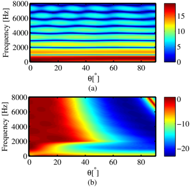
## Heatmap: Frequency vs. Angle
### Overview
The image presents two heatmaps, labeled (a) and (b), displaying a relationship between frequency (in Hertz) and angle (in degrees). Both heatmaps share the same axes scales, but differ in the color scale and the distribution of values. The heatmaps appear to represent some form of spectral analysis or signal processing data.
### Components/Axes
* **X-axis:** θ [°] (Angle in degrees), ranging from 0 to 90.
* **Y-axis:** Frequency [Hz] (Frequency in Hertz), ranging from 0 to 8000.
* **Heatmap (a):** Color scale ranges from 0 to 15, with blue representing lower values and red representing higher values.
* **Heatmap (b):** Color scale ranges from -20 to 0, with blue representing higher values and red representing lower values.
* **Labels:** "(a)" and "(b)" identify the two heatmaps.
### Detailed Analysis or Content Details
**Heatmap (a):**
The heatmap shows roughly horizontal bands of color, indicating that the value is relatively constant for a given frequency but changes with angle.
* **0-1000 Hz:** Values are consistently low, around 0-2, appearing as dark blue.
* **1000-3000 Hz:** Values increase to approximately 5-8, appearing as yellow-green.
* **3000-6000 Hz:** Values are around 8-12, appearing as yellow-orange.
* **6000-8000 Hz:** Values are around 12-15, appearing as orange-red.
* There are slight variations in color intensity within each band, suggesting some angle-dependent fluctuations.
**Heatmap (b):**
This heatmap exhibits a more complex pattern. The color distribution is not banded like in (a).
* **0-20°:** Values are highly negative, around -15 to -20, appearing as dark red.
* **20-50°:** Values increase rapidly, transitioning from dark red to blue, reaching approximately 0 at around 50°.
* **50-80°:** Values remain around 0, with some fluctuations.
* **80-90°:** Values decrease again, becoming slightly negative, appearing as light red.
* There is a clear diagonal trend, with negative values at low angles and positive values at higher angles.
### Key Observations
* Heatmap (a) shows a frequency-dependent value that is relatively independent of the angle.
* Heatmap (b) shows a strong angle-dependent value, with a clear transition from negative to positive values as the angle increases.
* The color scales are different, indicating that the two heatmaps represent different quantities or have been normalized differently.
* The patterns in both heatmaps are smooth and continuous, suggesting that the underlying data is well-behaved.
### Interpretation
The two heatmaps likely represent different aspects of the same phenomenon. Heatmap (a) could represent the magnitude of a signal at different frequencies and angles, while heatmap (b) could represent the phase or some other property of the signal. The strong angle dependence in heatmap (b) suggests that the signal is sensitive to the angle of incidence or observation.
The transition from negative to positive values in heatmap (b) could indicate a change in the sign of the signal or a resonance effect. The specific meaning of the data would depend on the context of the experiment or simulation from which it was obtained.
The difference in color scales suggests that the two quantities are measured in different units or have different ranges. It is possible that one quantity is a logarithmic scale, while the other is a linear scale.
Without further information about the experiment or simulation, it is difficult to draw more specific conclusions about the data. However, the heatmaps provide valuable insights into the relationship between frequency, angle, and the measured quantity.