## Heatmaps: Frequency vs. Angle Analysis
### Overview
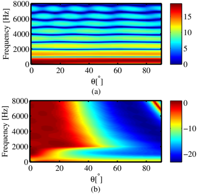
The image contains two heatmaps (a) and (b) comparing frequency (y-axis, Hz) and angle θ (x-axis, degrees). Both use color gradients to represent measured values, with distinct color scales and spatial distributions.
---
### Components/Axes
- **X-axis (θ[°])**: Angle in degrees, ranging from 0° to 80°.
- **Y-axis (Frequency [Hz])**: Frequency in Hz, ranging from 0 Hz to 8000 Hz.
- **Heatmap (a)**:
- Color scale: 0 (blue) to 15 (red).
- Legend: Right-aligned, vertical gradient from blue to red.
- **Heatmap (b)**:
- Color scale: -20 (blue) to 0 (red).
- Legend: Right-aligned, vertical gradient from blue to red.
---
### Detailed Analysis
#### Heatmap (a)
- **Structure**: Horizontal bands of color, indicating uniform values across angles for specific frequency ranges.
- **Key Trends**:
- **0–2000 Hz**: Predominantly blue (values ~0–5), suggesting low measured values.
- **2000–4000 Hz**: Yellow-orange bands (~5–10), indicating moderate values.
- **4000–8000 Hz**: Red bands (~10–15), representing the highest values.
- **Spatial Grounding**: Red bands are concentrated at the top (high frequencies), while blue dominates the lower frequencies.
#### Heatmap (b)
- **Structure**: Diagonal gradient from red (top-left) to blue (bottom-right), with a sharp boundary at ~4000 Hz.
- **Key Trends**:
- **0–4000 Hz**: Red-to-yellow gradient (~0 to -10), indicating higher values (closer to 0).
- **4000–8000 Hz**: Blue-to-cyan gradient (~-10 to -20), showing a sharp decline in values.
- **Spatial Grounding**: Red regions dominate the lower-left (low frequencies), while blue regions occupy the upper-right (high frequencies).
---
### Key Observations
1. **Heatmap (a)** exhibits **frequency-dependent uniformity**, with distinct horizontal bands suggesting consistent values across angles for specific frequency ranges.
2. **Heatmap (b)** shows a **frequency-dependent gradient**, with a critical transition at ~4000 Hz where values drop sharply.
3. **Color Consistency**: Red in both heatmaps represents the highest values (15 in (a), 0 in (b)), while blue represents the lowest (0 in (a), -20 in (b)).
---
### Interpretation
- **Heatmap (a)** likely represents a parameter (e.g., signal strength, gain) that remains constant across angles but varies with frequency. The horizontal bands suggest discrete frequency bins with stable measurements.
- **Heatmap (b)** indicates a **frequency-dependent attenuation or loss**, where values decrease significantly above 4000 Hz. The diagonal boundary may represent a cutoff frequency or a material property change (e.g., dielectric loss tangent).
- **Technical Implications**:
- Heatmap (a) could model idealized system behavior (e.g., antenna gain), while (b) might reflect real-world losses (e.g., cable attenuation).
- The sharp transition in (b) at 4000 Hz suggests a physical threshold, such as the onset of dispersion or material resonance.
---
### Limitations
- Exact numerical values are inferred from color scales; precise measurements require calibration data.
- No explicit units or context (e.g., dB, linear scale) are provided for the color gradients.