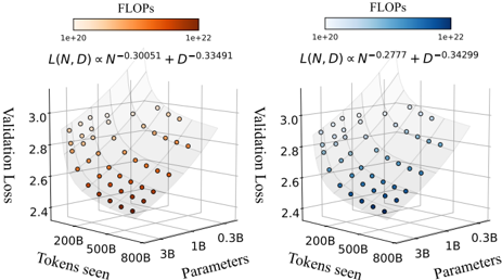
## 3D Scatter Plot: Validation Loss vs. Tokens Seen & Parameters
### Overview
The image presents two 3D scatter plots visualizing the relationship between Validation Loss, Tokens Seen, and Parameters. Each plot is colored according to FLOPs (Floating Point Operations per second). The plots are side-by-side for comparison. Each plot also includes a formula relating Validation Loss (L) to Tokens Seen (N) and Parameters (D).
### Components/Axes
* **X-axis:** Tokens Seen (ranging from approximately 200B to 800B, then to 1B and 0.3B).
* **Y-axis:** Parameters (ranging from approximately 200B to 800B, then to 1B and 0.3B).
* **Z-axis:** Validation Loss (ranging from approximately 2.4 to 3.1).
* **Color Scale (Legend):** FLOPs, ranging from 1e+20 (light color) to 1e+22 (dark color).
* Left Plot: Red to Orange gradient.
* Right Plot: Blue to Cyan gradient.
* **Formula (Top of each plot):**
* Left Plot: L(N, D) α N<sup>-0.30051</sup> + D<sup>-0.33491</sup>
* Right Plot: L(N, D) α N<sup>-0.2777</sup> + D<sup>-0.34299</sup>
* **Data Points:** Scatter points representing individual data instances.
### Detailed Analysis or Content Details
**Left Plot (Red/Orange):**
* The data points generally cluster in the region where Tokens Seen are between 200B and 800B, and Parameters are between 200B and 800B.
* The Validation Loss values are concentrated between approximately 2.6 and 3.0.
* The color gradient indicates that lower Validation Loss values (around 2.4-2.6) correspond to darker orange/red colors, suggesting higher FLOPs.
* The data points show a general trend of decreasing Validation Loss as both Tokens Seen and Parameters increase, but with significant scatter.
* Approximate data points (Validation Loss, Tokens Seen, Parameters):
* (2.45, 200B, 200B) - Dark Orange
* (2.55, 500B, 500B) - Orange
* (2.7, 800B, 800B) - Light Orange
* (2.9, 1B, 1B) - Light Orange
* (3.0, 0.3B, 0.3B) - Light Orange
**Right Plot (Blue/Cyan):**
* The data points are similarly clustered in the region where Tokens Seen are between 200B and 800B, and Parameters are between 200B and 800B.
* The Validation Loss values are concentrated between approximately 2.6 and 3.0.
* The color gradient indicates that lower Validation Loss values (around 2.4-2.6) correspond to darker blue/cyan colors, suggesting higher FLOPs.
* The data points show a general trend of decreasing Validation Loss as both Tokens Seen and Parameters increase, but with significant scatter.
* Approximate data points (Validation Loss, Tokens Seen, Parameters):
* (2.4, 200B, 200B) - Dark Cyan
* (2.5, 500B, 500B) - Cyan
* (2.75, 800B, 800B) - Light Cyan
* (2.95, 1B, 1B) - Light Cyan
* (3.05, 0.3B, 0.3B) - Light Cyan
### Key Observations
* Both plots exhibit a similar overall distribution of data points.
* The right plot (blue/cyan) generally shows slightly lower Validation Loss values compared to the left plot (red/orange) for similar values of Tokens Seen and Parameters.
* The FLOPs color scale suggests a correlation between lower Validation Loss and higher FLOPs in both plots.
* The formulas at the top of each plot indicate a power-law relationship between Validation Loss and both Tokens Seen and Parameters, with different exponents for each plot.
### Interpretation
The plots demonstrate the impact of model size (Parameters) and training data (Tokens Seen) on Validation Loss. The decreasing trend of Validation Loss with increasing Parameters and Tokens Seen suggests that larger models trained on more data generally perform better. The FLOPs color scale indicates that achieving lower Validation Loss often requires more computational resources.
The different exponents in the formulas for the two plots suggest that the relationship between Validation Loss and model size/training data may vary depending on the specific model or dataset. The right plot's formula suggests a slightly weaker dependence on Tokens Seen but a similar dependence on Parameters compared to the left plot.
The scatter in the data points indicates that other factors besides model size and training data also influence Validation Loss. These factors could include model architecture, optimization algorithms, and data quality. The plots provide a valuable visual representation of the trade-offs between model performance, computational cost, and data requirements in machine learning.