## Scatter Plot: Risk or Safety
### Overview
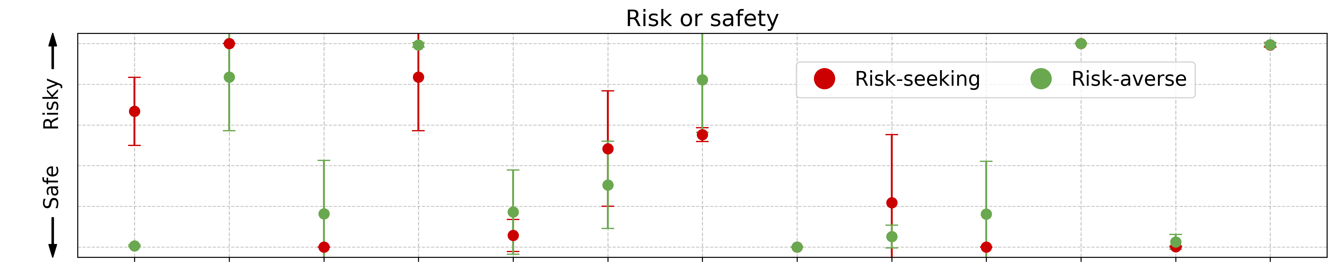
The image presents a scatter plot visualizing the relationship between risk and safety, comparing "Risk-seeking" and "Risk-averse" behaviors. The x-axis represents an unspecified variable related to risk or safety, while the y-axis indicates the level of riskiness, ranging from "Safe" to "Risky". Data points are represented as colored circles with vertical error bars.
### Components/Axes
* **Title:** "Risk or safety" - positioned at the top-center of the chart.
* **X-axis:** Labeled "Risk or safety" - no specific units or scale markings are visible.
* **Y-axis:** Labeled "Risky" at the top and "Safe" at the bottom, indicating a qualitative scale.
* **Legend:** Located in the top-right corner, with two entries:
* Red circle: "Risk-seeking"
* Green circle: "Risk-averse"
* **Data Points:** Scatter points with error bars, representing the data for each category.
### Detailed Analysis
The chart contains multiple data points for both "Risk-seeking" (red) and "Risk-averse" (green) categories. Each data point has a vertical error bar indicating the variability or uncertainty around the central value.
**Risk-Seeking (Red):**
The red data points are scattered across the plot, generally trending towards the "Risky" side of the y-axis.
* Point 1: Approximately x=1, y=Risky, error bar extends from approximately y=Safe to y=Risky.
* Point 2: Approximately x=2, y=Risky, error bar extends from approximately y=Safe to y=Risky.
* Point 3: Approximately x=3, y=slightly below the midpoint, error bar extends from approximately y=Safe to y=Risky.
* Point 4: Approximately x=4, y=slightly below the midpoint, error bar extends from approximately y=Safe to y=Risky.
* Point 5: Approximately x=5, y=Risky, error bar extends from approximately y=Safe to y=Risky.
**Risk-Averse (Green):**
The green data points are also scattered, but generally trend towards the "Safe" side of the y-axis.
* Point 1: Approximately x=1, y=Safe, error bar extends from approximately y=Safe to y=slightly above the midpoint.
* Point 2: Approximately x=2, y=Safe, error bar extends from approximately y=Safe to y=slightly above the midpoint.
* Point 3: Approximately x=3, y=slightly above the midpoint, error bar extends from approximately y=Safe to y=slightly above the midpoint.
* Point 4: Approximately x=4, y=Safe, error bar extends from approximately y=Safe to y=slightly above the midpoint.
* Point 5: Approximately x=5, y=Safe, error bar extends from approximately y=Safe to y=slightly above the midpoint.
### Key Observations
* The "Risk-seeking" data points are predominantly located in the upper portion of the chart (Risky), while the "Risk-averse" data points are predominantly in the lower portion (Safe).
* There is considerable overlap in the error bars between the two categories, suggesting that the difference between risk-seeking and risk-averse behavior is not always clear-cut.
* The x-axis variable is not defined, making it difficult to interpret the relationship between risk/safety and this unknown factor.
* The error bars are consistently large, indicating substantial variability within each category.
### Interpretation
The data suggests a general tendency for individuals identified as "Risk-seeking" to exhibit behaviors considered "Risky," and vice versa for "Risk-averse" individuals. However, the significant overlap in error bars indicates that this is not a strict categorization, and there is considerable individual variation. The lack of a defined x-axis variable limits the ability to draw more specific conclusions about the factors influencing risk preference. The chart could be illustrating the results of a psychological study or a behavioral experiment, where participants were assessed for their risk tolerance and then observed in a specific context. The large error bars suggest that other factors, not accounted for in this visualization, may also play a role in determining risk-related behaviors. The chart demonstrates a correlation, but does not imply causation.