\n
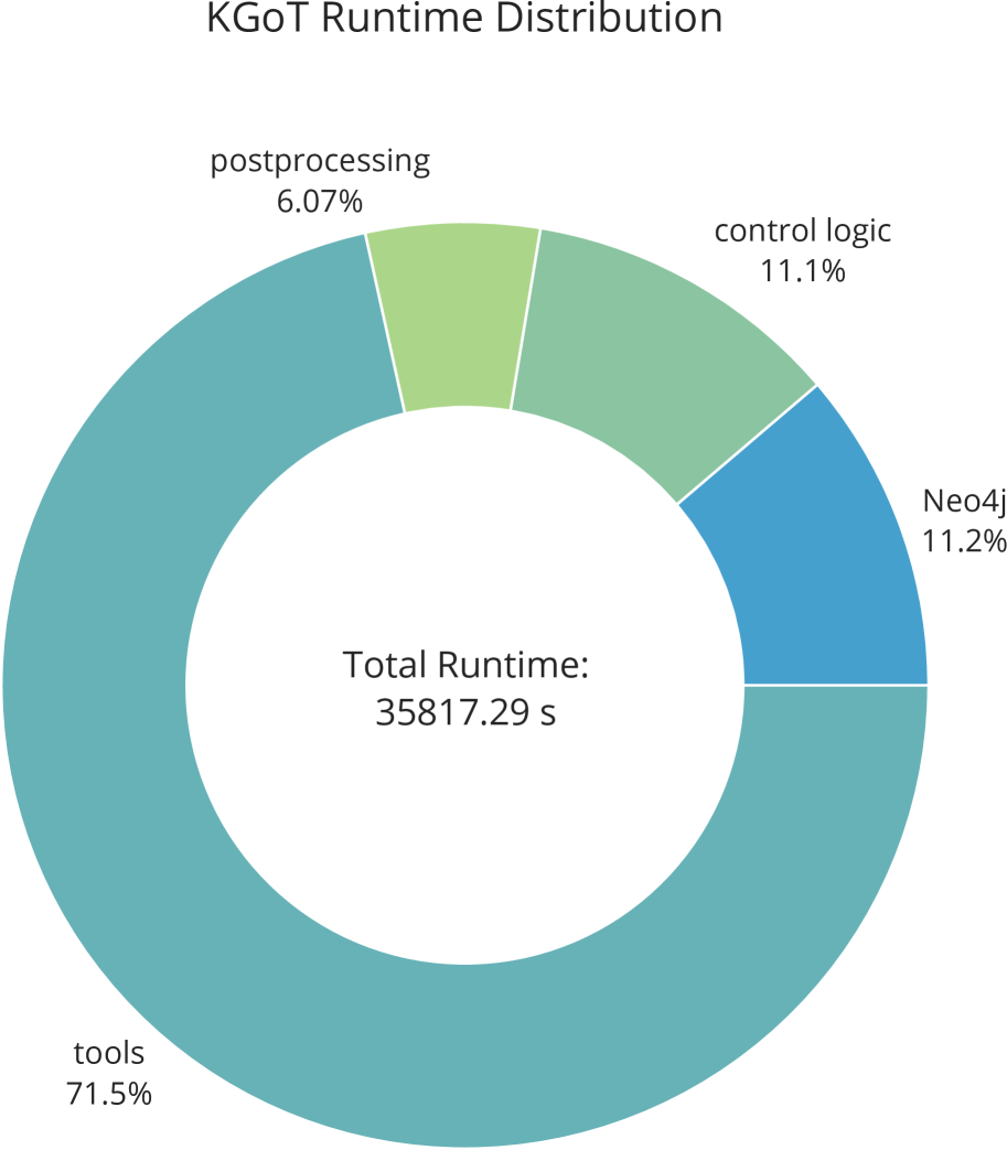
## Donut Chart: KGoT Runtime Distribution
### Overview
This image presents a donut chart illustrating the distribution of runtime for different components within a system called KGoT. The chart displays the percentage of total runtime allocated to each component, along with the total runtime in seconds.
### Components/Axes
* **Title:** KGoT Runtime Distribution
* **Center Text:** Total Runtime: 35817.29 s
* **Legend:** Located around the donut chart, with labels and corresponding colors:
* tools: Light Blue
* Neo4j: Teal
* control logic: Light Green
* postprocessing: Pale Green
* **Categories:** tools, Neo4j, control logic, postprocessing.
### Detailed Analysis
The donut chart segments represent the runtime contribution of each component. The percentages are as follows:
* **tools:** 71.5% - Represented by a large light blue segment, occupying the majority of the donut.
* **Neo4j:** 11.2% - Represented by a teal segment.
* **control logic:** 11.1% - Represented by a light green segment.
* **postprocessing:** 6.07% - Represented by a pale green segment, the smallest segment in the chart.
The total runtime is stated as 35817.29 seconds.
### Key Observations
* The "tools" component dominates the runtime, consuming approximately 71.5% of the total time.
* The "Neo4j" and "control logic" components contribute roughly the same amount to the runtime, around 11% each.
* "postprocessing" has the smallest runtime contribution, at just over 6%.
### Interpretation
The chart indicates that the "tools" component is the primary performance bottleneck in the KGoT system. Optimizing this component would likely yield the most significant performance improvements. The relatively small runtime contribution of "postprocessing" suggests that optimizing this component would have a limited impact on overall performance. The similar contributions of "Neo4j" and "control logic" suggest that improvements in either of these areas could provide moderate performance gains. The total runtime of approximately 35817 seconds provides a baseline for measuring the impact of any optimizations. The chart effectively visualizes where the system spends its time, allowing for targeted performance analysis and improvement efforts.