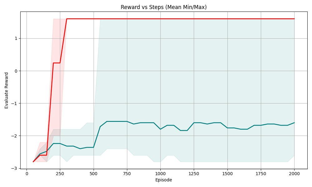
## Line Chart: Reward vs Episode (Mean Min/Max)
### Overview
This is a line chart plotting **Evaluate Reward** (y-axis) against **Episode** (x-axis), showing two distinct data series with their respective minimum/maximum ranges (shaded regions). The chart tracks reward performance over 2000 episodes, with one series achieving a high, stable positive reward and the other remaining in negative reward territory.
### Components/Axes
- **X-axis**: Labeled "Episode", linear scale from 0 to 2000, with major ticks at 0, 250, 500, 750, 1000, 1250, 1500, 1750, 2000.
- **Y-axis**: Labeled "Evaluate Reward", linear scale from -3 to 1, with major ticks at -3, -2, -1, 0, 1.
- **Data Series**:
- **Red Line (with light red shaded range)**: Represents a high-reward series.
- **Teal (dark cyan) Line (with light teal shaded range)**: Represents a low-reward series.
- **Legend**: Implicit (colors correspond to the two series; no explicit legend box, but shaded regions match line colors).
### Detailed Analysis
#### 1. Red Series (High Reward)
- **Trend**:
- Starts at ~-2.8 (Episode 0).
- Rises sharply to ~0.2 (Episode 200).
- Jumps to ~1.5 (Episode 250) and stabilizes at ~1.5 from Episode 250 to 2000.
- **Shaded Range (Min/Max)**:
- Narrow range after Episode 250 (≈1 to 2), indicating low variance in rewards.
- Wider range early (Episode 0–200: ≈-3 to -0.5), showing initial variability.
#### 2. Teal Series (Low Reward)
- **Trend**:
- Starts at ~-2.8 (Episode 0).
- Rises to ~-2.2 (Episode 200).
- Fluctuates between ~-2.5 and -1.5 from Episode 250 to 2000, with a slight upward trend (ending at ~-1.8 at Episode 2000).
- **Shaded Range (Min/Max)**:
- Wider range (≈-3 to -1) after Episode 500, indicating high variance in rewards.
- Narrower range early (Episode 0–200: ≈-3 to -2), showing initial consistency.
### Key Observations
- The red series achieves a **high, stable reward (≈1.5)** after Episode 250, with minimal variance (narrow shaded area).
- The teal series remains in **negative reward** (never above 0), with higher variance (wider shaded area) and a slow upward trend.
- The red series has a **dramatic improvement** around Episode 200–250, while the teal series shows gradual improvement but never reaches positive reward.
- The red series’ shaded region is much narrower after stabilization, indicating **consistent performance**; the teal series’ wider range suggests **unpredictable reward outcomes**.
### Interpretation
- The red series likely represents a **successful learning agent** (e.g., in reinforcement learning) that quickly converges to a high-reward policy, with consistent performance (low variance).
- The teal series represents a **less successful agent**, possibly with a suboptimal policy, showing gradual improvement but remaining in negative reward (indicating poor performance or a different task/objective).
- The sharp rise in the red series around Episode 200–250 suggests a **critical learning phase** where the agent discovers a high-reward strategy.
- The wider variance in the teal series implies its reward outcomes are more unpredictable, possibly due to exploration-exploitation tradeoffs or a more complex task.
This chart effectively contrasts two learning trajectories: one that rapidly achieves high, stable rewards and another that struggles to improve beyond negative values, highlighting the impact of policy quality or task complexity on performance.