## [Chart Type]: Stacked Bar Chart with Associated Data Table
### Overview
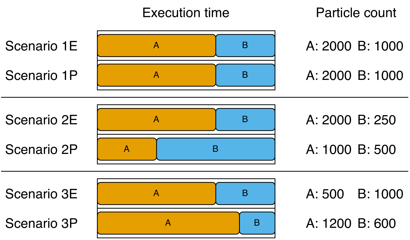
The image displays a comparative analysis of six scenarios (1E, 1P, 2E, 2P, 3E, 3P) across two metrics: "Execution time" (represented by stacked horizontal bars) and "Particle count" (listed as numerical values). The chart is organized into three distinct groups separated by horizontal lines.
### Components/Axes
* **Primary Headers (Top):** "Execution time" (centered above the bar chart area) and "Particle count" (centered above the numerical data column).
* **Row Labels (Left):** Six scenario identifiers: "Scenario 1E", "Scenario 1P", "Scenario 2E", "Scenario 2P", "Scenario 3E", "Scenario 3P".
* **Bar Chart Legend (Embedded):** The bars are composed of two colored segments:
* **Orange Segment:** Labeled "A" within the bar.
* **Blue Segment:** Labeled "B" within the bar.
* **Data Column (Right):** For each scenario, lists the particle counts for components A and B in the format "A: [value] B: [value]".
### Detailed Analysis
The execution time for each scenario is visualized as a horizontal bar divided into segments A (orange) and B (blue). The total bar length represents the total execution time, and the segment lengths represent the relative time contribution of each component. The numerical particle counts are provided for direct reference.
**Group 1 (Top):**
* **Scenario 1E:**
* Execution Time Bar: Orange segment (A) is longer than the blue segment (B). Approximate visual ratio A:B ~ 2:1.
* Particle Count: A: 2000, B: 1000.
* **Scenario 1P:**
* Execution Time Bar: Identical in appearance to Scenario 1E. Orange segment (A) longer than blue (B). Approximate visual ratio A:B ~ 2:1.
* Particle Count: A: 2000, B: 1000.
**Group 2 (Middle):**
* **Scenario 2E:**
* Execution Time Bar: Orange segment (A) is significantly longer than the blue segment (B). Approximate visual ratio A:B ~ 8:1.
* Particle Count: A: 2000, B: 250.
* **Scenario 2P:**
* Execution Time Bar: Blue segment (B) is significantly longer than the orange segment (A). Approximate visual ratio A:B ~ 1:4.
* Particle Count: A: 1000, B: 500.
**Group 3 (Bottom):**
* **Scenario 3E:**
* Execution Time Bar: Orange segment (A) is longer than the blue segment (B). Approximate visual ratio A:B ~ 3:2.
* Particle Count: A: 500, B: 1000.
* **Scenario 3P:**
* Execution Time Bar: Orange segment (A) is longer than the blue segment (B). Approximate visual ratio A:B ~ 4:1.
* Particle Count: A: 1200, B: 600.
### Key Observations
1. **Identical Pairs:** Scenarios 1E and 1P are visually and numerically identical in both execution time distribution and particle counts.
2. **Inverse Relationship in Group 2:** Scenario 2E shows a very long A segment with high A particles (2000) and low B particles (250). In contrast, Scenario 2P shows a very long B segment with lower A particles (1000) and higher B particles (500) compared to 2E. This suggests a potential performance inversion or different optimization focus.
3. **Particle Count vs. Time Discrepancy:** The relationship between particle count and execution time segment length is not consistent. For example:
* In 3E, B has double the particles of A (1000 vs 500) but a shorter execution time segment.
* In 3P, A has double the particles of B (1200 vs 600) and a much longer execution time segment.
4. **Grouping:** The scenarios are grouped in pairs (1E/1P, 2E/2P, 3E/3P), suggesting a comparison between two methods or configurations (denoted by 'E' and 'P') for three different base cases.
### Interpretation
This chart likely compares the performance (execution time) and resource usage (particle count) of two different algorithms, methods, or system configurations (labeled 'E' and 'P') across three test cases or problem instances (1, 2, 3).
* **What the data suggests:** The 'E' and 'P' configurations behave very differently depending on the scenario. In scenario 1, they perform identically. In scenario 2, they show a dramatic trade-off: 'E' spends most time on component A with many A particles, while 'P' spends most time on component B with fewer total particles. In scenario 3, both spend more time on A, but 'P' uses more A particles and achieves a different time distribution.
* **How elements relate:** The execution time bar provides a visual, relative measure of where computational effort is spent (A vs. B). The particle count provides an absolute measure of the problem size or data volume for each component. The lack of a direct, consistent correlation between particle count and time segment length implies that the computational cost per particle differs significantly between components A and B, and between the 'E' and 'P' methods.
* **Notable anomalies:** The most striking anomaly is the complete reversal of the dominant component (from A in 2E to B in 2P) in the second group. This indicates that the 'P' method might be fundamentally restructured to handle component B differently, or that the problem structure in scenario 2 is uniquely sensitive to the method change. The identical nature of 1E and 1P serves as a control, showing that under some conditions, the methods are equivalent.