## Bar Chart: Execution Time and Particle Count for Different Scenarios
### Overview
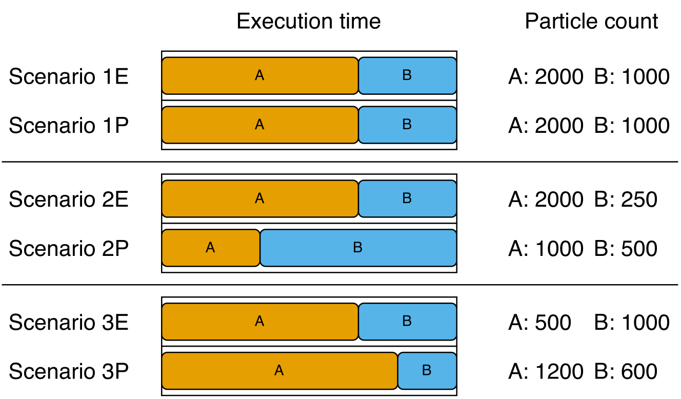
The image presents a bar chart comparing the execution time of two components, A and B, across six different scenarios. It also shows the particle count for each component in each scenario. The execution time is represented by the length of the colored bars, with orange representing component A and blue representing component B. The particle count is listed numerically to the right of the bars.
### Components/Axes
* **Title:** Execution time (top-center), Particle count (top-right)
* **Y-axis Labels:** Scenario 1E, Scenario 1P, Scenario 2E, Scenario 2P, Scenario 3E, Scenario 3P
* **Bar Colors:** Orange (Component A), Blue (Component B)
* **Particle Count Labels:** A, B
### Detailed Analysis
**Scenario 1E:**
* Execution Time: Component A (orange) and Component B (blue) have approximately equal execution times.
* Particle Count: A: 2000, B: 1000
**Scenario 1P:**
* Execution Time: Component A (orange) and Component B (blue) have approximately equal execution times.
* Particle Count: A: 2000, B: 1000
**Scenario 2E:**
* Execution Time: Component A (orange) has a significantly longer execution time than Component B (blue).
* Particle Count: A: 2000, B: 250
**Scenario 2P:**
* Execution Time: Component A (orange) has a shorter execution time than Component B (blue).
* Particle Count: A: 1000, B: 500
**Scenario 3E:**
* Execution Time: Component A (orange) has a longer execution time than Component B (blue).
* Particle Count: A: 500, B: 1000
**Scenario 3P:**
* Execution Time: Component A (orange) has a longer execution time than Component B (blue).
* Particle Count: A: 1200, B: 600
### Key Observations
* Scenarios 1E and 1P have identical execution time distributions and particle counts.
* The execution time ratio between components A and B varies significantly across the different scenarios.
* The particle count of component A varies from 500 to 2000, while the particle count of component B varies from 250 to 1000.
* There is no clear correlation between execution time and particle count.
### Interpretation
The chart illustrates the performance characteristics of two components (A and B) under different scenarios. The execution time and particle count are independent variables, and their relationship is not immediately obvious from the data presented. The "E" and "P" suffixes in the scenario names likely represent different configurations or parameters within each scenario, leading to variations in execution time and particle count. The data suggests that the optimal configuration for each scenario may depend on the specific requirements of the application, as the relative performance of components A and B varies significantly.