## Heatmaps: Comparative Analysis of Three Panels
### Overview
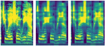
The image displays three adjacent heatmaps with color gradients ranging from dark blue (low values) to bright yellow (high values). No textual labels, legends, or axis markers are visible. The panels appear to represent spatial or temporal distributions of an unspecified metric.
### Components/Axes
- **Structure**:
- Each heatmap is divided into a grid-like pattern with vertical and horizontal bands.
- Color intensity varies across the grid, suggesting a scalar value mapped to a color scale (e.g., 0–100% or categorical intensity).
- **Spatial Arrangement**:
- **Panel 1 (Left)**: Dominated by vertical yellow streaks on the left and right edges, with a central region of alternating blue and yellow bands.
- **Panel 2 (Center)**: Features a checkerboard-like pattern with alternating blue and yellow squares, interrupted by vertical yellow bands near the center.
- **Panel 3 (Right)**: Shows a more uniform distribution of yellow bands concentrated in the upper and lower regions, with a central blue-dominated area.
### Detailed Analysis
- **Color Distribution**:
- **Panel 1**: Yellow regions occupy ~30% of the total area, concentrated in vertical bands. Blue regions dominate (~70%), with wavy horizontal gradients.
- **Panel 2**: Yellow and blue regions are nearly equal (~50% each), with a grid-like alternation. Vertical yellow bands occupy ~20% of the width.
- **Panel 3**: Yellow regions occupy ~40% of the area, primarily in the upper and lower thirds. Blue regions dominate the central ~60%.
- **Notable Patterns**:
- Panel 1 exhibits wave-like horizontal gradients, suggesting a sinusoidal or oscillatory trend.
- Panel 2’s checkerboard pattern implies a binary or alternating categorical distribution.
- Panel 3’s asymmetry (yellow concentrated at top/bottom) may indicate boundary effects or directional bias.
### Key Observations
1. **Panel 1**: High-intensity (yellow) regions are localized and vertical, contrasting with the diffuse blue background.
2. **Panel 2**: Regular alternation of colors suggests a structured, possibly binary system (e.g., on/off states).
3. **Panel 3**: Asymmetrical yellow distribution implies a non-uniform process, such as directional flow or edge dominance.
### Interpretation
The heatmaps likely represent variations in a physical, biological, or computational system. The absence of legends or labels prevents precise quantification, but the following inferences can be made:
- **Panel 1** may depict a system with localized peaks (e.g., signal strength, temperature) against a baseline.
- **Panel 2** could represent a binary classification or alternating process (e.g., on/off cycles, categorical states).
- **Panel 3** might illustrate a directional phenomenon (e.g., fluid flow, wave propagation) with boundary-driven intensity.
**Critical Limitation**: Without axis labels, legends, or contextual metadata, the exact nature of the data (e.g., units, categories) remains speculative. The analysis is constrained to visual pattern recognition.