## Line Chart: Performance Metrics Across α Values
### Overview
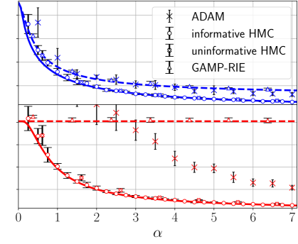
The image is a line chart comparing multiple performance metrics (ADAM, informative HMC, uninformative HMC, GAMP-RIE) against a reference threshold (red dashed line) across a range of α values (0 to 7). The y-axis represents a normalized metric (likely error or efficiency), decreasing from ~1.2 to ~0.2. The blue line represents the primary data series, while the red dashed line serves as a reference.
### Components/Axes
- **X-axis (α)**: Labeled "α", ranging from 0 to 7 in integer increments.
- **Y-axis**: Unlabeled, but values decrease from ~1.2 (top) to ~0.2 (bottom).
- **Legend**: Located in the top-right corner, with four entries:
- **ADAM** (blue crosses, `×`)
- **informative HMC** (blue circles, `○`)
- **uninformative HMC** (blue stars, `★`)
- **GAMP-RIE** (blue triangles, `△`)
- **Red dashed line**: A horizontal reference line at ~0.8, spanning the entire x-axis.
### Detailed Analysis
1. **Blue Line (Primary Data Series)**:
- **Trend**: Starts at ~1.2 (α=0) and decreases gradually to ~0.8 (α=7).
- **Data Points**:
- **ADAM** (`×`): Peaks at ~1.2 (α=0), drops to ~0.9 (α=3), then stabilizes near ~0.8 (α=7).
- **informative HMC** (`○`): Starts at ~1.1 (α=0), decreases to ~0.85 (α=3), and stabilizes near ~0.8 (α=7).
- **uninformative HMC** (`★`): Begins at ~1.0 (α=0), drops to ~0.8 (α=3), and remains near ~0.8 (α=7).
- **GAMP-RIE** (`△`): Starts at ~1.05 (α=0), decreases to ~0.82 (α=3), and stabilizes near ~0.8 (α=7).
- **Uncertainty**: Error bars (vertical lines) indicate variability, with ADAM showing the largest spread (~0.1–0.2).
2. **Red Dashed Line (Reference)**:
- **Trend**: Horizontal line at ~0.8, constant across all α values.
- **Position**: All blue data points (except ADAM at α=0) lie above this line.
### Key Observations
- **ADAM** (`×`) exhibits the highest initial value (~1.2) and the slowest decline, suggesting it may be less sensitive to α.
- **informative HMC** (`○`) and **GAMP-RIE** (`△`) show similar trends, with GAMP-RIE slightly outperforming informative HMC at higher α.
- **uninformative HMC** (`★`) starts lower than the other blue series but converges with them by α=3.
- The red dashed line (~0.8) acts as a threshold; most data points (except ADAM at α=0) fall above it, indicating a performance benchmark.
### Interpretation
The chart suggests that the metrics for ADAM, informative HMC, uninformative HMC, and GAMP-RIE degrade with increasing α, but ADAM maintains the highest performance. The red dashed line likely represents a target or baseline, with most data points exceeding it. The convergence of uninformative HMC and other series at higher α implies that α may have diminishing returns for certain metrics. The variability in ADAM’s error bars highlights potential instability in its performance under varying α.
**Note**: The y-axis label is missing, so the exact metric (e.g., error, efficiency) remains unspecified. The red dashed line’s purpose (e.g., target, theoretical limit) is inferred from its position relative to the data.