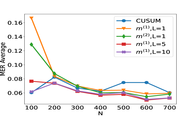
## Line Chart: MER Average vs. N for Different Methods
### Overview
This image displays a line chart comparing the "MER Average" on the y-axis against "N" on the x-axis for five different methods. The methods are represented by distinct colored lines with markers, and their labels are provided in a legend. The chart shows how the MER Average changes as N increases for each method.
### Components/Axes
* **Y-axis Title:** MER Average
* **Scale:** Linear, ranging from approximately 0.05 to 0.17.
* **Markers:** 0.06, 0.08, 0.10, 0.12, 0.14, 0.16.
* **X-axis Title:** N
* **Scale:** Linear, ranging from 100 to 700.
* **Markers:** 100, 200, 300, 400, 500, 600, 700.
* **Legend:** Located in the top-right quadrant of the chart.
* **CUSUM:** Blue line with circular markers.
* **m⁽¹⁾, L=1:** Orange line with triangular markers.
* **m⁽²⁾, L=1:** Green line with diamond markers.
* **m⁽¹⁾, L=5:** Red line with square markers.
* **m⁽¹⁾, L=10:** Purple line with star markers.
### Detailed Analysis
The chart presents data points for five series at N values of 100, 200, 300, 400, 500, 600, and 700.
**1. CUSUM (Blue line with circles):**
* **Trend:** The CUSUM line generally slopes upward from N=400 to N=500, then plateaus, and slightly decreases towards N=700. It shows a slight dip between N=100 and N=200.
* **Data Points (approximate):**
* N=100: 0.060
* N=200: 0.082
* N=300: 0.068
* N=400: 0.062
* N=500: 0.076
* N=600: 0.076
* N=700: 0.060
**2. m⁽¹⁾, L=1 (Orange line with triangles):**
* **Trend:** This line starts at its highest point at N=100 and then sharply decreases until N=400, after which it shows a slight upward trend until N=600, followed by a decrease.
* **Data Points (approximate):**
* N=100: 0.165
* N=200: 0.085
* N=300: 0.070
* N=400: 0.062
* N=500: 0.065
* N=600: 0.058
* N=700: 0.059
**3. m⁽²⁾, L=1 (Green line with diamonds):**
* **Trend:** This line shows a steep downward trend from N=100 to N=200, and then a gradual decrease as N increases, with a slight increase between N=400 and N=500.
* **Data Points (approximate):**
* N=100: 0.128
* N=200: 0.085
* N=300: 0.072
* N=400: 0.065
* N=500: 0.068
* N=600: 0.055
* N=700: 0.058
**4. m⁽¹⁾, L=5 (Red line with squares):**
* **Trend:** This line starts at a moderate value at N=100, increases slightly to N=200, then decreases steadily as N increases, with a slight dip at N=400 and N=600.
* **Data Points (approximate):**
* N=100: 0.078
* N=200: 0.074
* N=300: 0.065
* N=400: 0.058
* N=500: 0.060
* N=600: 0.053
* N=700: 0.055
**5. m⁽¹⁾, L=10 (Purple line with stars):**
* **Trend:** This line shows a general upward trend from N=100 to N=200, followed by a decrease until N=400, and then a slight increase and plateauing.
* **Data Points (approximate):**
* N=100: 0.060
* N=200: 0.074
* N=300: 0.068
* N=400: 0.060
* N=500: 0.062
* N=600: 0.055
* N=700: 0.055
### Key Observations
* The **m⁽¹⁾, L=1** method exhibits the highest MER Average at N=100 (approximately 0.165).
* As N increases, most methods show a general decreasing trend in MER Average, particularly between N=100 and N=400.
* The **CUSUM** method shows a relatively stable MER Average for N > 400, hovering around 0.076 before decreasing slightly.
* The **m⁽¹⁾, L=5** and **m⁽¹⁾, L=10** methods tend to have the lowest MER Averages for larger values of N (N >= 400), often falling below 0.060.
* At N=200, several lines converge around an MER Average of 0.074-0.085.
* At N=700, the MER Averages for most methods are clustered between 0.055 and 0.060, with CUSUM being slightly higher.
### Interpretation
This chart likely demonstrates the performance of different anomaly detection or change detection algorithms (indicated by the method names like CUSUM and the parameterized 'm' methods) across varying sample sizes (N). The "MER Average" could represent a metric like Mean Error Rate or a similar measure of performance.
* **Initial High Performance:** The high MER Average for `m⁽¹⁾, L=1` at N=100 suggests that this method might be very sensitive to initial anomalies or variations but may not generalize well to larger datasets.
* **Convergence and Stability:** The convergence of several lines at higher N values indicates that for larger sample sizes, the performance of these methods becomes more similar. The general decrease in MER Average as N increases suggests that most methods become more robust or accurate with more data.
* **Method-Specific Behavior:** The distinct trends for each method highlight their different characteristics. For instance, CUSUM appears to maintain a moderate performance level for larger N, while `m⁽¹⁾, L=5` and `m⁽¹⁾, L=10` seem to achieve lower error rates at larger sample sizes. The parameters L=5 and L=10 in the 'm' methods likely represent different window sizes or look-ahead periods, influencing their behavior. A larger L might lead to smoother detection or a different trade-off between false positives and negatives.
* **Trade-offs:** The chart implicitly shows trade-offs. For example, `m⁽¹⁾, L=1` might detect anomalies very quickly (low N), but at the cost of higher average error over time or larger datasets. Conversely, methods with lower MER at higher N might be slower to detect initial changes but are more reliable overall.
* **Peircean Investigative Reading:** The data suggests an investigation into the optimal choice of algorithm and its parameters (like L) based on the expected size of the data stream (N) and the desired performance metric (MER Average). If the goal is to detect anomalies in a large, stable dataset, methods like `m⁽¹⁾, L=5` or `m⁽¹⁾, L=10` might be preferred. If rapid detection of early anomalies is critical, `m⁽¹⁾, L=1` might be considered, but with an awareness of its potential for higher average error. The CUSUM method appears to offer a balanced approach, especially for larger N.