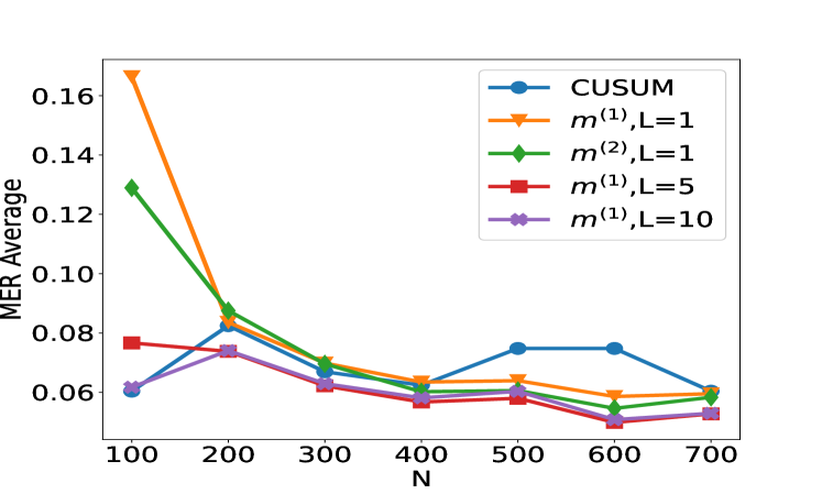
## Line Chart: MER Average vs. N for Different Methods
### Overview
The image displays a line chart comparing the performance of five different statistical or machine learning methods. The performance metric is "MER Average" (likely Mean Error Rate or a similar average error measure), plotted against a variable "N" (likely sample size, number of observations, or a similar parameter). The chart shows how the average error for each method changes as N increases from 100 to 700.
### Components/Axes
* **X-Axis:** Labeled "N". It has major tick marks and labels at N = 100, 200, 300, 400, 500, 600, and 700.
* **Y-Axis:** Labeled "MER Average". It has major tick marks and labels at 0.06, 0.08, 0.10, 0.12, 0.14, and 0.16.
* **Legend:** Positioned in the top-right corner of the plot area. It contains five entries, each with a unique color, marker, and label:
1. Blue line with circle markers: `CUSUM`
2. Orange line with downward-pointing triangle markers: `m^(1),L=1`
3. Green line with diamond markers: `m^(2),L=1`
4. Red line with square markers: `m^(1),L=5`
5. Purple line with left-pointing triangle markers: `m^(1),L=10`
### Detailed Analysis
**Trend Verification & Data Point Extraction (Approximate Values):**
1. **CUSUM (Blue, Circles):**
* **Trend:** Starts low, increases to a peak around N=500-600, then decreases.
* **Points:** N=100: ~0.060 | N=200: ~0.082 | N=300: ~0.068 | N=400: ~0.060 | N=500: ~0.075 | N=600: ~0.075 | N=700: ~0.060
2. **m^(1),L=1 (Orange, Down-Triangles):**
* **Trend:** Starts very high, drops sharply until N=300, then declines more gradually.
* **Points:** N=100: ~0.168 | N=200: ~0.085 | N=300: ~0.069 | N=400: ~0.064 | N=500: ~0.064 | N=600: ~0.059 | N=700: ~0.060
3. **m^(2),L=1 (Green, Diamonds):**
* **Trend:** Starts high, drops sharply until N=300, then declines gradually, converging with others.
* **Points:** N=100: ~0.129 | N=200: ~0.089 | N=300: ~0.070 | N=400: ~0.062 | N=500: ~0.059 | N=600: ~0.054 | N=700: ~0.060
4. **m^(1),L=5 (Red, Squares):**
* **Trend:** Starts moderate, shows a slight dip and rise, generally trends downward with some fluctuation.
* **Points:** N=100: ~0.077 | N=200: ~0.074 | N=300: ~0.062 | N=400: ~0.057 | N=500: ~0.058 | N=600: ~0.050 | N=700: ~0.053
5. **m^(1),L=10 (Purple, Left-Triangles):**
* **Trend:** Starts the lowest, rises to a peak at N=200, then generally declines.
* **Points:** N=100: ~0.061 | N=200: ~0.074 | N=300: ~0.063 | N=400: ~0.058 | N=500: ~0.060 | N=600: ~0.053 | N=700: ~0.053
### Key Observations
1. **Initial Disparity:** At the smallest sample size (N=100), there is a large spread in performance. The methods `m^(1),L=1` and `m^(2),L=1` have significantly higher MER (~0.168 and ~0.129) compared to the others (~0.06-0.08).
2. **Convergence with Increasing N:** As N increases, the performance of all five methods converges. By N=700, all methods have an MER Average within a narrow band of approximately 0.053 to 0.060.
3. **CUSUM Anomaly:** The `CUSUM` method shows a distinct, non-monotonic trend, with its MER increasing to form a plateau between N=500 and N=600 before falling again. This is an outlier compared to the generally decreasing trends of the other methods.
4. **Effect of Parameter L:** For the `m^(1)` family of methods, increasing the parameter `L` from 1 to 5 to 10 appears to improve (lower) the initial MER at N=100. The `m^(1),L=10` method starts with the lowest error.
### Interpretation
This chart likely evaluates the sample efficiency or consistency of different change-point detection or sequential analysis algorithms. "MER" could stand for "Missed Event Rate" or "Mean Error Ratio."
* **What the data suggests:** The methods `m^(1),L=1` and `m^(2),L=1` are highly sensitive to small sample sizes (low N), performing poorly. However, they improve rapidly and become competitive as more data (higher N) becomes available. In contrast, `CUSUM` and the `m^(1)` methods with higher `L` values (5, 10) are more robust and perform better with limited data.
* **Relationship between elements:** The parameter `L` in the `m^(1)` methods seems to act as a tuning parameter that trades off initial performance for stability. A higher `L` leads to better initial MER. The convergence of all lines suggests that given sufficient data (N > 400), the choice of method becomes less critical for this specific metric.
* **Notable anomaly:** The `CUSUM` method's performance degradation (increasing MER) in the mid-range of N (500-600) is curious. It could indicate a specific vulnerability or a phase where the method's assumptions are less valid for the underlying data generating process at that scale. This would be a key point for further investigation.
* **Underlying message:** The choice of method should be informed by the expected operational sample size. For scenarios with limited data, `m^(1),L=10` or `CUSUM` are preferable. For scenarios with abundant data, all methods perform similarly, and other factors like computational cost might become the deciding factor.