# Technical Document Analysis of Line Chart
## Chart Overview
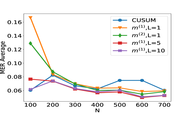
The image is a line chart comparing the Mean Error Rate (MER) average across different statistical methods as a function of sample size (N). The chart includes five distinct data series with varying trends.
---
## Axis Labels and Scales
- **X-axis (Horizontal):**
- Label: `N` (sample size)
- Range: 100 to 700 (increments of 100)
- **Y-axis (Vertical):**
- Label: `MER Average` (Mean Error Rate)
- Range: 0.06 to 0.16 (increments of 0.02)
---
## Legend and Data Series
The legend is positioned in the **upper-right corner** of the chart. Each data series is represented by a unique color and marker type:
| Legend Label | Color | Marker Type | Corresponding Line |
|--------------------|--------|-------------|--------------------|
| CUSUM | Blue | Circle | Solid blue line |
| `m^(1),L=1` | Orange | Triangle | Dashed orange line |
| `m^(2),L=1` | Green | Diamond | Dotted green line |
| `m^(1),L=5` | Red | Square | Dash-dot red line |
| `m^(1),L=10` | Purple | X | Dotted purple line |
---
## Key Trends and Data Points
### 1. **CUSUM (Blue Line)**
- **Trend:** Sharp decline from N=100 to N=200, followed by fluctuations.
- **Data Points:**
- N=100: 0.06
- N=200: 0.08
- N=300: 0.07
- N=400: 0.06
- N=500: 0.08
- N=600: 0.07
- N=700: 0.06
### 2. **`m^(1),L=1` (Orange Line)**
- **Trend:** Steep decline from N=100 to N=400, then stabilizes.
- **Data Points:**
- N=100: 0.16
- N=200: 0.08
- N=300: 0.07
- N=400: 0.06
- N=500: 0.06
- N=600: 0.06
- N=700: 0.06
### 3. **`m^(2),L=1` (Green Line)**
- **Trend:** Rapid decline from N=100 to N=200, followed by gradual stabilization.
- **Data Points:**
- N=100: 0.13
- N=200: 0.09
- N=300: 0.07
- N=400: 0.06
- N=500: 0.06
- N=600: 0.06
- N=700: 0.06
### 4. **`m^(1),L=5` (Red Line)**
- **Trend:** Gradual decline from N=100 to N=300, then plateaus.
- **Data Points:**
- N=100: 0.08
- N=200: 0.07
- N=300: 0.06
- N=400: 0.06
- N=500: 0.06
- N=600: 0.06
- N=700: 0.06
### 5. **`m^(1),L=10` (Purple Line)**
- **Trend:** Slight peak at N=200, followed by stabilization.
- **Data Points:**
- N=100: 0.06
- N=200: 0.07
- N=300: 0.06
- N=400: 0.06
- N=500: 0.06
- N=600: 0.06
- N=700: 0.06
---
## Spatial Grounding and Validation
- **Legend Placement:** Upper-right corner (confirmed via visual inspection).
- **Color-Marker Consistency:**
- All data points match their legend labels (e.g., blue circles for CUSUM, orange triangles for `m^(1),L=1`).
- Example: At N=100, the orange triangle (highest point) corresponds to `m^(1),L=1` (0.16).
---
## Observations
1. **CUSUM** exhibits the most volatility, with a sharp initial drop and subsequent fluctuations.
2. **`m^(1),L=1`** and **`m^(2),L=1`** show the steepest declines, stabilizing near 0.06 by N=400.
3. **`m^(1),L=5`** and **`m^(1),L=10`** demonstrate slower convergence, with `m^(1),L=10` having the least variability.
---
## Conclusion
The chart illustrates how different statistical methods (`m^(1),L=1`, `m^(2),L=1`, etc.) and the CUSUM method perform in terms of MER average as sample size (N) increases. All methods converge toward lower error rates as N grows, with `m^(1),L=10` showing the most stable performance.