# Technical Document Extraction: Accuracy vs. Temperature Analysis
## Overview
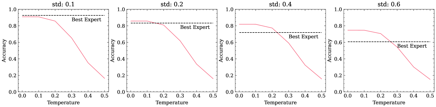
The image contains **four line graphs** comparing **accuracy** against **temperature** under varying **standard deviation (std)** conditions. Each graph includes a **red data line** and a **dashed black reference line** labeled "Best Expert." All graphs share identical axis labels and scales.
---
## Key Components
### Axis Labels
- **X-axis**: "Temperature" (range: 0.0 to 0.5, increments of 0.1)
- **Y-axis**: "Accuracy" (range: 0.0 to 1.0, increments of 0.2)
### Legends
- **Best Expert**: Dashed black horizontal line at **0.6 accuracy** (consistent across all graphs).
---
## Graph Analysis
### Graph 1: `std: 0.1`
- **Title**: "std: 0.1"
- **Data Line (Red)**:
- Starts at **~0.9 accuracy** at 0.0 temperature.
- Declines sharply to **~0.15 accuracy** at 0.5 temperature.
- **Best Expert Line**: Horizontal at **0.6 accuracy**.
### Graph 2: `std: 0.2`
- **Title**: "std: 0.2"
- **Data Line (Red)**:
- Starts at **~0.85 accuracy** at 0.0 temperature.
- Declines to **~0.1 accuracy** at 0.5 temperature.
- **Best Expert Line**: Horizontal at **0.6 accuracy**.
### Graph 3: `std: 0.4`
- **Title**: "std: 0.4"
- **Data Line (Red)**:
- Starts at **~0.8 accuracy** at 0.0 temperature.
- Declines to **~0.05 accuracy** at 0.5 temperature.
- **Best Expert Line**: Horizontal at **0.6 accuracy**.
### Graph 4: `std: 0.6`
- **Title**: "std: 0.6"
- **Data Line (Red)**:
- Starts at **~0.75 accuracy** at 0.0 temperature.
- Declines to **~0.0 accuracy** at 0.5 temperature.
- **Best Expert Line**: Horizontal at **0.6 accuracy**.
---
## Trends
1. **Data Line (Red)**:
- All graphs show a **monotonic decrease** in accuracy as temperature increases.
- Higher std values correlate with **steeper declines** in accuracy.
- At 0.5 temperature, accuracy drops below **0.2** for std ≥ 0.2.
2. **Best Expert Line**:
- Remains **constant at 0.6 accuracy** across all temperatures and std values.
- Acts as a **baseline reference** for comparison.
---
## Spatial Grounding
- **Legend Placement**: Upper-right corner of each graph.
- **Line Colors**:
- Red: Data line (no explicit legend label).
- Dashed Black: "Best Expert" (explicitly labeled).
---
## Notes
- No additional text, tables, or embedded diagrams are present.
- All graphs share identical axis scales and labeling conventions.
- The "Best Expert" line is **not temperature-dependent** and serves as a static benchmark.