\n
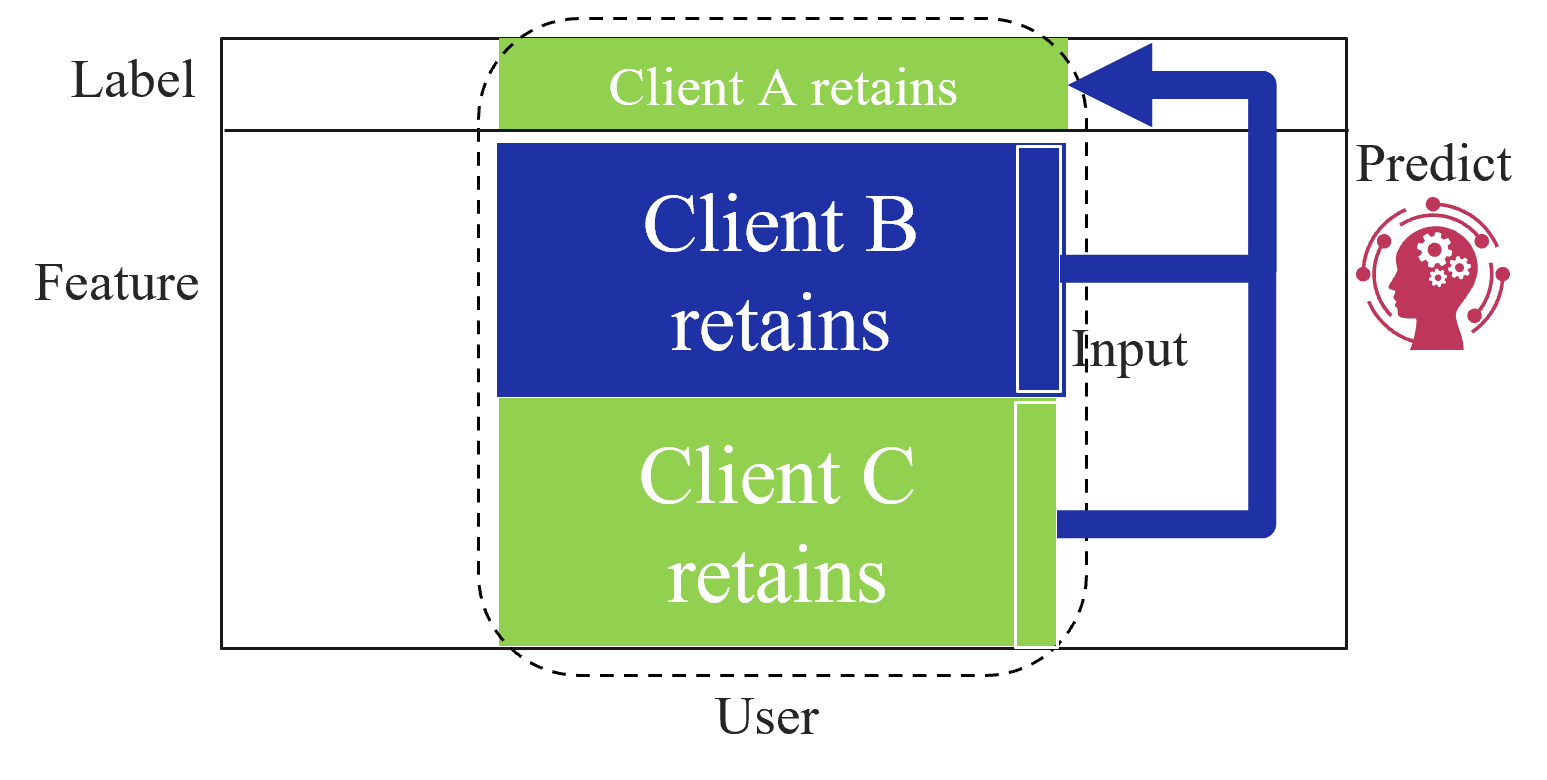
## Diagram: Client Retention Prediction Flow
### Overview
The image depicts a diagram illustrating a client retention prediction process. It shows how client data (labeled as "Label" and "Feature") is used as input to predict which clients will be retained. The diagram uses colored blocks to represent different client groups (A, B, and C) and arrows to indicate the flow of information.
### Components/Axes
The diagram consists of the following labeled components:
* **Label:** Located on the left vertical axis.
* **Feature:** Located on the left vertical axis, below "Label".
* **User:** Located on the bottom horizontal axis.
* **Input:** A label within the diagram, indicating the data being fed into the prediction model.
* **Predict:** A label on the right side, indicating the output of the prediction model.
* **Client A retains:** A light green block.
* **Client B retains:** A dark blue block.
* **Client C retains:** A light green block.
There are no explicit axes scales or numerical values present in the diagram.
### Detailed Analysis or Content Details
The diagram shows three client groups: A, B, and C. The retention status of each client is indicated by the text within the colored blocks.
* **Client A retains:** Represented by a light green block at the top.
* **Client B retains:** Represented by a dark blue block in the center.
* **Client C retains:** Represented by a light green block at the bottom.
An arrow points from the right side of the diagram towards the "Input" label, and then towards the "Client B retains" block. This suggests that the input data is used to predict the retention status of Client B. The "Predict" component, located on the right side, contains an icon of a brain with gears, symbolizing the prediction process.
The entire set of blocks (Client A, B, and C) is enclosed within a dashed black border, suggesting they represent the core data used for prediction.
### Key Observations
* Clients A and C are both labeled as "retains" and are represented by the same color (light green).
* Client B is labeled as "retains" but is represented by a different color (dark blue).
* The arrow indicates a flow of information *to* Client B, suggesting it is the focus of the prediction.
* The diagram does not provide any quantitative data or probabilities related to client retention.
### Interpretation
The diagram illustrates a simplified model for predicting client retention. It suggests that client data, represented by "Label" and "Feature", is used as input to a prediction model ("Predict"). The model then outputs a prediction regarding whether a specific client (in this case, Client B) will be retained. The use of different colors for Client B compared to Clients A and C might indicate that Client B has unique characteristics or a different retention risk profile.
The diagram is conceptual and does not provide details about the prediction algorithm or the specific features used for prediction. It serves as a high-level overview of the client retention prediction process. The diagram implies a supervised learning approach, where the model learns from labeled data (clients who have already been retained or not) to predict the retention status of new clients. The absence of numerical data suggests that the diagram is intended to convey the overall process rather than specific results.