## Line Charts: Prediction Accuracy vs. Number of Interactions
### Overview
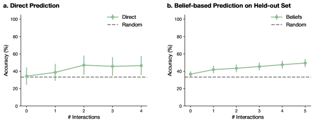
The image presents two line charts, labeled 'a. Direct Prediction' and 'b. Belief-based Prediction on Held-out Set'. Both charts compare the accuracy of a prediction method against a random baseline, as a function of the number of interactions. Accuracy is measured in percentage (%).
### Components/Axes
Both charts share the following components:
* **X-axis:** Labeled "# Interactions", ranging from 0 to 4 in chart 'a' and 0 to 5 in chart 'b'. The axis is discrete, representing integer values.
* **Y-axis:** Labeled "Accuracy (%)", ranging from 0 to 100.
* **Legend:** Located in the top-left corner of each chart.
* 'Direct' (or 'Beliefs') - Represented by a solid green line with light green shaded error bars.
* 'Random' - Represented by a gray dashed line.
### Detailed Analysis or Content Details
**Chart a: Direct Prediction**
* **Direct (Green Line):** The line starts at approximately 32% accuracy at 0 interactions, rises to a peak of roughly 52% at 2 interactions, then declines slightly to around 48% at 4 interactions. The error bars indicate a significant degree of variability, ranging from approximately 25% to 60% across all interaction levels.
* 0 Interactions: ~32% ± ~10%
* 1 Interaction: ~40% ± ~15%
* 2 Interactions: ~52% ± ~10%
* 3 Interactions: ~48% ± ~10%
* 4 Interactions: ~48% ± ~10%
* **Random (Gray Dashed Line):** The line is relatively flat, starting at approximately 30% and remaining around 30-35% throughout all interaction levels.
**Chart b: Belief-based Prediction on Held-out Set**
* **Beliefs (Green Line):** The line shows an increasing trend, starting at approximately 38% accuracy at 0 interactions and rising to around 52% at 5 interactions. The error bars are substantial, ranging from approximately 30% to 60% across all interaction levels.
* 0 Interactions: ~38% ± ~10%
* 1 Interaction: ~42% ± ~10%
* 2 Interactions: ~46% ± ~10%
* 3 Interactions: ~48% ± ~10%
* 4 Interactions: ~50% ± ~10%
* 5 Interactions: ~52% ± ~10%
* **Random (Gray Dashed Line):** Similar to chart 'a', the line is relatively flat, starting at approximately 30% and remaining around 30-35% throughout all interaction levels.
### Key Observations
* In both charts, the 'Direct'/'Beliefs' method consistently outperforms the 'Random' baseline.
* The error bars are large in both charts, indicating high variance in the results.
* Chart 'a' shows a peak in accuracy at 2 interactions, followed by a slight decline.
* Chart 'b' demonstrates a consistent increase in accuracy with increasing interactions.
### Interpretation
These charts compare the performance of two prediction methods – a 'Direct' prediction method and a 'Belief-based' method – against a random baseline. The number of interactions appears to represent the amount of data or experience used by the prediction methods.
Chart 'a' suggests that the 'Direct' prediction method benefits from a small number of interactions (up to 2), but further interactions do not lead to significant improvements and may even cause a slight decrease in accuracy. The large error bars suggest that the performance is highly variable and sensitive to the specific data.
Chart 'b' indicates that the 'Belief-based' method improves with more interactions, suggesting that it is able to learn and refine its predictions over time. Again, the large error bars highlight the variability in the results.
The consistent outperformance of both methods over the 'Random' baseline suggests that they are both capable of learning something from the data, but the high variance indicates that the results may not be robust or generalizable. The difference between the two charts could be due to the nature of the data used (direct vs. held-out set) or the specific algorithms employed. The held-out set in chart 'b' likely provides a more realistic assessment of the model's ability to generalize to unseen data.