## Box Plot Comparison: ECE Diff and AUROC Diff
### Overview
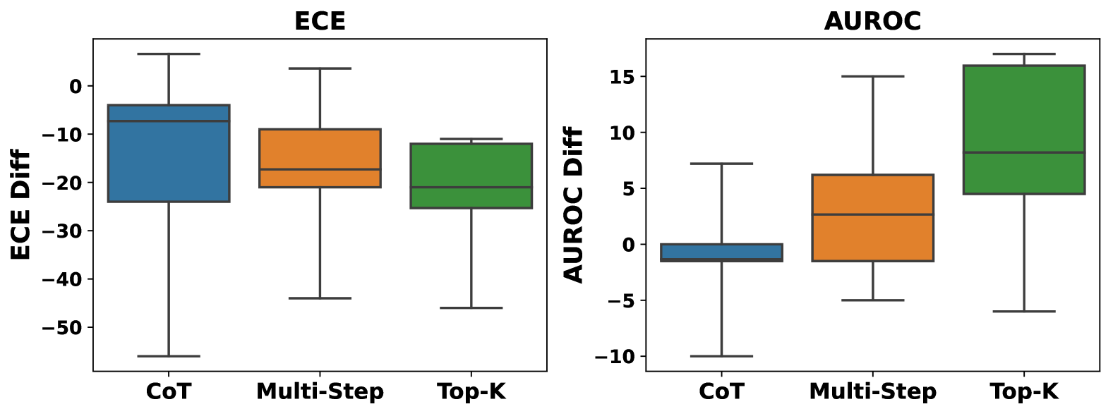
The image displays two side-by-side box plots comparing the distribution of difference scores for three methods (CoT, Multi-Step, Top-K) across two metrics: ECE (Expected Calibration Error) and AUROC (Area Under the Receiver Operating Characteristic curve). The plots are presented on a light gray background.
### Components/Axes
**Left Plot:**
* **Title:** "ECE" (centered at the top).
* **Y-axis Label:** "ECE Diff" (rotated vertically on the left).
* **Y-axis Scale:** Linear scale ranging from -50 to 0, with major tick marks at intervals of 10 (-50, -40, -30, -20, -10, 0).
* **X-axis Categories:** Three categories labeled "CoT", "Multi-Step", and "Top-K" from left to right.
* **Data Series (Box Plots):**
* **CoT:** Blue box.
* **Multi-Step:** Orange box.
* **Top-K:** Green box.
**Right Plot:**
* **Title:** "AUROC" (centered at the top).
* **Y-axis Label:** "AUROC Diff" (rotated vertically on the left).
* **Y-axis Scale:** Linear scale ranging from -10 to 15, with major tick marks at intervals of 5 (-10, -5, 0, 5, 10, 15).
* **X-axis Categories:** Same three categories as the left plot: "CoT", "Multi-Step", "Top-K".
* **Data Series (Box Plots):**
* **CoT:** Blue box.
* **Multi-Step:** Orange box.
* **Top-K:** Green box.
**Legend/Spatial Grounding:** The legend is not a separate element. The method names ("CoT", "Multi-Step", "Top-K") are placed directly below their respective box plots on the x-axis. The color coding is consistent across both plots: Blue = CoT, Orange = Multi-Step, Green = Top-K.
### Detailed Analysis
**Left Plot: ECE Diff**
* **Trend Verification:** All three distributions are centered below zero, indicating a negative difference. The CoT distribution appears to have the widest overall range, while Top-K has the most compact interquartile range (IQR).
* **CoT (Blue):**
* Median (line inside box): Approximately -8.
* Interquartile Range (IQR, box height): Spans from approximately -24 (25th percentile) to -4 (75th percentile).
* Whiskers: Extend from a maximum of approximately +5 to a minimum of approximately -55.
* **Multi-Step (Orange):**
* Median: Approximately -18.
* IQR: Spans from approximately -21 to -9.
* Whiskers: Extend from approximately +3 to -44.
* **Top-K (Green):**
* Median: Approximately -21.
* IQR: Spans from approximately -25 to -12.
* Whiskers: Extend from approximately -11 to -46.
**Right Plot: AUROC Diff**
* **Trend Verification:** The distributions show a clear upward trend from CoT to Top-K. CoT is centered near zero, Multi-Step is positive, and Top-K is strongly positive.
* **CoT (Blue):**
* Median: Approximately -1.
* IQR: Very narrow, spanning from approximately -2 to 0.
* Whiskers: Extend from approximately +7 to -10.
* **Multi-Step (Orange):**
* Median: Approximately +3.
* IQR: Spans from approximately -2 to +6.
* Whiskers: Extend from approximately +15 to -5.
* **Top-K (Green):**
* Median: Approximately +8.
* IQR: Spans from approximately +5 to +16.
* Whiskers: Extend from approximately +17 to -6.
### Key Observations
1. **Metric Directionality:** The "ECE Diff" values are predominantly negative for all methods, while the "AUROC Diff" values are predominantly positive for Multi-Step and Top-K.
2. **Performance Ranking:** For AUROC Diff, there is a clear performance hierarchy: Top-K > Multi-Step > CoT. For ECE Diff, the medians are all negative and relatively close, with CoT showing the least negative median (closest to zero) but the highest variance.
3. **Variance:** CoT exhibits the largest variance (longest whiskers and tallest box) in the ECE Diff plot. In the AUROC Diff plot, Top-K shows the largest positive variance.
4. **Outliers:** No individual data points (outliers) are plotted beyond the whiskers in either chart.
### Interpretation
This visualization compares the impact of three reasoning or sampling methods (Chain-of-Thought, Multi-Step, Top-K) on two key model performance metrics. The "Diff" likely represents the change in ECE and AUROC relative to a baseline (e.g., standard prompting).
* **ECE Interpretation:** A negative ECE Diff suggests an improvement in calibration (lower ECE is better). All methods improve calibration, with Multi-Step and Top-K showing a slightly larger median improvement than CoT. However, CoT's performance is highly variable, sometimes leading to much larger improvements (whisker to -55) and sometimes to slight degradation (whisker to +5).
* **AUROC Interpretation:** A positive AUROC Diff indicates improved discriminative performance (higher AUROC is better). Here, the methods show a clear stratified benefit: Top-K provides the largest and most consistent boost, followed by Multi-Step. CoT, on average, provides negligible change to AUROC but has high variance, with outcomes ranging from significant degradation (-10) to moderate improvement (+7).
* **Overall Relationship:** The data suggests a potential trade-off or divergence in metric outcomes. While all methods tend to improve calibration (ECE), their effect on discriminative power (AUROC) varies dramatically. Top-K appears to be the most effective for boosting AUROC while also solidly improving calibration. CoT is the least reliable for improving AUROC and shows the most unpredictable results for calibration. This could imply that the mechanisms by which these methods alter model confidence (affecting ECE) and decision boundaries (affecting AUROC) are distinct.