## Bar Chart: Distribution
### Overview
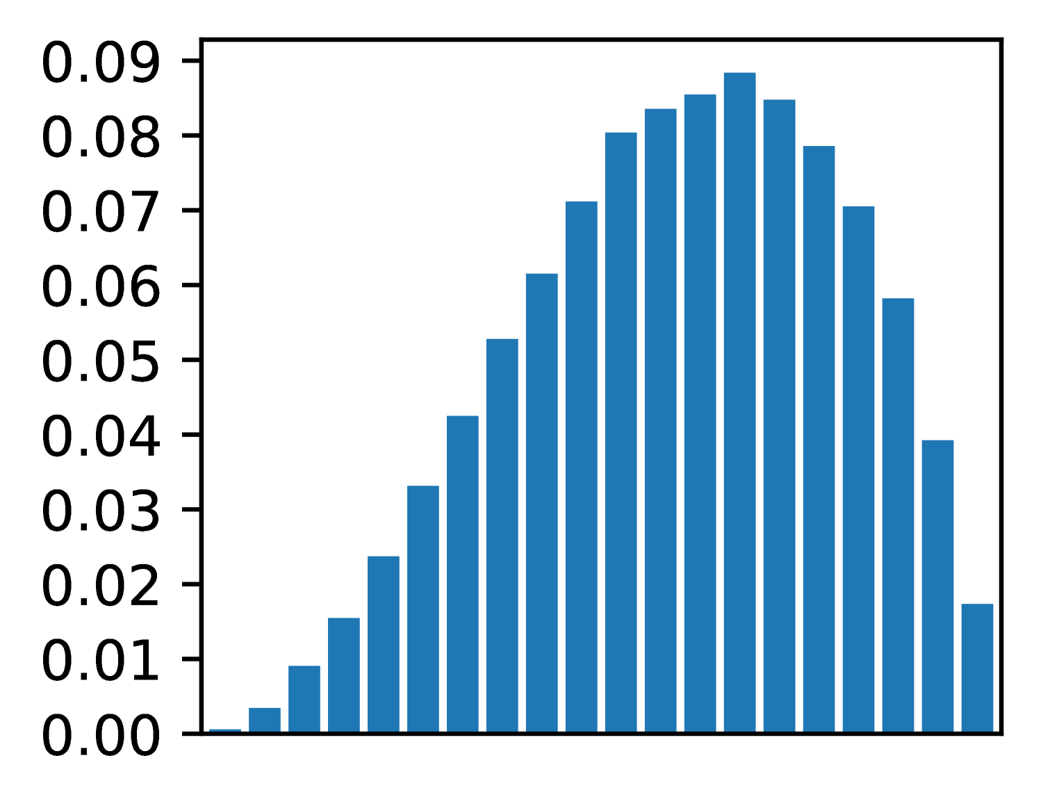
The image is a bar chart displaying a distribution. The bars are blue and arranged along an implicit x-axis. The y-axis ranges from 0.00 to 0.09 in increments of 0.01. The bars form a bell-shaped curve, indicating a normal or near-normal distribution.
### Components/Axes
* **Y-axis:** Ranges from 0.00 to 0.09, incrementing by 0.01.
* 0.00
* 0.01
* 0.02
* 0.03
* 0.04
* 0.05
* 0.06
* 0.07
* 0.08
* 0.09
* **X-axis:** Implicit, represented by the position of the bars. No explicit labels are provided.
### Detailed Analysis
The bar heights, read from left to right, are approximately:
* Bar 1: 0.003
* Bar 2: 0.009
* Bar 3: 0.015
* Bar 4: 0.024
* Bar 5: 0.032
* Bar 6: 0.042
* Bar 7: 0.052
* Bar 8: 0.061
* Bar 9: 0.071
* Bar 10: 0.079
* Bar 11: 0.083
* Bar 12: 0.085
* Bar 13: 0.088
* Bar 14: 0.084
* Bar 15: 0.079
* Bar 16: 0.070
* Bar 17: 0.059
* Bar 18: 0.040
* Bar 19: 0.018
### Key Observations
* The distribution is unimodal, with a peak around the 13th bar.
* The distribution appears roughly symmetrical.
* The values increase from left to center, then decrease from center to right.
### Interpretation
The bar chart represents a distribution, likely of some variable. The bell shape suggests that the data is normally distributed, or at least approximately so. Without labels on the x-axis, the specific meaning of the distribution is unclear, but it shows the frequency or probability of different values occurring. The peak of the distribution indicates the most common value. The symmetry suggests that values are equally likely to be above or below the mean.