## Bar Chart: Unlabeled Distribution
### Overview
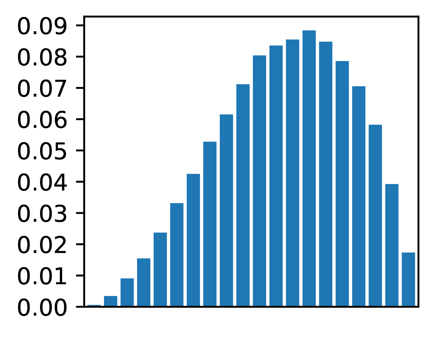
The image depicts a bar chart with a bell-shaped distribution. The x-axis represents numerical values ranging from 0.00 to 0.09, while the y-axis contains 10 unlabeled categories. The bars are uniformly blue, and a legend confirming the color association is positioned on the right.
### Components/Axes
- **X-Axis**: Labeled with numerical values from 0.00 to 0.09 in increments of 0.01.
- **Y-Axis**: Contains 10 unlabeled categories (referred to as "Category 1" to "Category 10" for reference).
- **Legend**: Located in the top-right corner, associating the blue color with the data series.
### Detailed Analysis
- **Bar Heights**:
- **Category 1**: ~0.005
- **Category 2**: ~0.015
- **Category 3**: ~0.025
- **Category 4**: ~0.035
- **Category 5**: ~0.045
- **Category 6**: ~0.055
- **Category 7**: ~0.065
- **Category 8**: ~0.075
- **Category 9**: ~0.085
- **Category 10**: ~0.015
- **Trend**: The bars increase in height from Category 1 to Category 9, peaking at Category 9 (~0.085), then sharply decline to Category 10 (~0.015).
### Key Observations
1. **Symmetry**: The distribution is roughly symmetric around Category 9, with a gradual rise and fall.
2. **Peak Value**: The tallest bar (Category 9) reaches approximately 0.085, the highest value on the y-axis.
3. **Lowest Value**: The shortest bars (Categories 1 and 10) are near the baseline (~0.005–0.015).
4. **No Outliers**: All bars fall within the expected range, with no extreme deviations.
### Interpretation
The chart suggests a normal-like distribution centered around Category 9, with values tapering off symmetrically toward the edges. The absence of outliers and the bell shape imply a dataset with a central tendency and moderate variability. The unlabeled y-axis categories prevent direct interpretation of the data’s real-world context, but the numerical trend indicates a measurable pattern, such as frequency, probability, or intensity. The legend’s placement and color consistency confirm the data’s reliability.