## Line Chart: Transfer Time vs. ID Batch Size
### Overview
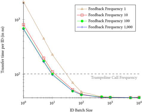
This image displays a log-log line chart illustrating the relationship between "ID Batch Size" and "Transfer time per ID (in ns)." The chart compares four different "Feedback Frequency" settings (1, 10, 100, and 1,000) to demonstrate how batching affects transfer performance. A horizontal reference line indicates the "Trampoline Call Frequency."
### Components/Axes
* **X-Axis:** Labeled "ID Batch Size." It uses a logarithmic scale ranging from $10^0$ (1) to $10^4$ (10,000).
* **Y-Axis:** Labeled "Transfer time per ID (in ns)." It uses a logarithmic scale starting above $10^1$ (10) and extending to $10^3$ (1,000) and beyond.
* **Legend:** Located in the top-right corner. It maps the following markers/colors to specific feedback frequencies:
* **Brown Triangle:** Feedback Frequency 1
* **Red Square:** Feedback Frequency 10
* **Green Circle:** Feedback Frequency 100
* **Blue Plus (+):** Feedback Frequency 1,000
* **Reference Line:** A dashed horizontal line is positioned at the $y=100$ mark, labeled "Trampoline Call Frequency" in grey text below the line.
### Detailed Analysis
**Trend Verification:**
All four data series exhibit a strong negative correlation (inverse relationship) between ID Batch Size and Transfer time per ID. The transfer time drops sharply as the batch size increases from 1 to 100. Beyond a batch size of 100, the curves flatten significantly, approaching a horizontal asymptote near 20 ns.
**Data Point Extraction (Approximate Values):**
| ID Batch Size | Feedback Freq 1 (Brown) | Feedback Freq 10 (Red) | Feedback Freq 100 (Green) | Feedback Freq 1,000 (Blue) |
| :--- | :--- | :--- | :--- | :--- |
| **1** | ~2,500 ns | ~800 ns | ~700 ns | ~700 ns |
| **5** | ~500 ns | ~200 ns | ~180 ns | ~180 ns |
| **10** | ~250 ns | ~110 ns | ~100 ns | ~100 ns |
| **50** | ~70 ns | ~40 ns | ~35 ns | ~35 ns |
| **100** | ~40 ns | ~30 ns | ~28 ns | ~28 ns |
| **500+** | ~25 ns | ~22 ns | ~22 ns | ~22 ns |
*Note: The Green (100) and Blue (1,000) lines are nearly identical throughout the entire range, with the Blue line consistently tracking slightly below or overlapping the Green line.*
### Key Observations
* **Performance Gap:** "Feedback Frequency 1" (Brown) is consistently the least efficient, showing significantly higher transfer times than the other frequencies, particularly at lower batch sizes.
* **The "Trampoline" Threshold:** The "Trampoline Call Frequency" line at 100 ns serves as a clear performance threshold. Batch sizes of 10 or fewer result in transfer times above this threshold for all feedback frequencies.
* **Diminishing Returns:** The most significant performance gains occur between batch sizes of 1 and 100. Increasing the batch size beyond 100 yields minimal improvements in transfer time.
### Interpretation
This chart likely represents performance benchmarking for a data transfer or RPC (Remote Procedure Call) system. The "Trampoline Call Frequency" likely refers to a specific overhead cost associated with the system's execution mechanism.
The data suggests that:
1. **Batching is critical:** Small batch sizes (1–10) incur a heavy performance penalty, likely due to the overhead of individual calls or feedback loops.
2. **Feedback Frequency Impact:** Lower feedback frequencies (specifically 1) are significantly more expensive. This implies that the system is optimized for higher-frequency feedback, or that the "Feedback Frequency 1" setting forces a synchronous or blocking behavior that is inefficient.
3. **Optimization Ceiling:** There is a "knee" in the curve around a batch size of 100. Beyond this point, the overhead of the transfer mechanism is minimized, and further increasing the batch size provides negligible benefit, suggesting that 100 is the optimal batch size for this system.