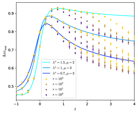
## Line Chart with Scatter Data: Accuracy over Time for Different Parameters
### Overview
The image is a scientific line chart overlaid with scatter data points. It plots a metric labeled "Acc_{ent}" (likely "Accuracy" or a related measure) against a variable "t" (likely time or a time-like parameter). The chart compares three theoretical or fitted curves (solid lines) against four sets of empirical or simulated data points (scatter markers), each corresponding to different parameter values.
### Components/Axes
* **X-Axis:**
* **Label:** `t`
* **Range:** -1 to 4
* **Major Ticks:** At -1, 0, 1, 2, 3, 4.
* **Y-Axis:**
* **Label:** `Acc_{ent}` (The subscript "ent" is present).
* **Range:** 0.5 to 0.9 (approximately, based on visible ticks).
* **Major Ticks:** At 0.5, 0.6, 0.7, 0.8, 0.9.
* **Legend (Position: Bottom-Left Corner):**
* **Line Series:**
1. **Cyan Line:** `λ* = 1.5, μ = 2`
2. **Medium Blue Line:** `λ* = 1, μ = 3`
3. **Dark Blue Line:** `λ* = 0.7, μ = 3`
* **Scatter Series (Circular Markers):**
1. **Yellow/Gold Markers:** `r = 10^3`
2. **Light Brown/Tan Markers:** `r = 10^2`
3. **Medium Brown Markers:** `r = 10^1`
4. **Dark Purple/Brown Markers:** `r = 10^0`
### Detailed Analysis
**1. Line Trends (Theoretical/Fitted Models):**
* **Cyan Line (λ*=1.5, μ=2):** Starts lowest at t=-1 (~0.47). Rises most steeply, crossing the other lines. Peaks highest at approximately t=0.5 with Acc_{ent} ≈ 0.93. After the peak, it declines the most gradually, remaining the highest line for t > 1, ending near Acc_{ent} ≈ 0.89 at t=4.
* **Medium Blue Line (λ*=1, μ=3):** Starts at an intermediate level at t=-1 (~0.49). Rises steeply but less so than the cyan line. Peaks at approximately t=0.3 with Acc_{ent} ≈ 0.89. Declines more steeply than the cyan line, ending near Acc_{ent} ≈ 0.75 at t=4.
* **Dark Blue Line (λ*=0.7, μ=3):** Starts highest at t=-1 (~0.50). Has the shallowest initial rise. Peaks earliest and lowest at approximately t=0.2 with Acc_{ent} ≈ 0.85. Declines the most steeply, ending as the lowest line near Acc_{ent} ≈ 0.64 at t=4.
**2. Scatter Data Trends (Empirical/Simulated Points):**
* **General Pattern:** All scatter series follow the same general shape as the lines: a rapid rise from t=-1 to a peak between t=0 and t=1, followed by a gradual decline. The points show significant vertical spread (variance) at each t value.
* **Yellow/Gold (r=10^3):** Consistently forms the upper envelope of the data cloud. Its peak is the highest, near Acc_{ent} ≈ 0.94 around t=0.7. It remains the highest series throughout the decline phase.
* **Light Brown (r=10^2):** Generally lies below the yellow points but above the others. Peaks around Acc_{ent} ≈ 0.92.
* **Medium Brown (r=10^1):** Lies in the middle-lower region of the data cloud.
* **Dark Purple (r=10^0):** Consistently forms the lower envelope of the data cloud. Its peak is the lowest, near Acc_{ent} ≈ 0.84. It shows the most pronounced decline, dropping to near Acc_{ent} ≈ 0.55 by t=4.
**3. Relationship Between Lines and Scatter:**
* The **Cyan Line (λ*=1.5, μ=2)** appears to be a good fit for the central tendency of the **Yellow (r=10^3)** data, especially for t > 1.
* The **Medium Blue Line (λ*=1, μ=3)** passes through the middle of the overall data cloud.
* The **Dark Blue Line (λ*=0.7, μ=3)** appears to be a good fit for the central tendency of the **Dark Purple (r=10^0)** data.
* This suggests the lines may represent model predictions for different values of a parameter `r`, with `λ*` and `μ` being other model parameters that vary with `r`.
### Key Observations
1. **Parameter Sensitivity:** The system's peak accuracy and its long-term decay are highly sensitive to the parameters. Higher `r` (and correspondingly higher `λ*`) leads to higher peak accuracy and slower decay.
2. **Convergence and Divergence:** All models and data converge in the rising phase (t < 0). They diverge significantly after the peak (t > 1), with the performance gap between high and low `r` widening over time.
3. **Peak Timing:** The peak occurs earlier for lower `r` values (and lower `λ*`). The dark blue line/low-r data peaks near t=0.2, while the cyan line/high-r data peaks near t=0.5-0.7.
4. **Data Variance:** The vertical spread of the scatter points indicates substantial stochasticity or noise in the measured `Acc_{ent}` for any given `t` and `r`. The variance appears relatively consistent across `t` after the peak.
### Interpretation
This chart likely illustrates the performance (accuracy) of a system—such as a machine learning model, a communication protocol, or a biological process—over time or under increasing load (`t`). The parameter `r` could represent a resource level (e.g., signal-to-noise ratio, data rate, population size), where higher `r` denotes a more favorable condition.
The key finding is a **performance trade-off**: configurations optimized for a high peak accuracy (high `r`, high `λ*`) also exhibit greater resilience, maintaining their advantage over time. Conversely, resource-constrained configurations (low `r`) not only peak lower but also degrade faster. The fitted lines suggest this behavior can be captured by a mathematical model with parameters `λ*` and `μ`, where `λ*` may control the peak height and `μ` the decay rate. The strong correlation between the line fits and the respective scatter envelopes validates the model's ability to describe the system's behavior across different operating regimes. The persistent scatter highlights the inherent uncertainty or noise in the process, which the model averages through.