## Bar Chart: Process Error Rate
### Overview
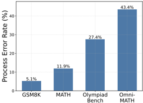
The image is a bar chart comparing the process error rate (in percentage) across four different datasets: GSM8K, MATH, Olympiad Bench, and Omni-MATH. The chart shows a clear increasing trend in the error rate from GSM8K to Omni-MATH.
### Components/Axes
* **Y-axis:** "Process Error Rate (%)". The scale ranges from 0% to approximately 45%, with gridlines at intervals of approximately 10%.
* **X-axis:** Categorical axis representing the datasets: GSM8K, MATH, Olympiad Bench, and Omni-MATH.
* **Bars:** Each dataset is represented by a blue bar, with the height corresponding to the process error rate.
### Detailed Analysis
* **GSM8K:** The process error rate is 5.1%.
* **MATH:** The process error rate is 11.9%.
* **Olympiad Bench:** The process error rate is 27.4%.
* **Omni-MATH:** The process error rate is 43.4%.
### Key Observations
* The process error rate increases significantly from GSM8K to Omni-MATH.
* The largest jump in error rate occurs between Olympiad Bench and Omni-MATH.
* The error rate for Omni-MATH is more than eight times that of GSM8K.
### Interpretation
The bar chart illustrates the relative difficulty or complexity of the four datasets in terms of process error rate. GSM8K appears to be the easiest, while Omni-MATH is the most challenging. The increasing trend suggests that as the complexity of the dataset increases, the process error rate also increases. This could be due to factors such as the complexity of the problems, the amount of data, or the diversity of the data. The large difference between Olympiad Bench and Omni-MATH suggests that Omni-MATH introduces a significant increase in complexity compared to the other datasets.