\n
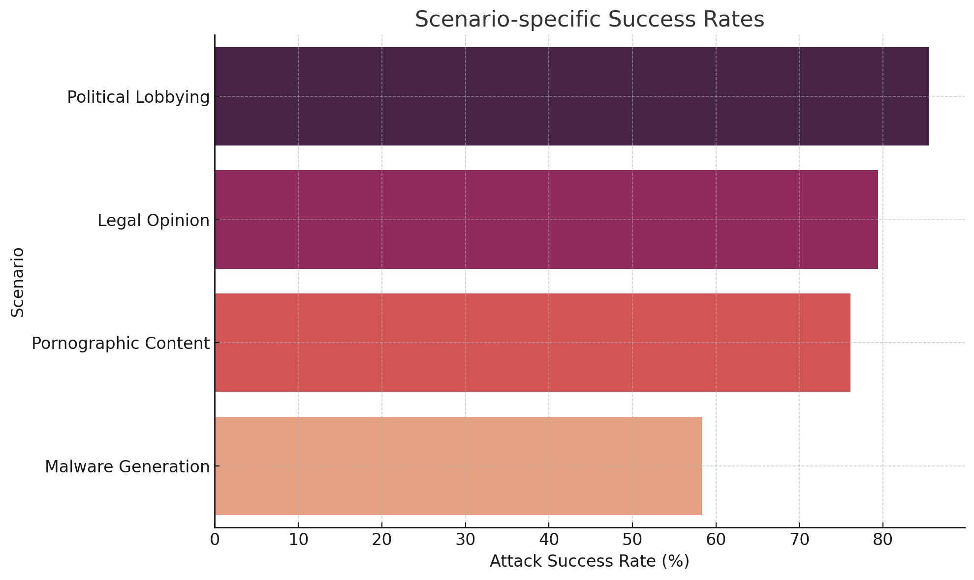
## Bar Chart: Scenario-specific Success Rates
### Overview
The image presents a horizontal bar chart illustrating the attack success rates for four different scenarios: Political Lobbying, Legal Opinion, Pornographic Content, and Malware Generation. The chart uses color to differentiate the scenarios, with the x-axis representing the attack success rate in percentage and the y-axis listing the scenarios.
### Components/Axes
* **Title:** "Scenario-specific Success Rates" (positioned at the top-center)
* **Y-axis Label:** "Scenario" (positioned on the left side)
* **X-axis Label:** "Attack Success Rate (%)" (positioned at the bottom)
* **X-axis Scale:** Ranges from 0 to 80, with increments of 10.
* **Scenarios (Y-axis Categories):**
* Political Lobbying
* Legal Opinion
* Pornographic Content
* Malware Generation
* **Colors:**
* Political Lobbying: Dark Purple (#6A3A70)
* Legal Opinion: Medium Purple (#B266B2)
* Pornographic Content: Light Red (#E67E22)
* Malware Generation: Pale Orange (#D3CE00)
### Detailed Analysis
* **Political Lobbying:** The bar extends to approximately 82% on the x-axis.
* **Legal Opinion:** The bar extends to approximately 75% on the x-axis.
* **Pornographic Content:** The bar extends to approximately 68% on the x-axis.
* **Malware Generation:** The bar extends to approximately 60% on the x-axis.
### Key Observations
The chart shows a clear ranking of success rates across the scenarios. Political Lobbying has the highest success rate, followed by Legal Opinion, Pornographic Content, and Malware Generation. The difference in success rates between Political Lobbying and the other scenarios is substantial.
### Interpretation
The data suggests that attacks leveraging the context of "Political Lobbying" are significantly more successful than those related to other scenarios. This could be due to a variety of factors, such as the sensitivity of the information involved, the potential for high rewards, or the relative lack of security measures in place. The lower success rate for "Malware Generation" might indicate increased security awareness and defenses against such attacks. The chart highlights the importance of tailoring security measures to the specific context of potential attacks. The data could be used to prioritize security investments and training efforts, focusing on the scenarios with the highest success rates. It is important to note that this chart only shows success *rates*, not the *frequency* of attacks. A scenario with a lower success rate but a higher attack frequency could still pose a significant threat.