## Scatter Plot: Apple Preference Evaluation
### Overview
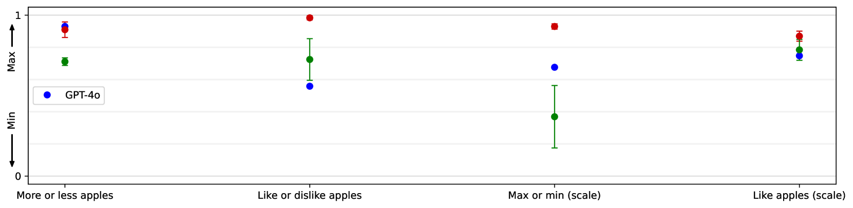
The image presents a scatter plot comparing the "Max" and "Min" values across four different categories related to apple preference: "More or less apples", "Like or dislike apples", "Max or min (scale)", and "Like apples (scale)". Each category is represented by a data point with error bars, and a separate data series is shown for "GPT-40" (blue).
### Components/Axes
* **X-axis:** Represents the four categories of apple preference: "More or less apples", "Like or dislike apples", "Max or min (scale)", and "Like apples (scale)".
* **Y-axis:** Labeled "Max" at the top and "Min" at the bottom, with a scale ranging from 0 to 1.
* **Data Series:** Two data series are present:
* Red data points with error bars.
* Blue data points labeled "GPT-40" with error bars.
* **Legend:** Located in the bottom-left corner, identifying the blue data points as "GPT-40".
### Detailed Analysis
Let's analyze each category individually, referencing the color-coded data points and error bars:
1. **More or less apples:**
* Red point: Approximately (0.25, 0.95). Error bars extend from approximately 0.7 to 1.0 on the Y-axis.
* GPT-40 (Blue point): Approximately (0.25, 0.5). Error bars extend from approximately 0.3 to 0.7 on the Y-axis.
2. **Like or dislike apples:**
* Red point: Approximately (0.75, 0.8). Error bars extend from approximately 0.5 to 1.0 on the Y-axis.
* GPT-40 (Blue point): Approximately (0.75, 0.4). Error bars extend from approximately 0.2 to 0.6 on the Y-axis.
3. **Max or min (scale):**
* Red point: Approximately (1.25, 0.9). Error bars extend from approximately 0.6 to 1.2 on the Y-axis.
* GPT-40 (Blue point): Approximately (1.25, 0.6). Error bars extend from approximately 0.4 to 0.8 on the Y-axis.
4. **Like apples (scale):**
* Red point: Approximately (1.75, 0.9). Error bars extend from approximately 0.7 to 1.1 on the Y-axis.
* GPT-40 (Blue point): Approximately (1.75, 0.5). Error bars extend from approximately 0.3 to 0.7 on the Y-axis.
### Key Observations
* The red data points consistently show higher "Max" values compared to the "GPT-40" blue data points across all four categories.
* The error bars indicate a significant range of variation within each category for both data series.
* The "GPT-40" data points generally cluster lower on the Y-axis, suggesting a lower maximum value for this series across all categories.
* The error bars for the red data points are generally larger than those for the GPT-40 data points, indicating greater variability.
### Interpretation
This plot appears to be evaluating the range of responses (from "Min" to "Max") for different apple preference questions, comparing a general population (represented by the red data points) to the responses generated by the "GPT-40" model (blue data points).
The consistently higher "Max" values for the red data points suggest that the general population exhibits a wider range of responses, with some individuals expressing very strong positive preferences. The "GPT-40" model, on the other hand, appears to have a more constrained range of responses, with lower maximum values.
The larger error bars for the red data points indicate greater diversity in opinions within the general population. The GPT-40 model's smaller error bars suggest more consistent, but potentially less nuanced, responses.
The plot doesn't provide information about the *nature* of the responses, only the range. It's possible that GPT-40 is more conservative in its responses, or that the data collection methods for the red data points are more prone to outliers. Further investigation would be needed to understand the underlying reasons for these differences.