## Scatter Plot: Apple Preference Scale
### Overview
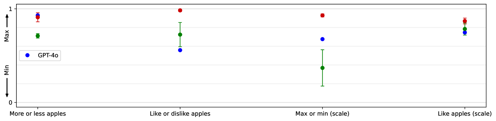
The image is a scatter plot comparing different models' responses to questions about apple preference. The x-axis represents different questions related to apple preference, and the y-axis represents a scale from 0 to 1, presumably indicating the strength or intensity of the response. Error bars are present, indicating the variability or uncertainty in the responses.
### Components/Axes
* **X-axis:** Categorical, with the following categories:
* "More or less apples"
* "Like or dislike apples"
* "Max or min (scale)"
* "Like apples (scale)"
* **Y-axis:** Numerical, scaled from 0 to 1, labeled "Min" at the bottom and "Max" at the top.
* **Legend:** Located on the left side of the chart.
* Blue: "GPT-4o"
* **Data Points:** Each category on the x-axis has data points for each model, with error bars.
### Detailed Analysis
Here's a breakdown of the data points for each category:
* **More or less apples:**
* Red: Approximately 0.93, with error bars extending from approximately 0.9 to 0.96.
* Green: Approximately 0.75, with error bars extending from approximately 0.72 to 0.78.
* Blue (GPT-4o): Not present in this category.
* **Like or dislike apples:**
* Red: Approximately 1.0.
* Green: Approximately 0.75, with error bars extending from approximately 0.6 to 0.9.
* Blue (GPT-4o): Approximately 0.5, with no visible error bars.
* **Max or min (scale):**
* Red: Approximately 0.95.
* Green: Approximately 0.25, with error bars extending from approximately 0.1 to 0.4.
* Blue (GPT-4o): Approximately 0.7, with no visible error bars.
* **Like apples (scale):**
* Red: Approximately 0.9, with error bars extending from approximately 0.87 to 0.93.
* Green: Approximately 0.85, with error bars extending from approximately 0.82 to 0.88.
* Blue (GPT-4o): Approximately 0.7, with no visible error bars.
### Key Observations
* The red data points consistently score high across all categories, indicating a strong preference for apples.
* The green data points show more variability, with lower scores in the "Max or min (scale)" category.
* The blue data points (GPT-4o) are present in the last three categories, with scores generally between 0.5 and 0.7.
* Error bars vary in size, indicating different levels of uncertainty in the responses.
### Interpretation
The scatter plot visualizes the responses of different models to questions about apple preference. The red data points, which are consistently high, may represent a baseline or a "gold standard" response. The green data points show more nuanced responses, with a lower score in the "Max or min (scale)" category, suggesting a potential sensitivity to the framing of the question. The blue data points (GPT-4o) provide a comparison point, showing a moderate preference for apples across the last three categories. The error bars indicate the variability in the responses, which could be due to factors such as the specific wording of the questions or the inherent uncertainty in the models' responses. Overall, the plot provides a comparative analysis of different models' apple preference, highlighting both similarities and differences in their responses.