## LineChart: Apple Preference and Scale Analysis
### Overview
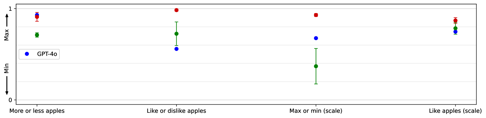
The chart compares three data series (GPT-4o, red, green) across four categories related to apple preferences and scale measurements. The y-axis represents a normalized scale (0–1), labeled "Max" and "Min," with error bars indicating uncertainty. The legend identifies GPT-4o (blue), but the red and green series lack explicit labels.
### Components/Axes
- **X-axis**: Four categories:
1. "More or less apples"
2. "Like or dislike apples"
3. "Max or min (scale)"
4. "Like apples (scale)"
- **Y-axis**: Labeled "Max" and "Min," with a range from 0 to 1.
- **Legend**: Located on the left, showing GPT-4o (blue). Red and green series are unlabeled.
- **Error Bars**: Vertical lines indicating uncertainty for each data point.
### Detailed Analysis
1. **"More or less apples"**:
- GPT-4o (blue): Max ≈ 0.90 (0.85–0.95), Min ≈ 0.80 (0.75–0.85).
- Red: Max ≈ 0.95 (0.90–1.00), Min ≈ 0.85 (0.80–0.90).
- Green: Max ≈ 0.75 (0.70–0.80), Min ≈ 0.65 (0.60–0.70).
2. **"Like or dislike apples"**:
- GPT-4o (blue): Max ≈ 0.60 (0.55–0.65), Min ≈ 0.50 (0.45–0.55).
- Red: Max ≈ 1.00 (0.95–1.05), Min ≈ 0.70 (0.65–0.75).
- Green: Max ≈ 0.75 (0.70–0.80), Min ≈ 0.60 (0.55–0.65).
3. **"Max or min (scale)"**:
- GPT-4o (blue): Max ≈ 0.70 (0.65–0.75), Min ≈ 0.50 (0.45–0.55).
- Red: Max ≈ 0.90 (0.85–0.95), Min ≈ 0.60 (0.55–0.65).
- Green: Max ≈ 0.50 (0.40–0.60), Min ≈ 0.30 (0.25–0.35).
4. **"Like apples (scale)"**:
- GPT-4o (blue): Max ≈ 0.80 (0.75–0.85), Min ≈ 0.70 (0.65–0.75).
- Red: Max ≈ 0.85 (0.80–0.90), Min ≈ 0.75 (0.70–0.80).
- Green: Max ≈ 0.80 (0.75–0.85), Min ≈ 0.70 (0.65–0.75).
### Key Observations
- **Red series** consistently shows the highest Max values, reaching 1.00 in "Like or dislike apples."
- **Green series** exhibits the largest uncertainty in "Max or min (scale)" (error range: 0.30–0.60).
- **GPT-4o (blue)** demonstrates moderate performance across all categories, with smaller error bars.
- The unlabeled red and green series lack contextual identification, limiting interpretability.
### Interpretation
The chart suggests that the red series (unlabeled) performs best in apple preference and scale metrics, particularly in "Like or dislike apples" and "Like apples (scale)." The green series shows significant variability in "Max or min (scale)," possibly due to measurement noise or smaller sample sizes. GPT-4o (blue) acts as a baseline, with stable but lower performance. The absence of labels for red and green series highlights a critical gap in data transparency, necessitating further clarification for robust analysis.