## Scatter Plot: A-mem vs. Base Data Distribution
### Overview
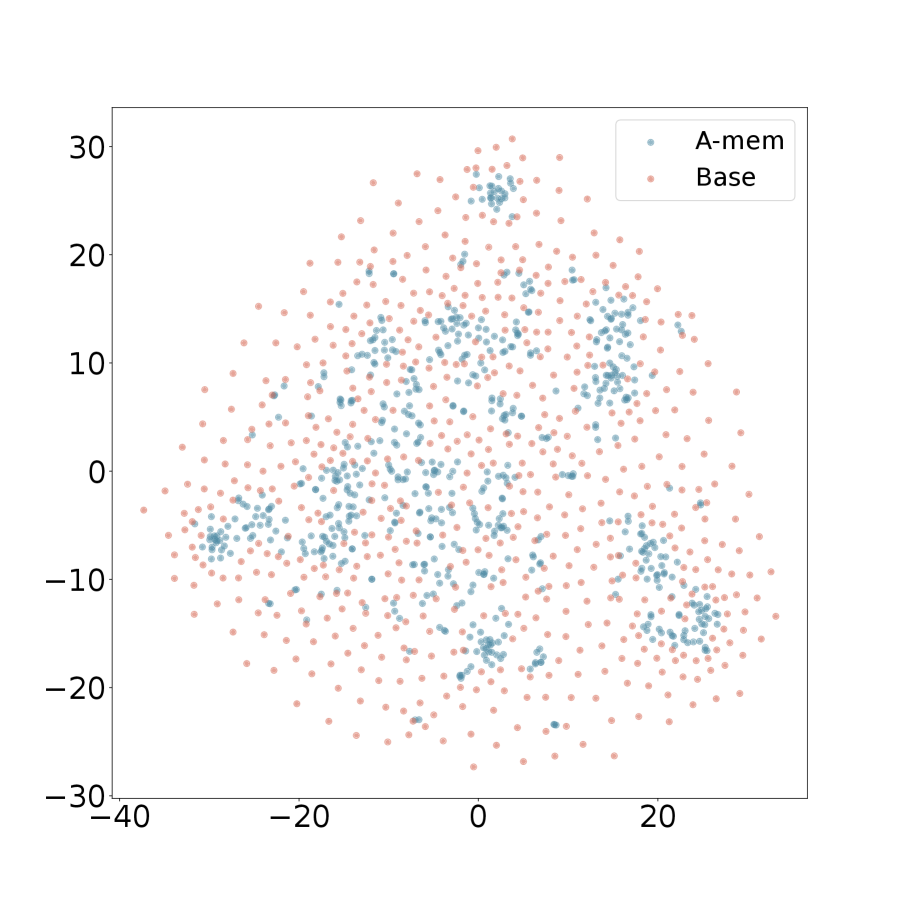
The image is a 2D scatter plot comparing the spatial distribution of two datasets, labeled "A-mem" and "Base". The plot visualizes the relative positioning of numerous data points across a Cartesian coordinate system, revealing distinct clustering patterns for the two groups.
### Components/Axes
* **Plot Type:** Scatter plot.
* **X-Axis:** Horizontal axis with numerical markers. The visible range is from approximately **-40 to 20**, with major tick marks at -40, -20, 0, and 20. There is no explicit axis title.
* **Y-Axis:** Vertical axis with numerical markers. The visible range is from approximately **-30 to 30**, with major tick marks at -30, -20, -10, 0, 10, 20, and 30. There is no explicit axis title.
* **Legend:** Located in the **top-right corner** of the plot area. It contains two entries:
* A blue dot labeled **"A-mem"**.
* A pink/salmon dot labeled **"Base"**.
* **Data Points:** Hundreds of individual points plotted according to their (x, y) coordinates. Points are colored according to their series as defined in the legend.
### Detailed Analysis
**1. "A-mem" Series (Blue Points):**
* **Visual Trend:** The blue points are not uniformly distributed. They form several distinct, dense clusters separated by areas of lower density.
* **Spatial Distribution & Key Clusters:**
* A major, dense cluster is centered near the origin **(0, 0)**, extending roughly from x=-10 to x=10 and y=-10 to y=10.
* Another significant cluster is located in the **upper-right quadrant**, centered approximately at **(15, 10)**.
* A smaller, distinct cluster appears in the **lower-left quadrant**, centered near **(-25, -5)**.
* Additional smaller groupings are visible in the **upper-left quadrant** (around (-10, 15)) and the **lower-right quadrant** (around (15, -15)).
* **Range:** The points span nearly the entire visible plot area, from x ≈ -35 to x ≈ 25 and y ≈ -25 to y ≈ 25.
**2. "Base" Series (Pink Points):**
* **Visual Trend:** The pink points are widely and more evenly dispersed across the entire plot area, forming a broad, diffuse cloud.
* **Spatial Distribution:** They lack the tight clustering seen in the "A-mem" series. The density appears relatively uniform, though slightly sparser at the extreme edges of the distribution (e.g., near x=-40, y=-30).
* **Range:** The points cover a slightly wider area than the "A-mem" series, extending from x ≈ -40 to x ≈ 30 and y ≈ -30 to y ≈ 30.
**3. Relationship Between Series:**
* The "A-mem" clusters are embedded within the broader "Base" cloud.
* The dense central "A-mem" cluster overlaps significantly with the central region of the "Base" distribution.
* The other "A-mem" clusters (e.g., upper-right, lower-left) are located in regions that are also populated by "Base" points, but the "A-mem" points are much more concentrated there.
### Key Observations
1. **Clustering vs. Dispersion:** The most striking feature is the structural difference between the two datasets. "A-mem" exhibits clear multimodality (multiple clusters), while "Base" appears unimodal and diffuse.
2. **Spatial Overlap:** Despite different distributions, both series occupy the same general feature space, with significant overlap in the central region.
3. **Cluster Locations:** The "A-mem" clusters are not randomly placed; they appear in specific quadrants, suggesting potential subgroups or states within that dataset.
4. **Density Gradient:** The "Base" series shows a subtle density gradient, being densest near the center (0,0) and gradually thinning toward the periphery.
### Interpretation
This scatter plot likely visualizes the output of a dimensionality reduction technique (like t-SNE or UMAP) applied to two different models or conditions ("A-mem" and "Base"). The plot suggests:
* **Underlying Structure:** The "A-mem" model or condition produces representations (or data points) that naturally separate into distinct, meaningful clusters. This could indicate it has learned to categorize or differentiate between several underlying states, concepts, or classes within the data.
* **Baseline Distribution:** The "Base" model/condition produces a more homogeneous, less structured representation, suggesting it does not differentiate the underlying data as sharply.
* **Relationship:** The "A-mem" clusters emerging from the "Base" cloud could imply that "A-mem" is a specialized or refined version of "Base," where specific patterns have been amplified and separated from the general background noise.
* **Investigative Insight:** A researcher would use this plot to argue that the "A-mem" approach leads to more structured and potentially more interpretable internal representations. The next step would be to investigate what real-world categories or data attributes correspond to each of the identified "A-mem" clusters. The lack of axis labels limits direct physical interpretation but is common in such embedding visualizations where the axes represent abstract, non-linear dimensions.