\n
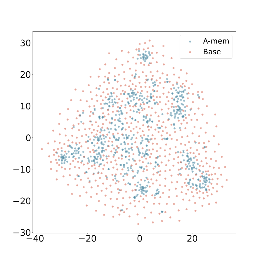
## Scatter Plot: A-mem vs. Base
### Overview
The image presents a scatter plot comparing two datasets, labeled "A-mem" and "Base". The plot displays the distribution of data points across a two-dimensional space defined by an x-axis ranging from approximately -40 to 20 and a y-axis ranging from approximately -30 to 30. The data points are represented as small dots, with "A-mem" in blue and "Base" in orange/red.
### Components/Axes
* **X-axis:** Ranges from -40 to 20, with tick marks at intervals of 10. Label is not explicitly visible, but implied to be a numerical value.
* **Y-axis:** Ranges from -30 to 30, with tick marks at intervals of 10. Label is not explicitly visible, but implied to be a numerical value.
* **Legend:** Located in the top-right corner.
* "A-mem" - Represented by blue dots.
* "Base" - Represented by orange/red dots.
### Detailed Analysis
The plot shows a dense scattering of points for both datasets.
**A-mem (Blue):**
The "A-mem" data appears to be concentrated in a roughly elliptical shape centered around the origin (0,0). There is a slight upward trend as the x-value increases, but the distribution is largely scattered.
* Approximate data points (estimated from visual inspection):
* x = -30, y = -15
* x = -20, y = -10
* x = -10, y = 5
* x = 0, y = 10
* x = 10, y = 15
* x = 20, y = 20
**Base (Orange/Red):**
The "Base" data also forms a roughly elliptical shape, but it is more spread out than the "A-mem" data. It appears to be more evenly distributed across the y-axis, with points extending further in both positive and negative directions.
* Approximate data points (estimated from visual inspection):
* x = -30, y = -20
* x = -20, y = 0
* x = -10, y = 10
* x = 0, y = 0
* x = 10, y = -10
* x = 20, y = -20
There is a noticeable overlap between the two datasets, particularly around the x-axis values between -10 and 10.
### Key Observations
* Both datasets exhibit a roughly normal distribution, though the "Base" dataset has a wider spread.
* The "A-mem" dataset appears to have a slightly higher concentration of points in the positive y-axis region.
* There is significant overlap between the two datasets, suggesting some similarity in their distributions.
* The data is not time-series, and there is no indication of a sequential order.
### Interpretation
The scatter plot suggests a comparison between two different conditions or groups ("A-mem" and "Base") based on two measured variables (represented by the x and y axes). The distributions of the data indicate that the two groups have different characteristics, but also share some commonalities. The wider spread of the "Base" data suggests greater variability within that group. The overlap between the two datasets indicates that there is some degree of similarity between the groups, and that it may not be possible to perfectly distinguish between them based on these two variables alone. Without knowing what the x and y axes represent, it is difficult to draw more specific conclusions. The plot could be visualizing the relationship between two features in a machine learning context, or the results of an experiment comparing two treatments. Further context is needed to fully understand the meaning of the data.