\n
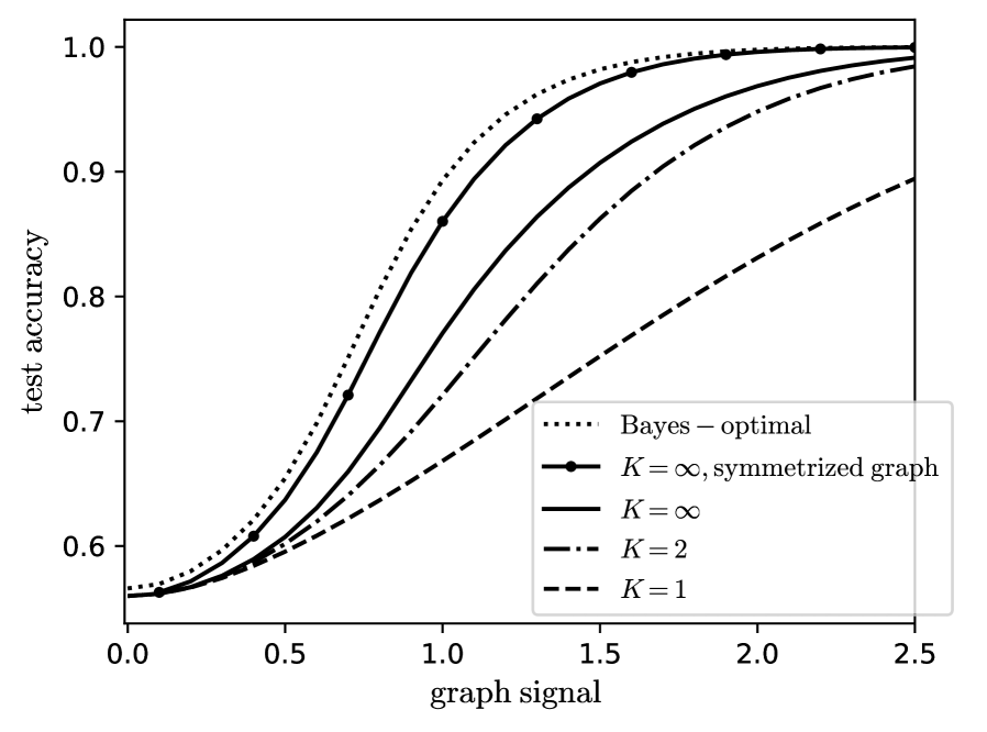
## Line Chart: Test Accuracy vs. Graph Signal
### Overview
The image presents a line chart illustrating the relationship between "graph signal" and "test accuracy" for different values of 'K' and a Bayes-optimal baseline. The chart compares the performance of several methods as the strength of the graph signal increases.
### Components/Axes
* **X-axis:** "graph signal", ranging from approximately 0.0 to 2.5.
* **Y-axis:** "test accuracy", ranging from approximately 0.55 to 1.05.
* **Legend:** Located in the top-right corner, listing the following data series:
* "Bayes – optimal" (dotted line, black)
* "K = ∞, symmetrized graph" (solid line, black)
* "K = ∞" (solid line, dark gray)
* "K = 2" (dashed line, gray)
* "K = 1" (dashed-dotted line, black)
### Detailed Analysis
The chart displays five distinct lines, each representing a different configuration.
* **Bayes – optimal (dotted black line):** This line starts at approximately (0.0, 0.6) and rapidly increases, reaching a plateau around (0.75, 0.98) and remaining near 1.0 for the rest of the range.
* **K = ∞, symmetrized graph (solid black line):** This line begins at approximately (0.0, 0.6) and increases more gradually than the Bayes-optimal line. It reaches approximately (0.75, 0.95) and continues to increase slowly, approaching 1.0 around (2.0, 0.99).
* **K = ∞ (solid dark gray line):** This line starts at approximately (0.0, 0.6) and increases at a rate between the Bayes-optimal and K = ∞, symmetrized graph lines. It reaches approximately (0.75, 0.93) and continues to increase, approaching 0.98 around (2.0, 0.98).
* **K = 2 (dashed gray line):** This line starts at approximately (0.0, 0.6) and increases at a slower rate than the previous lines. It reaches approximately (0.75, 0.85) and continues to increase, approaching 0.93 around (2.0, 0.93).
* **K = 1 (dashed-dotted black line):** This line starts at approximately (0.0, 0.6) and exhibits the slowest increase among all lines. It reaches approximately (0.75, 0.75) and continues to increase, approaching 0.88 around (2.0, 0.88).
All lines converge towards a test accuracy of approximately 1.0 as the graph signal increases.
### Key Observations
* The Bayes-optimal method consistently achieves the highest test accuracy across all graph signal values.
* Increasing the value of K generally improves test accuracy, with K = 1 performing the worst and K = ∞, symmetrized graph performing the best among the K values tested.
* The performance gap between the methods decreases as the graph signal increases.
* All methods start with a similar test accuracy at a graph signal of 0.0.
### Interpretation
The chart demonstrates the impact of graph signal strength and parameter 'K' on the test accuracy of different methods. The Bayes-optimal method represents an upper bound on achievable accuracy. The results suggest that as the graph signal becomes stronger (higher values on the x-axis), the performance of all methods improves and converges. The parameter 'K' appears to influence the rate of improvement, with larger values of K leading to faster convergence towards the optimal accuracy. The "symmetrized graph" modification for K = ∞ further enhances performance. This could indicate that incorporating symmetry into the graph structure improves the accuracy of the method. The chart highlights the trade-off between computational complexity (potentially higher for larger K) and accuracy. The data suggests that for weak graph signals, the choice of K is crucial, while for strong graph signals, the performance difference between different K values becomes less significant.