\n
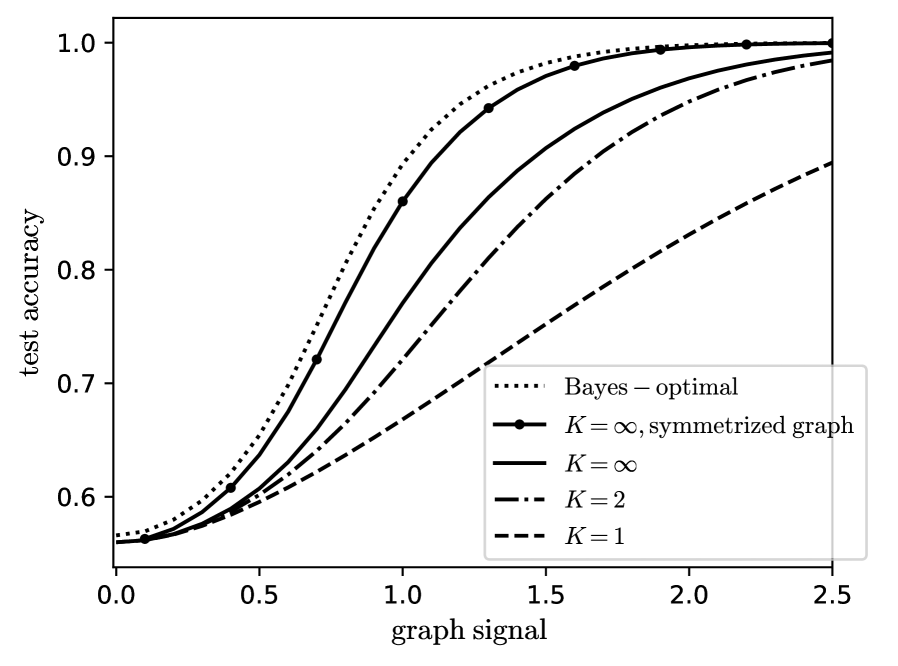
## Line Graph: Test Accuracy vs. Graph Signal for Different K Values
### Overview
The image is a line graph plotting "test accuracy" against "graph signal." It compares the performance of five different models or conditions, represented by distinct line styles. The graph demonstrates how accuracy improves with increasing graph signal strength, with different methods converging toward perfect accuracy (1.0) at different rates.
### Components/Axes
* **X-Axis (Horizontal):**
* **Label:** `graph signal`
* **Scale:** Linear, ranging from 0.0 to 2.5.
* **Major Tick Marks:** 0.0, 0.5, 1.0, 1.5, 2.0, 2.5.
* **Y-Axis (Vertical):**
* **Label:** `test accuracy`
* **Scale:** Linear, ranging from 0.6 to 1.0.
* **Major Tick Marks:** 0.6, 0.7, 0.8, 0.9, 1.0.
* **Legend:**
* **Position:** Bottom-right corner of the plot area.
* **Entries (from top to bottom as listed):**
1. `Bayes – optimal` (represented by a dotted line `...`)
2. `K = ∞, symmetrized graph` (represented by a solid line with circular markers `—•—`)
3. `K = ∞` (represented by a solid line `—`)
4. `K = 2` (represented by a dash-dot line `-.-`)
5. `K = 1` (represented by a dashed line `--`)
### Detailed Analysis
The graph shows five sigmoidal (S-shaped) curves, all starting at approximately the same low accuracy for a graph signal of 0.0 and increasing toward an accuracy of 1.0 as the signal increases. The curves are ordered by performance.
1. **Bayes – optimal (Dotted Line):**
* **Trend:** This is the highest-performing curve, representing the theoretical upper bound. It rises the most steeply.
* **Approximate Data Points:**
* At signal 0.0: Accuracy ≈ 0.56
* At signal 0.5: Accuracy ≈ 0.65
* At signal 1.0: Accuracy ≈ 0.92
* At signal 1.5: Accuracy ≈ 0.99
* Reaches near-perfect accuracy (≈1.0) by signal ≈ 2.0.
2. **K = ∞, symmetrized graph (Solid Line with Markers):**
* **Trend:** This curve closely follows the Bayes-optimal line but is consistently slightly below it. It is the best-performing practical method shown.
* **Approximate Data Points (Markers):**
* At signal 0.0: Accuracy ≈ 0.56
* At signal 0.5: Accuracy ≈ 0.61
* At signal 1.0: Accuracy ≈ 0.86
* At signal 1.5: Accuracy ≈ 0.98
* At signal 2.0: Accuracy ≈ 1.0
3. **K = ∞ (Solid Line):**
* **Trend:** This curve is below the symmetrized version. It shows a clear performance gap compared to the symmetrized graph, especially in the mid-range of graph signal (0.5 to 1.5).
* **Approximate Data Points:**
* At signal 0.0: Accuracy ≈ 0.56
* At signal 0.5: Accuracy ≈ 0.59
* At signal 1.0: Accuracy ≈ 0.75
* At signal 1.5: Accuracy ≈ 0.92
* At signal 2.0: Accuracy ≈ 0.98
4. **K = 2 (Dash-Dot Line):**
* **Trend:** This curve shows significantly slower improvement than the K=∞ variants. It requires a much stronger graph signal to achieve high accuracy.
* **Approximate Data Points:**
* At signal 0.0: Accuracy ≈ 0.56
* At signal 0.5: Accuracy ≈ 0.58
* At signal 1.0: Accuracy ≈ 0.65
* At signal 1.5: Accuracy ≈ 0.80
* At signal 2.0: Accuracy ≈ 0.92
* At signal 2.5: Accuracy ≈ 0.98
5. **K = 1 (Dashed Line):**
* **Trend:** This is the lowest-performing curve. Its ascent is the most gradual, indicating the weakest relationship between graph signal and test accuracy for this condition.
* **Approximate Data Points:**
* At signal 0.0: Accuracy ≈ 0.56
* At signal 0.5: Accuracy ≈ 0.57
* At signal 1.0: Accuracy ≈ 0.60
* At signal 1.5: Accuracy ≈ 0.68
* At signal 2.0: Accuracy ≈ 0.78
* At signal 2.5: Accuracy ≈ 0.89
### Key Observations
* **Performance Hierarchy:** There is a clear and consistent ordering of performance: Bayes-optimal > K=∞, symmetrized > K=∞ > K=2 > K=1. This hierarchy holds across the entire range of graph signal values > 0.
* **Convergence:** All methods start at a baseline accuracy of approximately 0.56 (likely random chance for a binary classification task) when the graph signal is zero. All methods appear to converge toward an accuracy of 1.0, but at vastly different rates.
* **Impact of Symmetrization:** For the K=∞ condition, symmetrizing the graph provides a substantial and consistent boost in accuracy, particularly in the critical transition region (signal between 0.5 and 1.5).
* **Impact of K Value:** Lower values of K (1 and 2) result in significantly worse performance, requiring a much stronger signal to achieve the same accuracy as the K=∞ models. The gap between K=2 and K=1 is also notable.
### Interpretation
This graph likely comes from a study on graph-based semi-supervised learning or signal processing on graphs. The "graph signal" probably represents the strength or quality of the underlying data structure or label information.
* **What the data suggests:** The results demonstrate that more complex models (higher K, likely representing more neighbors or a larger receptive field) and specific graph preprocessing (symmetrization) lead to more efficient learning. They achieve higher accuracy with a weaker signal.
* **Relationship between elements:** The "Bayes-optimal" line serves as a benchmark, showing the best possible performance given the data distribution. The proximity of the "K=∞, symmetrized" curve to this benchmark suggests it is a highly effective method that nearly achieves theoretical optimality. The poor performance of K=1 indicates that using only immediate neighbors (or a very local view) is insufficient for this task.
* **Notable Anomaly/Trend:** The most striking trend is the dramatic difference in the *slope* of the curves. The steep slope of the top two curves indicates a phase transition: once a critical signal strength is reached (around 0.5-1.0), accuracy improves very rapidly. The shallower slopes for K=2 and K=1 suggest a more gradual, less efficient learning process. This implies that capturing broader graph structure (via high K or symmetrization) is crucial for leveraging the signal effectively.